Even Westvang uses tax return data to visualize migration patterns of 300,000 Norwegians.
When running at full speed the visualization is clearly lacking in terms of salient features, yet I find it interesting. Then again, I like looking at Pachinko machines and waterfalls — processes comfortably stuck between the random and the ordered. When slowing the animation down and filtering for certain demographies it becomes more useful. At its best laymen, like myself, can visually perceive facets of the natioal Norwegian migratory process that before were only available through the statistical calculations of researchers in demography.
As you might expect, each particle represents a person moving from one ZIP code to another. The more people moving from point A to point B, the faster the particles move.
The most interesting bit, that I wish Westvan did more of, is closer to the end, when he shows a couple of demographic breakdowns. The older demographic tends to move shorter distances, and those with higher salaries shoot out from bigger cities. Hey Jon Bruner, something to keep in mind for your next iteration. Although I’m pretty sure the US doesn’t make income data for every citizen publicly available like Norway does. What’s that about?
[Even Westvan via @mariuswatz]


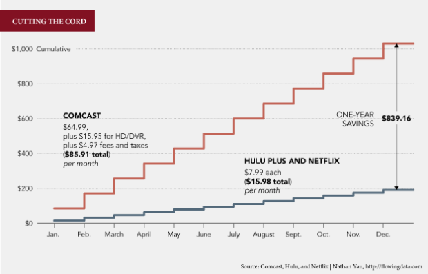
 Visualize This: The FlowingData Guide to Design, Visualization, and Statistics (2nd Edition)


