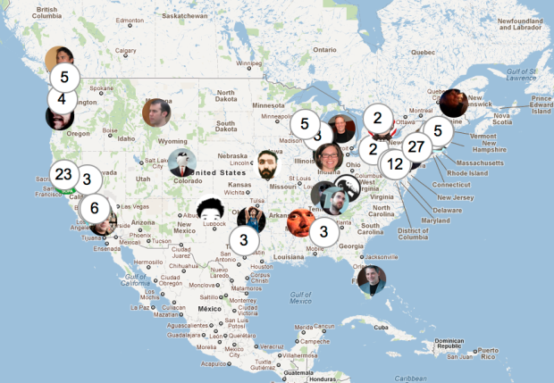
You’d think that this would’ve been done by now, but this simple mashup does exactly what the title says. Just connect your Twitter account and the people you follow popup, with some simple clustering so that people don’t get all smushed together in one location.
-
-
-
In a similar fashion to their work in Britain from Above, CGI and animation group 422 South map the daily patterns of those in the Netherlands in VPRO’s production of Netherlands from Above. It’s hard to get a grasp on what exactly I’m seeing, since I know next to nothing about the Netherlands and the video narration is in Dutch, but the visuals are beautiful. Planes fly, cars drive, and patterns emerge. The technique never seems to lose its entertainment value.
Check out the short making-of video, too, which also includes folks from Stamen describing their work with the interactive portion of the feature.
[422 South | Thanks, Ben]
-
-
-
-
When you use the same password for every online account, there could be trouble down the line if one of those sites was breached. You gotta mix it up these days. As part of their Watchdog initiative, Mozilla released an add-on to help you see how you’re reusing passwords, and to hopefully keep your personal information secure.
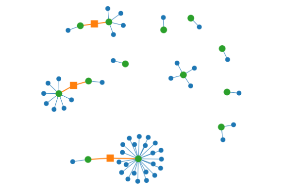
Ever been told not to reuse the same password across different websites? With this add-on, you can visualize your passwords and the sites you use them on. By looking at this visualization, you can get a quick idea of which passwords you’ve been using the most, and the kinds of sites you’re using them on. As you continue to change your passwords and update your password manager, the picture will improve!
Personally, I don’t save any of my passwords. The risk of my computer getting stolen and some random person gaining access to my online accounts is too much for me to handle. Of course as a result, I have to put up with the craptastic experience of trying to remember passwords with a variable number of capital letters, symbols, and digits.
[Mozilla]
-
-
-
This talk by Bret Victor caught fire a few days ago, but I just got a chance to watch to it in its entirety. It’s worth the one hour. Victor demos some great looking software that connects code to the visual, making the creation process more visceral, and he finishes up with worhtwhile thoughts on the invention process.
-
You knew this was coming, right? The New York Times describes the point guard fundamentals — dribble penetration, ball screen, and isolation — of Jeremy Lin in this animated Linfographic. For each play, the players of interest are outlined, and the frame shifts so that you can see where the players have been, relative to where they currently are. It’s a simple concept executed well.
I’m familiar with this stuff already, but I imagine this being pretty useful for people just tuning into the game, due to their sudden case of Linsanity. Today’s game against Dallas is gonna be a hot ticket.
-
-
-
-
In the 1980s, students and researchers at UCLA, led by marketing professor Alan Andreasen, found some interesting spending patterns when people approach major life events.
[W]hen some customers were going through a major life event, like graduating from college or getting a new job or moving to a new town, their shopping habits became flexible in ways that were both predictable and potential gold mines for retailers. The study found that when someone marries, he or she is more likely to start buying a new type of coffee. When a couple move into a new house, they’re more apt to purchase a different kind of cereal. When they divorce, there’s an increased chance they’ll start buying different brands of beer.
These findings turned out to be the backbone of work by statistician Andrew Pole, who was hired by Target to analyze their data and increase sales. Somewhere along the way, the marketing department at Target asked Pole if there was a way to predict that a customer was expecting a child. Birth records are freely available, so it’s easy to send baby-related coupons and advertisements to new mothers, but Target wanted first dibs, before that baby came out.
As you might expect, Pole found 25 products that were strong indicators and soon he had an estimate of pregnancies with a pregnancy prediction score.
Pole applied his program to every regular female shopper in Target’s national database and soon had a list of tens of thousands of women who were most likely pregnant. If they could entice those women or their husbands to visit Target and buy baby-related products, the company’s cue-routine-reward calculators could kick in and start pushing them to buy groceries, bathing suits, toys and clothing, as well. When Pole shared his list with the marketers, he said, they were ecstatic. Soon, Pole was getting invited to meetings above his paygrade. Eventually his paygrade went up.
Creepy or just good marketing? I say the latter.
[New York Times | Thanks, Paul]
-
-
-
 Taking the next step in the Wolfram|Alpha experiment, Wolfram launches a Pro version that lets you plug in your own data and get information out of it.
The key idea is automation. The concept in Wolfram|Alpha Pro is that I should just be able to take my data in whatever raw form it arrives, and throw it into Wolfram|Alpha Pro. And then Wolfram|Alpha Pro should automatically do a whole bunch of analysis, and then give me a well-organized report about my data. And if my data isn’t too large, this should all happen in a few seconds.
I haven’t had a chance to try it yet, but the sense I get from others is that the part about data not being too large is key. Apparently it’s still in the early stages and can’t handle much data at once. The main hook is automated summaries, model fitting, and some graphs, but if you know enough to interpret the models appropriately, shouldn’t you know enough to derive them?
I’d love to hear initial thoughts from those who have tried it. For those who haven’t, it’s $4.99 per month, but there’s a two-week free trail.
[Wolfram]
-


 Visualize This: The FlowingData Guide to Design, Visualization, and Statistics (2nd Edition)


