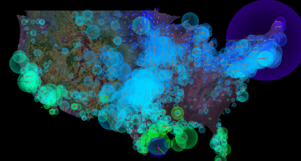
Nicolas Garcia Belmonte, author of the JavaScript InfoVis Toolkit, mapped 72 hours of weather data from 1,200 stations across the country.
Gathering the data from the National Weather Service was pretty interesting, I didn’t know USA had so many weather stations! The visualization shows wind direction encoded in line angles, wind speed encoded in line lengths and disk radius, and temperature encoded in hue.
Press play, and watch it glow. You can also easily switch between symbols: discs with lines, lines only, or filled circles.
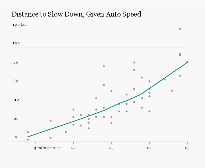

 Visualize This: The FlowingData Guide to Design, Visualization, and Statistics (2nd Edition)


