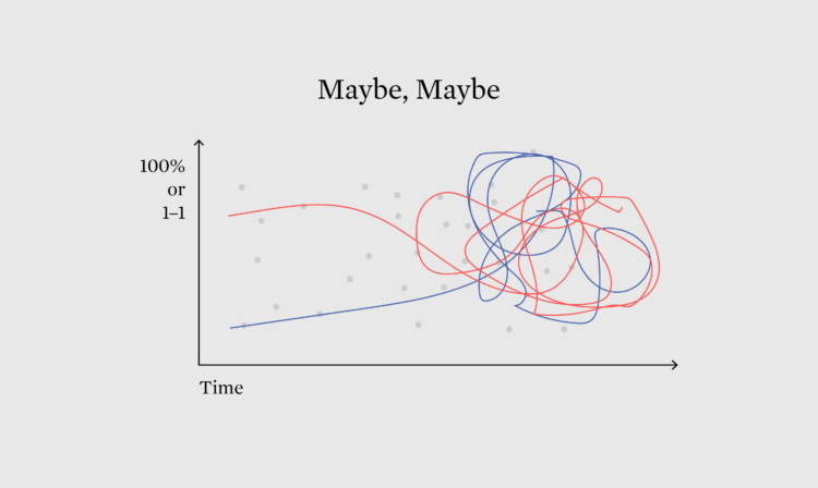
As election day in the United States draws closer, the probabilities, odds, and forecasts are in full swing, which gives us a chance to check the ways in which we currently communicate the fuzzy numbers.
As election day in the United States draws closer, the probabilities, odds, and forecasts are in full swing, which gives us a chance to check the ways in which we currently communicate the fuzzy numbers.
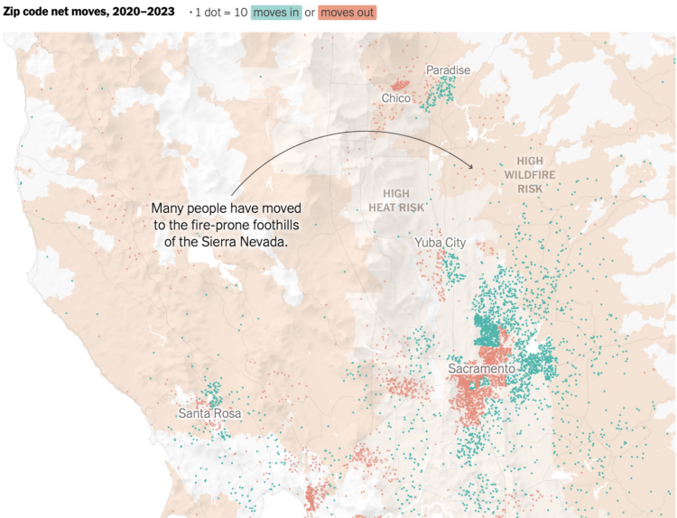
Mira Rojanasakul and Nadja Popovich, for The New York Times, mapped migration out of cities between 2020 and 2023. The dot density maps show where more people moved out than in as orange dots and the opposite in green. For many, this has meant more space and lower cost of living in exchange for moving closer to areas with higher natural disaster risk.

There are hundreds of occupations, and while the exact number varies by classification system, most U.S. government organizations list about 500 of them. You can probably guess at least a handful of the most common. Cashiers. Drivers. Teachers.
It gets more interesting the further down the list you go, breaking it down by demographic. You get a more accurate picture of the occupations throughout our lives.
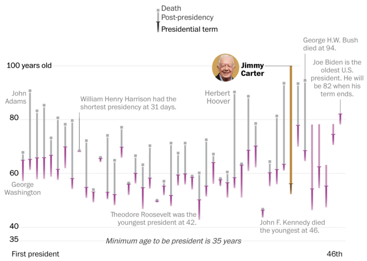
Jimmy Carter, the 39th president of the United States, turned 100 years old. For The Washington Post, Hannah Dormido and Kevin Uhrmacher show how that compares the other presidents.
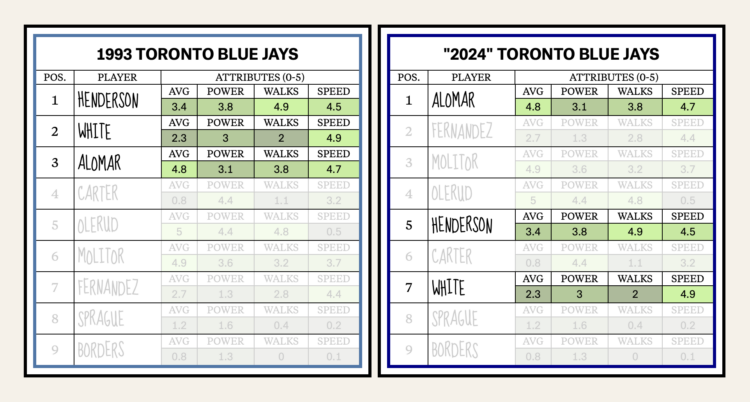
Baseball’s batting lineup has changed from what seemed to make sense to what the numbers show as optimal. Neil Paine and Michelle Pera-McGhee for The Pudding show the shifts.
No place in the lineup showcases how the game has changed more than the No. 2 slot. Remember how the second spot in the order used to be all about making contact and moving runners over? Now, the data say that your best overall hitter should hit second rather than third, as originally believed. At the No. 2 spot, they will come to the plate more often, and less frequently with two outs. This is why better overall hitters — and especially better power hitters, like Trout, Seager, and Ohtani, hit in the 2-hole more than they ever did in the past.
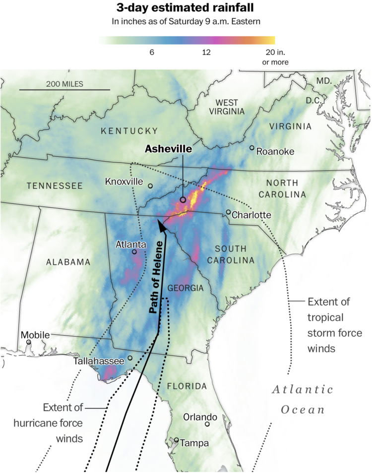
Western North Carolina got the brunt of Hurricane Helene with two feet of rain over three days and major flooding as a result. The Washington Post mapped the event.
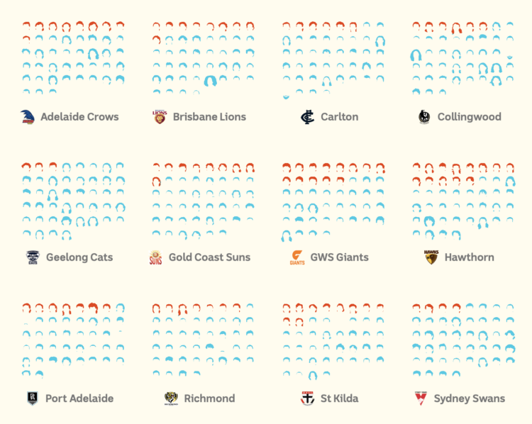
The mullet has grown popular in the Australian Football League. ABC News counted all of the long hairs.
If only I could go back in time to my eight-year-old self to tell him that the haircut his mom gave him was nothing to be embarrassed about. He was ahead of his time.

North Korea has been releasing thousands of trash bags into the air with balloons to land in South Korea. The bags in the air disrupt flight traffic and land in random places and on people. Reuters explains the trash, where it’s coming from, where it’s landing, and the annoyance of having bags of garbage floating over you.
I like how the story leads with floating trash balloons as you scroll. The balloons came in waves, and the number of items on the screen roughly estimates the volume of each wave.

As Hurricane Helene approached Florida, it grew from a tropical storm to a Category 4 hurricane. What does that mean? Amudalat Ajasa, Aaron Steckelberg, and Julie Hoban, reporting for The Washington Post, illustrate the hurricane categories with an animated model that starts peacefully and then suffers through each level.
As a Californian, I’m more familiar with earthquakes and wildfires, so this was helpful.
Helene is still moving through as of this writing, and The Post has a tracker with a projected path.

Here’s the good stuff for September 2024.
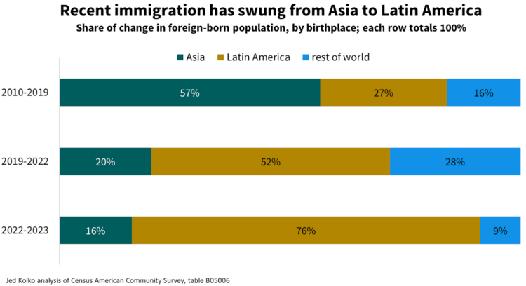
Jed Kolko, the former Under Secretary of Commerce for Economic Affairs of the United States, discusses the challenges of estimation and recent immigration numbers from the Census Bureau:
Numerous government agencies estimate the population. Annual Census population estimates guide the allocation of federal spending and also serve as the “population controls” for essential demographic surveys. (This turns out to be a big deal. More on this, below.) These annual estimates help bridge the gap between full-count decennial censuses, and they are revised to reflect new information each year. Other agencies produce population estimates and projections for their own purposes — CBO estimates and forecasts the population as inputs into their outlook for federal spending, revenue, and deficits.
Immigration is an essential part of estimating the size and growth of the population, and the trickiest.

Fourteen years ago, I did a short Q&A with Amstat News, where apparently I talked about why I blog. It feels like a lifetime ago. I was still in school and had only been running this site for a few years. For this month’s data visualization issue, I had the chance to talk about how it’s been going the past decade and a half.

For Financial Times, Sam Learner, Oliver Roeder, and Irene de la Torre Arenas made a game to help you better understand the competition for electoral votes. You get spending units that you can allot to different swing states. The more you spend, the greater the chances of you winning a state.
The fun part: Your spending choices are compared against other FT reader choices. If you spend more on a state than someone else, you win the votes. Get the majority of votes from all states and you win. Then you can see how good or bad your choices are.
The game, from the London-based news outlet, is a way to help people better understand how the Electoral College in the United States works. It works well. The game, that is.
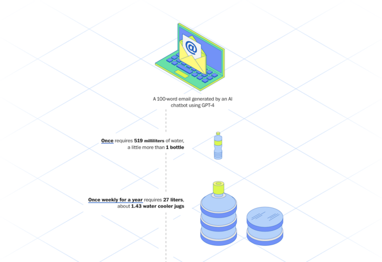
For The Washington Post, Pranshu Verma and Shelly Tan illustrate the scale of energy and water used to generate email with ChatGPT. One email from a GPT-4 language model requires about one bottle of water (for cooling data centers).
You can easily extrapolate that over many emails and many people over months and years. Then there’s the water used to train the models. That’s a lot of water.
Although, if generative email becomes a thing among the masses, what are we even doing?
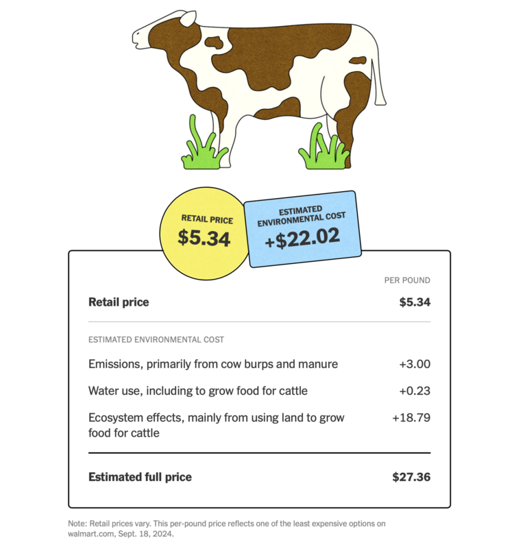
The New York Times highlights the work of True Price Foundation, a group that estimates the environmental and social costs tied to food production that aren’t included in the price you see at the grocery store. Impact from carbon emissions, water pollution, and poor working conditions find their way into our lives later in the form of climate change, loss of species, and required healthcare.
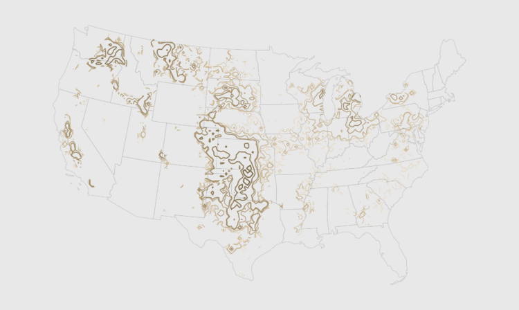
GeoTIFF data can provide high granularity but make it hard to see patterns when data is sparse. Contour lines provide an aggregated view that makes patterns easier to see.
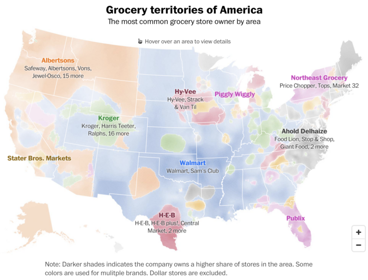
Any day is a good day for a map of predominant commercial chains. For The Washington Post, Kevin Schaul and Jaclyn Peiser show the most common grocery owners, creating territories within the United States. Albertsons, also the owner of Safeway and Vons, dominates the northwest, and Walmart has its hands just about everywhere, but especially owns a stronghold on the midwest.
On methodology:
Grocery store addresses comes from OpenStreetMap, a community-driven effort to populate maps with location data. The Post pulled locations in the United States identified as supermarkets, as well as Walmart, Sam’s Club, Target and Costco. The map visualizes the influence of the nearest grocery store locations using a k-nearest neighbor analysis that falls off as the distance to a stores increases. Grocery stores with unique names were excluded from this analysis.
There is also a search feature that lets you see the common stores in your county, beyond the leading owner.
For Bloomberg, Elena Mejía and Shawn Donnan use a transitioning cartogram to show how immigration might play a role in the upcoming election:
In the battleground states that will decide this November’s election, about 72% of migrants in 2023 went to Biden counties while less than a third went to Trump counties, the Bloomberg analysis found. Counties that voted for Biden four years ago are home to roughly 60% of the overall US population.
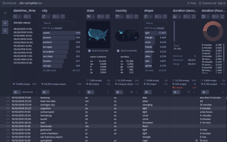
Fathom Information Design, known for client visualization-centric projects, introduced Rowboat. It’s a tool that lets you load large CSV files or Excel spreadsheets quickly in the browser. See summary graphics for each column, filter based on criteria, and quickly explore the dataset.
It’s surprisingly fast for running in the browser. I threw a couple hundred megabytes at it and the view loaded in a few seconds. So I threw in half a gigabyte and it still did fine. The tool did not like a file over a gigabyte. It seemed to really not like files with a lot of columns even though they were relatively small.
So Rowboat is currently focused on a specific set of tasks with a certain type of data, and it works well at that. Most of the tool is free for now, but there a paid tier that lets save data and export reports.
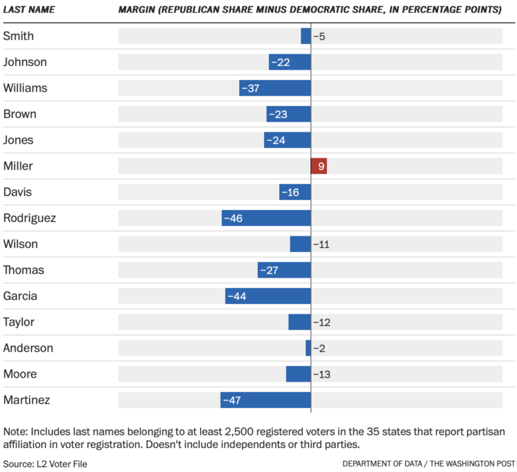
For The Washington Post, Andrew Van Dam and Lenny Bronner analyzed names and political leanings, using a voter file with 212 million registered voters. They break it down by age and geography. You can also search for your own name.
As with most trends related to political leanings, the patterns found in names run closely with demographic shifts, such as a name that grows more common among a race group and less common in another.
 Visualize This: The FlowingData Guide to Design, Visualization, and Statistics (2nd Edition)
New tools, refined process.


