
In a collaboration between PEER 1 Hosting, Steamclock Software, and Jeff Johnston, the Map of the Internet app provides a picture of what the physical Internet looks like.
Read More
In a collaboration between PEER 1 Hosting, Steamclock Software, and Jeff Johnston, the Map of the Internet app provides a picture of what the physical Internet looks like.
Read More
With Google Reader closing its doors in July (which stinks because I use it multiple times per day), now is a good time to make a switch.
For those who want to stick with RSS, you can grab the feed here. Note the change in feed URL. I used to use a service called Feedburner to deliver the RSS, but that’s owned by Google, too, so it’s probably best to move away from there.
Then of course you can follow @flowingdata on Twitter.
Or Facebook.
Or Google+.
Or via daily or weekly email.
Today might be pi day, but yesterday was Feltron Report day. The theme this year is visual density — or maybe programmatic graphics. Either way, it looks mighty fine.
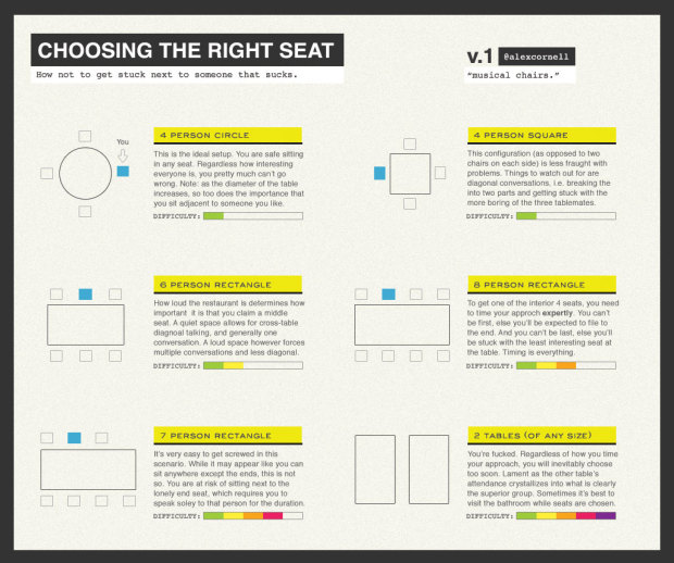
It can be tricky picking the right seat at a dinner party. So much depends on how many people there are and what shape the table is. Luckily, Alex Cornell provides a guide on where to sit and when to arrive to get the best seat of the night. The 4-person circle is your best bet.
This is the ideal setup. You are safe sitting in any seat. Regardless how interesting everyone is, you pretty much can’t go wrong. Note: as the diameter of the table increases, so too does the importance that you sit adjacent to someone you like.
Sorry for always sitting at the lonely end seat in the 7-person rectangle. [via kottke]
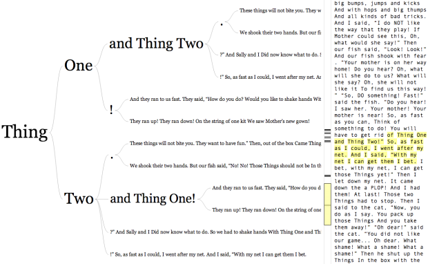
In 2007, Martin Wattenberg and Fernanda Viégas created the word tree, a search tool for unstructured text. You enter the text, pick a word or phrase, and you can see how other words and phrases branch from the root. Data visualization developer Jason Davies rephrased the visualization in JavaScript, and you can enter a URL or a Twitter username (or enter your own text like with the original). There’s also a nice sidebar that makes it easier to browse through the text.
So for example, the above is a word tree for The Cat in the Hat, and you can see what branches from Thing One and Thing Two. The phrase “and Thing Two” often follows “Thing One” as do exclamation points. The reverse feature comes in handy for text like Steve Jobs’ commencement speech.
Jake Porway, executive director of DataKind on data hackathons and why they require careful planning to actually work:
Any data scientist worth their salary will tell you that you should start with a question, NOT the data. Unfortunately, data hackathons often lack clear problem definitions. Most companies think that if you can just get hackers, pizza, and data together in a room, magic will happen. This is the same as if Habitat for Humanity gathered its volunteers around a pile of wood and said, “Have at it!” By the end of the day you’d be left with a half of a sunroom with 14 outlets in it.
Without subject matter experts available to articulate problems in advance, you get results like those from the Reinvent Green Hackathon. Reinvent Green was a city initiative in NYC aimed at having technologists improve sustainability in New York. Winners of this hackathon included an app to help cyclists “bikepool” together and a farmer’s market inventory app. These apps are great on their own, but they don’t solve the city’s sustainability problems. They solve the participants’ problems because as a young affluent hacker, my problem isn’t improving the city’s recycling programs, it’s finding kale on Saturdays.
Without clear direction on what to do with the data or questions worth answering, hackathons can end up being a bust from all angles. From the organizer side, you end up with a hodgepodge of projects that vary a lot in quality and purpose. From the participant side, you’re left up to your own devices and have to approach the data blind, without a clear starting point. From the judging side, you almost always end up having to pick a winner when there isn’t a clear one, because the criteria of the contest was fuzzy to begin with.
This also applies to hiring freelancers for visualization work. You should have a clear goal or story to tell with your data. If you expect the hire to analyze your data and produce a graphic, you better get someone with a statistics background. Otherwise, you end up with a design-heavy piece with little substance.
Basically, the more specific you can be about what you’re looking for, the better.

Self-tracking devices are all the rage these days. I went to the Apple store, and there was practically a whole wall of them. They were all uni-taskers though. There was one for cycling, another for running, and one for golfing. Amiigo, an Indiegogo campaign with four days left to contribute (but funded to completion five times over as of this writing), aims to track multiple exercises and figure out what you’re exercise you’re doing automatically.
Read More
Lois Beckett for ProPublica has a thorough piece on data brokers — companies that collect and sell information about you — and what they know and where they get the data from.
They start with the basics, like names, addresses and contact information, and add on demographics, like age, race, occupation and “education level,” according to consumer data firm Acxiom’s overview of its various categories.
But that’s just the beginning: The companies collect lists of people experiencing “life-event triggers” like getting married, buying a home, sending a kid to college — or even getting divorced.
Credit reporting giant Experian has a separate marketing services division, which sells lists of “names of expectant parents and families with newborns” that are “updated weekly.”
The companies also collect data about your hobbies and many of the purchases you make. Want to buy a list of people who read romance novels? Epsilon can sell you that, as well as a list of people who donate to international aid charities.
So if you’re wondering why you received that catalog in the mail, it was probably because a store sold your purchase data to a broker.
My many thanks to FlowingData sponsors who help keep the lights on around here. Check ’em out. They help you do stuff with data.
InstantAtlas — Enables information analysts and researchers to create highly-interactive online reporting solutions that combine statistics and map data to improve data visualization, enhance communication, and engage people in more informed decision making.
Tableau Software — Helps people see and understand data. Ranked by Gartner in 2011 as the world’s fastest growing business intelligence company, Tableau helps anyone quickly and easily analyze, visualize and share information.
Periscopic — A socially conscious data visualization firm that specializes in using technology to help companies and organizations facilitate information transparency and public awareness. They do good with data.
Column Five Media — Whether you are a startup that is just beginning to get the word out about your product, or a Fortune 500 company looking to be more social, they can help you create exciting visual content – and then ensure that people actually see it.
Want to sponsor FlowingData? Send interest to [email protected] for more details.

When we build models of the world, we often think of it broken down into pieces, such as cities, counties, and countries. In their newly funded project The City of 7 Billion, architects Joyce Hsiang and Bimal Mendis aim to model the world as one city, to study the impact of population growth on the environment and natural resources on a larger scale.
Every corner of the planet, they argue, is “urban” in some sense, touched by farming that feeds cities, pollution that comes out of them, industrialization that has made urban centers what they are today. So why not think of the world as a single urban entity?
Hsiang and Mendis don’t yet know exactly what this will look like (that is the question, Mendis says). But they are planning to seed their geo-spatial model with worldwide data on population growth, economic and social indicators, topography, ecology and more. Ultimately, they hope, other researchers will be able to use the open-source platform for research on development patterns or air quality; the public will be able to use it to grasp the implications of building in a flood plain or implementing an energy policy; and architects will be able to use it to view the world as if it were a single project site.
Along with a slew of other challenges I am sure, one of the big ones is finding comparable data at high granularity. Large cities tend to track (and hopefully release) data about what’s going, but once you step out of the major areas, data grows scarce.
They started with population, which was transformed into the physical installation above.
Along the same lines as Google Flu Trends, researchers at Microsoft, Stanford and Columbia University are investigating whether search data can be used to find interactions between drugs. They recently found an interaction.
Using automated software tools to examine queries by six million Internet users taken from Web search logs in 2010, the researchers looked for searches relating to an antidepressant, paroxetine, and a cholesterol lowering drug, pravastatin. They were able to find evidence that the combination of the two drugs caused high blood sugar.
The idea is that people are searching for symptoms and medications, and this data is stored in anonymized search logs. They then followed a suspicion that using the two drugs at the same time might cause hyperglycemia. Those that searched for the two drugs were more likely to search for hyperglycemia than the control group (probably those who didn’t search for hyperglycemia).
The work is still in its infancy, but it’ll be interesting to see how this sort of data can be used to supplement existing work by the Food and Drug Administration.

Although time series plots and small multiples can go a long way, animation can make your data feel more real and relatable. Here is how to do it in R via the animated GIF route.
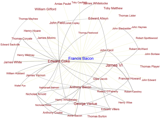
These days it’s relatively easy to figure out connections between people via email, Twitter, Facebook, etc. However, it’s harder to decipher relationships between people in the 17th century. Researchers at Carnegie Mellon and Georgetown University aim to figure that out in the Six Degrees of Francis Bacon.
Historians and literary critics have long studied the way that early modern people associated with each other and participated in various kinds of formal and informal groups. Yet their scholarship, published in countless books and articles, is scattered and unsynthesized. By data-mining existing scholarship that describes relationships between early modern persons, documents, and institutions, we have created a unified, systematized representation of the way people in early modern England were connected.
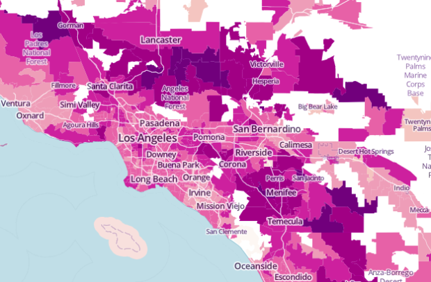
The United States Census Bureau just released county-level commute estimates for 2011, based on the American Community Survey (that thing so many people seem to be against).
About 8.1 percent of U.S. workers have commutes of 60 minutes or longer, 4.3 percent work from home, and nearly 600,000 full-time workers had “megacommutes” of at least 90 minutes and 50 miles. The average one-way daily commute for workers across the country is 25.5 minutes, and one in four commuters leave their county to work.
The Bureau graphic isn’t very good [PDF], but WNYC plugged the data into a map, which is a lot more informative.
There’s also a link to download the data on the bottom left of the WNYC map in CSV format, in case you want to try your hand at making a choropleth map. Or you can grab some flow data from the Census Bureau.
 Visualize This: The FlowingData Guide to Design, Visualization, and Statistics (2nd Edition)
New tools, refined process.


