When you go to one of the major sites to look up the weather, it’s often hard to find what you’re looking for. The sites feel dated, there isn’t much hierarchy to the information, and navigation gets buried in the show-as-much-information-as-possible-on-the-same-page approach. Forecast, a site by the makers of the Dark Sky app, hopes to improve that experience during those times you need more than the high and lows for the day from the nearest widget.
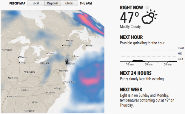
When you visit Forecast, you notice a difference right away. There’s a map with local, regional, and global views, the temperature in large print on the right, and there are descriptions about what to expect that are easy to understand.
From there, you get your daily forecasts below the map with details on demand. So you can get a lot of the same information that you get from larger sites, but you don’t get hit with a bunch of data at once, and when you request more information, you get it quickly.
There’s also an API. Forecast and the Dark Sky app both run on it, which is the cherry on top of the goodness.
I usually go to Matthew Ericson’s minimalist weather page when I’m figuring out when to ride my bike or mow the lawn. Forecast might be my new weather destination for a while.


 Visualize This: The FlowingData Guide to Design, Visualization, and Statistics (2nd Edition)


