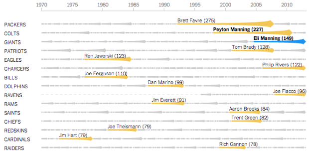
• A handful of experts weighed in on visualization as a spectrum rather than an unyielding tool.

    The panelists emphasized repeatedly that data visualization exists on a spectrum. On one side are the pieces that are purely aesthetic and emotional, and on the other, the focus is purely on conveying the insights found in the data. Tom Carden, a data visualization engineer at Square, asks himself if the goal is to grab attention for a new idea, or to build a tool that will be used on an ongoing basis: “Tools need to be actionable, auditable, and they have to stand up to scrutiny long-term.” Tools should be able to accommodate new data, he said, and should grow with companies in such a way that people aren’t surprised by a difference between this week and last week.

    From the other side of the spectrum are different types of insight that can be emotional, reflective, or just darn funny. This is equally important to analytic insight that you get from tools, and they feed in to each other providing a more realistic view of what data really represents.

    Some illustrated notes from the panel:

  • With the State of the Union address tonight, The Guardian plotted the Flesh-Kincaid grade levels for past addresses. Each circle represents a state of the union and is sized by the number of words used. Color is used to provide separation between presidents. For example, Obama’s state of the union last year was around the eighth-grade level, and in contrast, James Madison’s 1815 address had a reading level of 25.3.

    My guess is this has to do with changes in how we write and talk more than anything else. Lee Drutman and Dan Drinkard for the Sunlight Foundation ran a more rigorous analysis on Congressional records back in May, and the declining trend is similar.

  • Viviana Ferro, Ilaria Pagin, and Elisa Zamarian had a look at all of Zeus’s relationships according to many authors over the years. Each person on the inside of a circle represents a lover, and the colored branches connect to children. Start with Zeus, the largest black dot near the middle, and then work your way out.

  • My life in graphsMy friends just got this for me, and it’s pretty much the perfect gift, especially since my dissertation is about journaling and personal data collection. My Life in Graphs: A Guided Journal is a book of blank charts and graphs, and you fill in the blanks. For example, there’s a map to mark your travel destinations and an x-y plot to evaluate “bucket-list viability.”

    I worked on mine a couple of days ago and showed it to my wife. She said I was like a kid showing off his homework. I think that’s a good thing.

  • Tom Cheesman of Swansea University, along with Kevin Flanagan and Studio NAND, dives into translations of Shakespeare’s Othello with TransVis.

    TransVis collects, digitises, analyses and compares translations and variations of literary works. In an initial prototype named VVV (»Version Variation Visualisation«), we have proposed analysis methods, interfaces and visualization tools to explore 37 translations of Shakespeare’s Othello into German with more works translated into other languages to come.

    The map is more of a browser to see where specific publications were written, rewritten and published, but I wonder if you’ll see anything interesting if you looked at just where something is rewritten or translated. It’d be like seeing ideas spreading. Or you know, Twilight copies.

  • Reality Prose has an excellent analysis on the changing price of LEGO bricks over the years and a misconception that cost has gone up. According to the chart above, based on data from BrickSet and adjusted for inflation, the average cost per brick has come down.
    Read More

  • David Brooks for The New York Times on the philosophy of data and what the future holds:

    If you asked me to describe the rising philosophy of the day, I’d say it is data-ism. We now have the ability to gather huge amounts of data. This ability seems to carry with it certain cultural assumptions — that everything that can be measured should be measured; that data is a transparent and reliable lens that allows us to filter out emotionalism and ideology; that data will help us do remarkable things — like foretell the future.

    Be sure to read the comments. There’s actually quite a bit of anti-data talk.

  • From Reddit user ddurrr while visiting London. Pretty much my current status and mental capacity. [Thanks, Tom]

  • Information visualization firm Periscopic just published a thoughtful interactive piece on gun murders in the United States, in 2010. It starts with the individuals: when they were killed, coupled with the years they potentially lost. Each arc represents a person, with lived years in orange and the difference in potential years in white. A mouseover on each arc shows more details about that person.
    Read More

  • In Waters Re~ artist Xárene Eskandar placed video of the same landscape at different times of day in parallel.

    They capture the subjective and perceptual qualities of time expressed as events, moments, memory and landscape. The goal is to break the linear experience of time, allowing viewers to perceive multiple times within a single viewpoint. As a result insignificant moments become significant events, heightening one’s experience of the landscape and one’s existence in that particular moment in time and space.

    The results are beautiful. [via FastCo]

  • ad-spending-and-profits-smallerRitchie King for Quartz compared money spent on Super Bowl ads — now about $3.75 million for a 30-second spot — to how much the companies make on average in 3 and a half hours (the average length of a game).

    It’s impossible to say exactly how much a successful Super Bowl ad ultimately earns a company. Surely the Wassup commercials were a huge boon for the Budweiser brand—but how huge?

    One thing is clear though: for the biggest advertisers, that $3.75 million is truly a pittance. In fact, some of them make almost as much in profits in an average 3.5 hours—roughly the time it takes to air the Super Bowl itself.

    Note that spending (on the bottom) is total between 2002 and 2011, and the vertical scales are different (so it probably would’ve been good to give more visual separation between the two charts), but still, kind of an interesting perspective.

  • Biostatistics PhD candidate Hilary Parker dived into the most poisoned names in US history. Her own name topped the list. There were several fad names such as Deneen, Catina, and Farrah that saw a quick spike and then a plummet, but the trend for Hilary is different.

    “Hilary”, though, was clearly different than these flash-in-the-pan names. The name was growing in popularity (albeit not monotonically) for years. So to remove all of the fad names from the list, I chose only the names that were in the top 1000 for over 20 years, and updated the graph (note that I changed the range on the y-axis).

    I think it’s pretty safe to say that, among the names that were once stable and then had a sudden drop, “Hilary” is clearly the most poisoned.

    There it is minding its own business, enjoying a steady rise in popularity over a few decades, and then boom, Bill Clinton is elected, and the name dies a quick death.

    Be sure to check out the rest of the analysis. Good stuff. [Thanks, @hspter]

  • The Mercator projection can be useful for giving directions, but when it comes to world maps, the projection doesn’t hold up well as you move far north and south. By how much? Give this puzzle game a try and match the red boundaries to their respective countries.

  • Carlos Scheidegger and Kenny Shirley, along with Chris Volinsky, visualized Major League Baseball Hall of Fame voting, from the first class in 1936 (which included Babe Ruth) up to present.

    All a fan can do is accept that Baseball Hall of Fame voting, conducted by the Baseball Writers Association of America (BBWAA), is a phenomenon unto itself. If we can’t understand baseball Hall of Fame voting, though, maybe the next best thing is visualizing the data behind it. The set of interactive plots on this webpage is our attempt to do that. We were especially interested in two things: (1) viewing the trajectories of BBWAA vote percentage by year for different players throughout history, and (2) simultaneously viewing the career statistics of these players, to help find patterns and explain their trajectories (or to reassure ourselves that the writers really are crazy).

    The interactive is on the analysis side of the spectrum, so you might be a bit lost if you don’t know a lick about baseball. However, if your’re a baseball fan, there’s a lot to play around with and dimensions to poke around at, as you can filter on pretty much all player stats such as home run count, batting average, and innings played. At the very least, you’re getting a peek at how statisticians pick and prod at their data.

    Start at the examples section for quick direction. I eventually found myself looking for downward trajectories. Poor Mark McGwire. [Thanks, Chris]