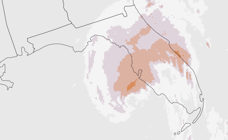
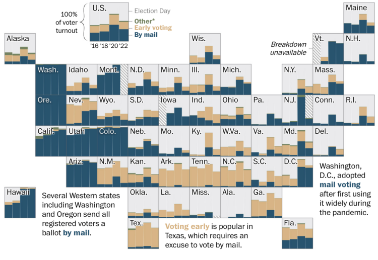
• Membership
  • Newsletter
  • Projects
  • Learning
  • About
  • Member Login
  • AI-generated email from a friend

    June 20, 2024

    Topic

    Statistics  /  AI, email, Neven Mrgan

    Neven Mrgan describes what it was like to get an AI-generated email from a friend:

    I knew that I didn’t want an algorithm to design layouts and draw illustrations “so I don’t have to,” but prior to this email, I never even pondered whether I wanted AI to call me up on behalf of people in my life. It had simply not occurred to me—and now that it has occurred to me, I definitely do not want small talk and relationships outsourced to server farms. This stuff shouldn’t feel hard or taxing; it’s what our presence here on Earth is mostly made up of. The effort, the clumsiness, and the time invested are where humanity is stored.

    I got an alert for a link to FlowingData, and it was for a sloppy AI-generated site. The site covered a hodgepodge of topics with generated titles, text, and cover images. It looked like a news site on the surface but stripped of all meaning once you tried to read.

    One of the “articles” was a “summary” of something I wrote. It felt lazy and offensive, which sounds familiar to what Mrgan felt about his friend’s “email.”

  • Heat tracker for the U.S.

    June 19, 2024

    Topic

    Statistical Visualization  /  heat, New York Times, warning

    It’s abnormally hot in a large portion of the United States, and it’s going to stay that way for a few days. The New York Times has a heat tracker to show the areas with dangerous high temperatures and how long it will last.

    A searchable line chart shows background bands for heat index levels, and a subtle gray to black gradient on the line reinforces the peaks.

    Stay indoors and stay hydrated.

  • Data Underload  /  age, old, young

    See Who is Older and Younger than You

    As you get older, it might start to feel like everyone is getting younger around you. At what point are you older than the majority?

    Read More
  • Analysis of Sudoku play patterns

    June 17, 2024

    Topic

    Self-surveillance  /  game, Sudoku, Vivek Rao

    Vivek Rao likes to play Sudoku, enough that he collected data on his gameplay and analyzed his strategies:

    In January 2023, I made a breakthrough. I started tracking what grids I fill out and how I fill them out1. And in the weeks after, I started to analyze my performance to look for patterns and ways I could speed up. As a throwback to my high school self, I decided to analyze 100 easy sudokus to see what I could learn about my performance.

  • Probabilistic Tic-Tac-Toe

    June 14, 2024

    Topic

    Statistics  /  Cameron Sun, game, probability, uncertainty

    Thinking about life and randomness, Cameron Sun modified the classic game of Tic-Tac-Toe. You choose where you want to go but don’t control the outcome:

    [I]n any given game of Probabilistic Tic-Tac-Toe you can do everything right and still lose (or do everything wrong and win.) However, the better player always rises to the top over time. These are characteristics that I find interesting about a lot of other games, and I thought they’d be fun to apply to an otherwise boring, solved game like tic-tac-toe. They’re also highly relevant to my life philosophy – that every outcome is effectively random, but our actions can often skew the odds in our favor. Bad breaks are inevitable, but good judgment is always rewarded (eventually, and given enough chances.)

    The code is available on GitHub.

  • Members Only

    Towards Unfamiliar Data Representation

    June 13, 2024

    Topic

    The Process  /  beginners, possibilities

    Visualization tends towards familiarity and convenience, which is useful for getting things done and reading data quickly. But the familiar is also less fun and can be stifling.

  • Data Underload  /  income, rank, work

    Occupation and Salary Rankings, Each Decade Since 1970

    Job types changed over the years, because there were these things called computers that created occupations and shifted others. How did income change for different jobs, relative to everyone else? Use this chart to see how occupations ranked over the decades.

    Read More
  • Visualize This on storytelling with data

    June 12, 2024

    Topic

    The Book  /  podcast, storytelling with data

    I talked to Cole Nussbaumer Knaflic about my early motivations, FD origins, the new book, how I work, and data things. Listen to the episode here.

    Cole, who runs storytelling with data, came around not long after FD. Although she has a team now, I count Cole as one of the few long-term, independent visualization folks. It was fun to finally get to chat.

  • Mapping hurricane winds with avocado of uncertainty

    June 12, 2024

    Topic

    Maps  /  Stamen, uncertainty, wind

    Stamen, whose design breakdowns I always appreciate, discusses why they took a different route to to show the uncertainty of wind speeds:

    Wind speed probability data shows you the likelihood of sustained wind speeds that denote a category 1 hurricane (74+ mph). The way the data appears on a map is through concentric polygons that denote progressively less likely areas to experience a category 1 hurricane. We had bands showing the breakdown by 10%, but felt that given how much other data we needed to show, paring back the number of circles would be best. We ultimately decided on showing 90%, 50%, and 10% chance areas of category 1 hurricane. The team, and our stakeholders, agreed that this way of showing hurricane forecasting was far more precise than the cone of uncertainty. Wind speed probability data shows specific degrees of hurricane likelihood compared to only emphasizing one area like with the cone. Put simply, the cone of uncertainty tries to do too much at the cost of specificity.

    See also: the challenges in reading the more common cone of uncertainty.

  • Visualizing GitHub commit history in a 3-D virtual space

    June 11, 2024

    Topic

    Data Art  /  3-d, GitHub, Ren Yuan, sonification

    Ren Yuan visualized the GitHub commit history for the PyTorch library. The virtual rendering shows commits flying towards a repository with events sonified over time.

    I wish this was a physical installation or could be experienced in VR. That would be fun.

    Find Yuan’s other experiments with visualization and sonification on his site or his more frequently updated X feed. They will get the ol’ imagination going.

  • Hockey player tracking projected on ice for live watch party

    June 10, 2024

    Topic

    Infographics  /  hockey, motion tracking, physical, SMT, sports

    During the Dallas Stars away games during this year’s NHL playoffs, fans could attend watch parties at the home arena. The team used projectors and player tracking to show movements on the ice in real-time.

    They should’ve used a colorblind-safe palette to differentiate the two teams instead of red and green. But this is a fun use of tracking technology that uses the hockey rink as a plotting space. I guess it brings the away fans closer to the game, too. Now do holograms.

  • Dr Pepper ties with Pepsi-Cola for number two soda

    June 7, 2024

    Topic

    Statistical Visualization  /  Beverage Digest, Dr Pepper, Pepsi, soda, Wall Street Journal

    Dr Pepper steadily rose and Pepsi steadily declined over the past couple of decades. Now they’re tied, according to estimates from Beverage Digest. For the Wall Street Journal, Jennifer Maloney reports (Apple News link):

    The 139-year-old soda brand is now tied with Pepsi-Cola as the No. 2 carbonated soft drink brand in America behind Coke. The regular versions of Pepsi and Dr Pepper are neck and neck in a spot that Pepsi has held nearly every year for the past four decades, according to sales-volume data from Beverage Digest.

    You’ll always be number one in my book, Dr Pepper.

  • Members Only

    Chart Options to Cut Through the Noise and See Patterns

    June 6, 2024

    Topic

    The Process  /  noise, options

    Sometimes the noise in a dataset makes it hard to see the worthwhile patterns when you visualize it. Here are chart options for you.

  • About a dog

    June 6, 2024

    Topic

    Infographics  /  dogs, New York Times, pets, storytelling

    For NYT, Sam Anderson, with illustrations by Gaia Alari, tells the story of his family dog Walnut. The storytelling and animation format work well to depict the love of a pet.

    For some reason, someone started cutting onions while I was reading.

  • Currently, a light display that shows where your energy is from

    June 5, 2024

    Topic

    Data Art  /  energy, light, Universal Everything

    Currently is a prototype ambient display that shows where your energy comes from. The display cycles through a set of radial stacked charts that provide the breakdown over time.

    It reminds me of eco-related projects from the late 2000s. I like it.

  • California property taxes, through the Painted Ladies houses

    June 4, 2024

    Topic

    Infographics  /  Painted Ladies, San Francisco Chronicle, taxes

    The Painted Ladies houses, which includes the house from the 1990s sitcom Full House, is a set of seven houses in San Francisco. Six of them are basically the same, but the annual property taxes are not. For the San Francisco Chronicle, Nami Sumida shows why through a set of charts and illustrations, using the differences as a way to explain California property taxes.

    This is also why I will never move.

  • Wheel of Fortune analysis for the win

    June 3, 2024

    Topic

    Statistics  /  Scott Menke, Upshot, Wheel of Fortune

    A Wheel of Fortune contestant employed strategies outlined in a NYT Upshot analysis and won in the bonus round:

    Last December, the Upshot published a guide to Wheel of Fortune strategies, using data from more than 6,000 bonus-round puzzles. Our guide has influenced the behavior of at least one contestant. Scott Menke, a data analyst from New Jersey, won $52,690 in cash and prizes on an episode last month after creating a strategy based on our article, he said.

    Data for good.

  • Simple tool for proportional area charts

    May 31, 2024

    Topic

    Apps  /  area, Krisztina Szűcs

    There might be times when you want to visualize data with area, but want to use irregular shapes that aren’t strictly squares. This straightforward tool by Krisztina Szucs lets click-and-drag for custom shapes. Enter values and drag the corners to make longer, shorter, wider, and narrower.

  • Members Only

    Visualization Tools and Learning Resources, May 2024 Roundup

    May 30, 2024

    Topic

    The Process  /  roundup

    Here’s the good stuff for the month.

  • On the PolicyViz Podcast →

    May 30, 2024

    Topic

    The Book  /  Jon Schwabish, podcast, PolicyViz

    I had a chat with Jon Schwabish on The PolicyViz Podcast. We talked about the new book and more generally, how data visualization changed over the past couple decades.

    You also get to hear me realize in real-time that I had not talked about these things out loud in a long while.

    I mean it’s great and you should definitely listen. Jon’s podcast has been in my listening queue for years, so it was fun to be in an episode.

  • Page 24 of 392
  • <
  • 1
  • ...
  • 21
  • 22
  • 23
  • 24
  • 25
  • 26
  • ...
  • 392
  • >

Analyze, visualize, and communicate data usefully, beyond the defaults.

Become a member →

Recently for Members

May 15, 2025
Step Chart, Enhanced

May 8, 2025
When the data is not what it seems

May 1, 2025
Finding the Right Charts

April 24, 2025
Visualization Tools, Datasets, and Resources – April 2025 Roundup

April 17, 2025
Breaking Out of Chart Software Defaults

Browse by Chart Type See All →

Pie Chart Unit Chart Radar Chart Packed Bubble Chart Strip Plot Dot Map Donut Chart Parallel Sets Grid Map Streamgraph

Browse By Topic

  • Visualization

    Seeing data

  • Maps

    Seeing geographic data

  • Infographics

    Explaining data

  • Networks

    Connecting data

  • Statistics

    Analyzing data

  • Software

    Working with data

  • Sources

    Getting data

  • Design

    Making data readable

Get the Book

Visualize This: The FlowingData Guide to Design, Visualization, and Statistics

Available now.

Order: Amazon / Bookshop

Made by FlowingData

  • The Process

  • Data Underload

  • Chart Everything

  • Guides

  • Books

  • Shop

  • About
  • Contact
  • Newsletter
  • LinkedIn
  • Instagram
  • Bluesky
  • RSS
Copyright © 2007-Present FlowingData. All rights reserved.