• Membership
  • Newsletter
  • Projects
  • Learning
  • About
  • Member Login
  • Planetary layer cake

    April 2, 2014

    Topic

    Maps  /  cake, planets

    From Cakecrumbs, a product that helps you learn while you eat: planetary layer cakes. The graduate student slash baker hobbyist’s sister asked if she could make one, and at first she thought it couldn’t be done. But then she thought more about it.

    I spent the rest of the afternoon thinking about it. I don’t admit defeat. Ever. But especially not with cake. Nothing is impossible is pretty much my baking motto, so to say this cake was impossible left me feeling weird. There had to be a way. A way that didn’t involve carving or crumbing the cake. I kept mulling it over until I had a breakthrough.

    See how it was done.

  • Bike share data in New York, animated

    April 1, 2014

    Topic

    Data Sources  /  animation, biking, New York

    Citi Bike, also known as NYC Bike Share, is releasing monthly data dumps for station check-outs and check-ins, which gives you a sense of where and when people move about the city. Jeff Ferzoco, Sarah Kaufman, and Juan Francisco Saldarriaga mapped 24 hours of activity in the video below.

    [Thanks, Jeff]

  • Dead links on the Million Dollar Homepage →

    April 1, 2014

    Topic

    Statistics  /  Million Dollar Homepage, Quartz

    Remember the Million Dollar Homepage from 2005? It sold ad space to anyone who was interested for one dollar per pixel, and there were one million pixels available. All spots were filled, and it gave a burst of bunch of other million dollar homepages that turned out to be zero dollar homepages.

    David Yanofsky for Quartz returned to the homepage to look at link rot. 22 percent of links on the homepage are dead.

  • Exponential water tank

    March 31, 2014

    Topic

    Infographics  /  exponential growth, teaching

    Hibai Unzueta, based on a paper by Albert Bartlett, demonstrates exponential growth with a simple animation. It depicts a man standing in a tank with finite capacity and water rising slowly, but at an exponential rate.

    Our brains are wired to predict future behaviour based on past behaviour (see here). But what happens when something growths exponentially? For a long time, the numbers are so little in relation to the scale that we hardly see the changes. But even at moderate growth rates exponential functions reach a point where the numbers grow too fast. Once we confirm that our predictions about the future have failed, very little time to react may be left.

    All looks safe at first, because the water rises so slowly, but it seems to rise all of a sudden. Oh, the suspense. What will happen to cartoon pixel man?

  • Centuries of European border changes

    March 28, 2014

    Topic

    Maps  /  borders, video

    The Centennia Historical Atlas is a program that shows you border changes in Europe and the Middle East, from the 11th century to the present. It’s meant as an educational tool. The video below is the animated map from the program set to climactic music from the movie Inception.

    Now contrast that to the original promotional video for Centennia. I’m amused. [via @sogrady]

  • Smoking rates and income →

    March 27, 2014

    Topic

    Maps  /  choropleth, health, New York Times, smoking

    Based on a study on smoking prevalence from 1996 to 2012, a map by The New York Times shows the results. Smoking rates among men and women have declined overall over the years, but there are still relatively high rates in many areas of the country, which appears to correlate with income. Lower income tends towards higher smoking rates.

    That would explain why the map above looks similar to a county-level map for median household income, which probably interacts with life spans by county somehow.

  • Reconstructing Google Streetview as a point cloud

    March 26, 2014

    Topic

    Maps  /  Google Streetview, openFrameworks

    Patricio Gonzalez Vivo, an MFA Design & Technology student, scraped depth from Google Streetview and then reconstructed it in openFrameworks. The result is Point Cloud City. See it in action in the video below.

    Dreamlike.

    Now I’m curious what else can be gleaned from this data, because this essentially means you could get really detailed data about the makeup of places, down to the window of a building. Although I don’t imagine Google will let this stay so accessible for long. [Thanks, @pixelbeat]

  • Human heartbeat

    March 26, 2014

    Topic

    Data Art  /  health, heart, Jen Lowe, personal

    Jen Lowe tracks her heart rate with a Basis watch, and she’s showing the last 24 hours of that data in One Human Heartbeat.

    Basis doesn’t provide an open API, so I access the data using a variation of this code. The heartrate you see is from 24 hours ago. This is because the data can only be accessed via usb connection. Twice a day I connect the watch and upload my latest heartrates to the database. I’ve been doing this for 33 days now.

    It’s March 25, 2014, and statistics say I have about 16452 days left.

    On the surface, it’s just a pulsating light on a screen, but somehow it feels like more than that. The countdown aspect makes me uneasy, as if I were watching a ticker on someone’s life, or my own even. I want to keep watching though, because it continues to pulsate. It’s hopeful.

  • How to Make Smoothed Density Maps in R

    Too many points to plot often means obscured patterns in the clutter. Density maps offer a smooth alternative.

  • Level of road grid

    March 25, 2014

    Topic

    Maps  /  grid, roads

    Seth Kadish looked at the road network of several major counties and estimated the directions the streets run. The result is a set of charts that shows which cities use a grid system and those that don’t.

    If you’re like me, and you use the Sun to navigate, you probably appreciate cities with gridded street plans that are oriented in the cardinal directions. If you know that your destination is due west, even if you hit a dead end or two, you’ll be able to get there. However, not all urban planners settled on such a simple layout for road networks. For some developers, topography or water may have gotten in the way. Others may not have appreciated the efficiency of the grid. This visualization assesses those road networks by comparing the relative degree to which they are gridded.

    Whoa, Charlotte.

    Since the original, Kadish has added more counties and a handful of international cities.

  • Graph TV shows ratings by episode

    March 24, 2014

    Topic

    Statistical Visualization  /  imdb, interactive, ratings, television

    Kevin Wu made a straightforward interactive that lets you see IMDB television ratings over time, per episode and by season.
    Read More

  • Failed Bitcoin market activity

    March 21, 2014

    Topic

    Statistical Visualization  /  Bitcoin, Stamen

    Stamen visualized Bitcoin activity, noting a variety of traders who knew what they were doing, didn’t know what they were doing, and were apparently automated.

    In February 2014 MtGox, one of the oldest Bitcoin exchanges, filed for bankruptcy protection. On March 9th a group posted a data leak, which included the trading history of all MtGox users from April 2011 to November 2013. The graphs below explore the trade behaviors of the 500 highest volume MtGox users from the leaked data set. These are the Bitcoin barons, wealthy speculators, dueling algorithms, greater fools, and many more who took bitcoin to the moon.

  • NBA passing dynamics

    March 20, 2014

    Topic

    Network Visualization  /  basketball, passing, sports

    With player tracking installed in all of the NBA arenas, the sports analytics folks can essentially replay entire games through data and dissect the many facets of play. Andrew Bergmann looked at the passing averages between starters on each team.

    The thickness of the gray lines on the accompanying chart represents the average number of passes per game between two players.

    A very clear picture emerges on which teams distribute the ball more evenly between players, such as the Nets, Bulls and Cavaliers. On the flip side, Chris Paul and Blake Griffin dominate passing for the Clippers, and likewise for Kevin Love and Ricky Rubio of the Timberwolves.

    These connections are non-directional, so it hides a little bit, but you still get a good sense of who the offense runs through based on the sum-width of connections from an individual. You can also easily see team ball distribution, which is the point of the graphic.

    Next step: match ups. I bet that’s where the money’s at. We’ve seen a lot of analyses and graphics that show the activity of a single team, but ultimately, you want to know how your team plays against others in your division and playoff contenders. Ideal gameplay against subpar teams? Not so important.

  • An exploration of cultural production

    March 19, 2014

    Topic

    Statistical Visualization  /  culture, MIT

    Pantheon, a project from the Macro Connections group at The MIT Media Lab, explores cultural influences across countries and domains.

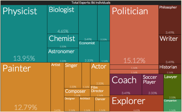
    To make our efforts tractable, Pantheon will not focus on culture, as it is understood in its broadest sense, but on cultural production. In a broad sense, culture can be understood as all of the information that humans—or animals [1]—generate and transmit through non-genetic means [2]. At Pantheon, however, we do not focus on the entire range of cultural information, but in a subset of this information that we define narrowly as cultural production. That is, we do not focus on cultural information such as passed on family values or societal trust [3], but on cultural production as proxied by the biographies of notable historical characters. Moreover, we focus on the subset of cultural production that we can identify as global culture, meaning the subset of cultural production that has broken the barriers of space, time and language.

    Rankings inevitably come into play, such as who the most influential philosopher, physicist, or country is, and the project covers a broad spectrum, so the methodology is the most important here. Using data from Wikipedia, Freebase, and other online sources, the researchers created several indices that essentially give a score to individuals for popularity and production. This naturally results in estimation fuzziness, which means you take the results with salt and all that.

    It’s an interesting look though and a good start to something bigger. If anything, you’ll probably learn something new after poking around for a bit.

  • Data Underload  /  coffee

    Coffee Place Geography

    My fascination with the geography of place and businesses continues.

    Read More
  • Job Board, March 2014

    March 18, 2014

    Topic

    Job Board

    Looking for a job in data science, visualization, or statistics? There are openings on the board.

    Assistant/Associate Professor-Statistics-Mathematical Sciences for the University of Massachusetts Lowell in Lowell, Massachusetts.

    Data Visualization Engineer / Reporting Manager for Nike in Portland, Oregon.

    Lead data Visualization Design-Developer (freelance) for SingTel in Singapore.

  • Gambling data as a proxy for excitement in sports

    March 17, 2014

    Topic

    Statistics  /  gambling, sports

    After he noticed gambling odds fluctuate wildly at the end of a football game, Todd Schneider realized a correlation between betting odds and game excitement. The Gambletron 2000 is a fun look into the proxy.

    It occurred to me then that variance in gambling market odds is a good way to quantify how exciting a game is. Modern betting exchanges allow gamblers to bet throughout the course of a game. The odds, which can also be expressed as win probabilities, continually readjust as the game progresses. My claim is that the more the odds fluctuate during a game, the more exciting that game is.

    Games and odds update automatically up to the minute, with a highlight on the “hotness” of games, or the amount of variation over time. A blowout game shows a line that heads towards 100 percent probability that a team will win, whereas a comeback game shows a dip towards 100 percent for one team and then a trend back towards 100 percent for the opposition.

    I had the odds for the Golden State-Portland game open for part of the time tonight, and it was kind of a fun accompaniment.

    Mobile alert app for sports, anyone? Current offerings are abysmal.

  • Beer me, Minnesota

    March 14, 2014

    Topic

    Infographics  /  beer, Star Tribune

    The Star Tribune has a fun interactive that recommends Minnesota brews, based on five key beer characteristics. Use sliders to enter your preference of bitterness, aroma, etc and the results come in radar graph form.

    Whether you’re a creature of habit or always up for something new, this tool will help you get to know what’s brewing in Minnesota. We’ve catalogued more than 100 beers from 36 Minnesota breweries and sorted them by five characteristics.

    I fully expect someone to expand this to the rest of the world.

  • Where time comes from

    March 13, 2014

    Topic

    Statistics  /  Atlantic, time

    The Atlantic interviewed Dr. Demetrios Matsakis, Chief Scientist for Time Services at the US Naval Observatory about where time comes from, the precision required and how they obtain it, and why we need such precision. Five seconds into it, my wife commented, “That sounds nerdy.” That’s how you know it’s gonna be good.

  • How people really read and share online

    March 12, 2014

    Topic

    Statistics  /  online reading, Web

    Tony Haile discusses how we read and share online, based on actual data. It’s not as click- and pageview-based as you might think.

    A widespread assumption is that the more content is liked or shared, the more engaging it must be, the more willing people are to devote their attention to it. However, the data doesn’t back that up. We looked at 10,000 socially-shared articles and found that there is no relationship whatsoever between the amount a piece of content is shared and the amount of attention an average reader will give that content.

    When we combined attention and traffic to find the story that had the largest volume of total engaged time, we found that it had fewer than 100 likes and fewer than 50 tweets. Conversely, the story with the largest number of tweets got about 20% of the total engaged time that the most engaging story received.

  • Page 224 of 392
  • <
  • 1
  • ...
  • 221
  • 222
  • 223
  • 224
  • 225
  • 226
  • ...
  • 392
  • >

Analyze, visualize, and communicate data usefully, beyond the defaults.

Become a member →

Recently for Members

May 15, 2025
Step Chart, Enhanced

May 8, 2025
When the data is not what it seems

May 1, 2025
Finding the Right Charts

April 24, 2025
Visualization Tools, Datasets, and Resources – April 2025 Roundup

April 17, 2025
Breaking Out of Chart Software Defaults

Browse by Chart Type See All →

Radar Chart Scatter Plot Table Mosaic Plot Calendar Network Graph Square Pie Chart Line Map Difference Chart Dot Density Map

Browse By Topic

  • Visualization

    Seeing data

  • Maps

    Seeing geographic data

  • Infographics

    Explaining data

  • Networks

    Connecting data

  • Statistics

    Analyzing data

  • Software

    Working with data

  • Sources

    Getting data

  • Design

    Making data readable

Get the Book

Visualize This: The FlowingData Guide to Design, Visualization, and Statistics

Available now.

Order: Amazon / Bookshop

Made by FlowingData

  • The Process

  • Data Underload

  • Chart Everything

  • Guides

  • Books

  • Shop

  • About
  • Contact
  • Newsletter
  • LinkedIn
  • Instagram
  • Bluesky
  • RSS
Copyright © 2007-Present FlowingData. All rights reserved.