• Membership
  • Newsletter
  • Projects
  • Learning
  • About
  • Member Login
  • Combatting the Obsession with New Tools

    April 29, 2014

    Topic

    Software  /  learning, Michal Migurski

    Michal Migurski thinks about finding the right job for the tool rather than the other way around:

    Near the second half of most nerd debates, your likelihood of hearing the phrase “pick the right tool for the job” approaches 100% (cf. frameworks, rails, more rails, node, drupal, jquery, rails again). “Right tool for the job” is a conversation killer, because no shit. You shouldn’t be using the wrong tool. And yet, working in code is working in language (naming things is the second hard problem) so it’s equally in-bounds to debate the choice of job for the tool. “Right tool” assumes that the Job is a constant and the Tool is a variable, but this is an arbitrary choice and notably contradicted by our own research into the motivations of idealistic geeks.

    Along the same lines, Frank Chimero on not trying any new tools for the year and how each represents someone’s perspective:

    Everything that’s made has a bias, but simple implements—a hammer, a lever, a text editor—assume little and ask less. The tool doesn’t force the hand. But digital tools for information work are spookier. The tools can force the mind, since they have an ideological perspective baked into them. To best use the tool, you must think like the people who made it. This situation, at its best, is called learning. But more often than not, with my tools, it feels like the tail wagging the dog.

    These approaches apply well to analysis and visualization. In the early goings especially, there tends to be an obsession with what tools to use. Which is best? Which is fastest? Which can handle the most data? Which makes everything beautiful? And yeah, it’s good to give these some thought in the beginning, but don’t get stuck asking so many questions or pondering so many scenarios that you never settle down and do actual work.

    There’s always going to be a new application that promises to help you do something with your data. Work on this stuff long enough and you’ll find that you probably won’t need that new thing.

  • Learn regular expressions with RegExr

    April 29, 2014

    Topic

    Apps  /  regular expression

    RegExr
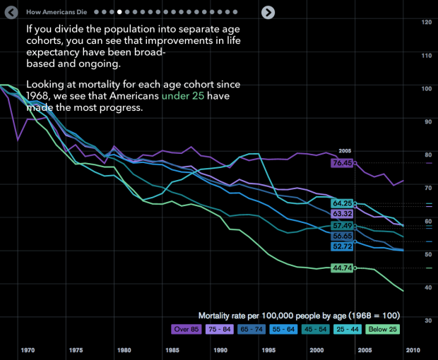
Learning regular expressions tends to involve a lot of trial and error and can be confusing for newcomers. RegExr is an online tool that lets you learn more interactively. Add a body of text in one area and type various regular expressions in another. Matches are highlighted and errors are noted on the fly, which is kind of perfect. Even if you aren’t new to regular expressions, this is worth bookmarking for later.

  • Lawmaking through the House and Senate visualized

    April 28, 2014

    Topic

    Network Visualization  /  government, lawmaking

    Researchers at the University of Washington’s Center for American Politics and Public Policy built the Legislative Explorer to show the lawmaking process in action. The visualization allows you to watch over 250,000 bills and resolutions introduced from 1973 to present.

    The left half represents the U.S. Senate, with senators sorted by party (blue=Democrat) and a proxy for ideology (top=liberal). The House is displayed on the right. Moving in from the borders, the standing committees of the Senate and House are represented, followed by the Senate and House floors. A bill approved by both chambers then moves upward to the President’s desk and into law, while an adopted resolutions (that does not require the president’s signature) moves downward.

    Each dot represents a bill, so you can see them move through the levels. Use the drop-down menus at the top to focus on a Congress, a person, party, topic, and several other categorizations. Or use the search to focus on specific bills. Finally, when you do press play, be sure to keep an eye on the counters on the bottom.

  • Detecting and Plotting Sequence Changes

    Change detection for a time series can be tricky, but guess what, there’s an R package for that. Then show the results in a custom plot.

  • Audio visualizer made with matrix of fire

    April 25, 2014

    Topic

    Data Art  /  fire, music

    The Pyro Board is a matrix of 2,500 flames that have controllable intensity, which can be used as an audio visualizer. Yeah, really. Just watch the video below.

    [via Colossal]

  • Detailed map of baseball fandom →

    April 24, 2014

    Topic

    Maps  /  baseball, facebook, Upshot

    For the past couple of sports seasons, Facebook mapped the most liked team by county. They did it for football (NFL), the NCAA basketball tournament, and baseball (MLB). Although generalized, the maps provide a view of sports fandom and people clusters across the country, and plus you know, they’re fun.

    The Upshot used the same like data, provided by Facebook, and mapped it at the ZIP code level. Then they took it a step further and looked closer at regional rivalries, such as Cubs and White Sox, Yankees and Red Sox, and Dodgers and Angels. Be sure to scroll down to Mets versus Phillies. They incorporated a tidbit of Josh Katz’s dialect map.

    The Upshot is off to an impressive start. It’s almost as if The New York Times people have been doing this for a while. [via @KevinQ]

  • PourOver allows filtering of large datasets in your browser

    April 24, 2014

    Topic

    Software  /  database, New York Times

    The New York Times released PourOver, a library that lets you do database-like things client-side, so that (1) you, the developer, can worry less about database optimization and server loads and (2) users get a more responsive, faster experience.

    PourOver is built around the ideal of simple queries that can be arbitrarily composed with each other, without having to recalculate their results. You can union, intersect, and difference queries. PourOver will remember how your queries were constructed and can smartly update them when items are added or modified. You also get useful features like collections that buffer their information periodically, views that page and cache, fast sorting, and much, much more.

    Also: How great is it that The New York Times is now getting into the habit of releasing code?

  • Where people bike and run, worldwide

    April 24, 2014

    Topic

    Maps  /  biking, running, Strava

    Remember those running maps I made with limited data from RunKeeper? Strava, which also provides an app to track your runs and bike rides, has a much more expansive version of popular paths around the world. Their dataset includes over 77 million rides and 19 million runs, summing to about 220 billion data points. Just pan and zoom to your area of interest, and there you go.

  • Data Underload  /  birth, changes, featured, life, time series

    The Change My Son Brought, Seen Through Personal Data

    I combed through personal data that I’ve actively and passively collected since early graduate school to see how life is different now with a 6-month old.

    Read More
  • The Upshot, a data-centric site from The New York Times launched

    April 22, 2014

    Topic

    News  /  New York Times, Upshot

    We heard a little bit about The Upshot last month. Now we get to see it. From editor David Leonhardt on what the site is about:

    One of our highest priorities will be unearthing data sets — and analyzing existing ones — in ways that illuminate and explain the news. Our first day of material, both political and economic, should give you a sense of what we hope to do with data. As with our written articles, we aspire to present our data in the clearest, most engaging way possible. A graphic can often accomplish that goal better than prose. Luckily, we work alongside The Times’s graphics department, some of the most talented data-visualization specialists in the country. It’s no accident that the same people who created the interactive dialect quiz, the deficit puzzle and the rent-vs-buy calculator will be working on The Upshot.

    Hey I’m on board with any site where Amanda Cox introduces statistical models.

    FiveThirtyEight is still evolving, and I suspect The UpShot to do the same, so it should be fun to see which way each goes (and what other sites come out of it). For now though, I’m just happy that we get to see this statistics-ish thing happen.

  • Music preference by region

    April 22, 2014

    Topic

    Maps  /  music

    Movoto mapped music preference for various genres, across the United States.

    We calculated musical taste scores using data from the National Endowment of the Arts, the Bureau of Labor Statistics, and the U.S. Bureau of Economic Analysis (via the Martin Prosperity Institute) and state level music preferences from Wikipedia. The scores include music genre preference survey data and genre performer concentrations by metro, weighted by that metro’s influence on the music scene. We took the scores for each metro and used a spatial statistics method called nearest neighbors to create the heatmap.

  • How people die in America

    April 21, 2014

    Topic

    Statistical Visualization  /  Bloomberg, mortality

    Matthew Klein for Bloomberg View explored mortality in America through a slidedeck of charts. The animations in between each slide grows tedious, but the topics covered, going beyond just national mortality rate, are worth browsing. (Although, can someone tell me why the female mortality rate rose between the 1970s and 2000? I know there’s a perfectly valid reason behind the trend, but I can’t remember.)

    The data itself is also worth your time, in case you’re looking for a side project. It comes from the Centers for Disease Control and Prevention and spans 1968 through 2010.

    I can tell you from experience the data query process isn’t the smoothest experience — as much as you can expect from a government site, I guess. That said, the amount of data, with a variety of demographic breakdowns and categorizations, can make for plenty of worthwhile projects. Highly recommended.

  • Where nobody lives

    April 18, 2014

    Topic

    Maps  /  census, population

    We’ve seen the map of where everyone lives. Now here’s the reverse of that by Nik Freeman: where nobody lives in the United States.

    A Block is the smallest area unit used by the U.S. Census Bureau for tabulating statistics. As of the 2010 census, the United States consists of 11,078,300 Census Blocks. Of them, 4,871,270 blocks totaling 4.61 million square kilometers were reported to have no population living inside them. Despite having a population of more than 310 million people, 47 percent of the USA remains unoccupied.

    See also Stephen Von Worley’s map from a couple years ago, which shows blocks in the US with only one person per square mile.

  • A principal component analysis step-by-step

    April 17, 2014

    Topic

    Statistics  /  principal component analysis

    Sebastian Raschka offers a step-by-step tutorial for a principal component analysis in Python.

    The main purposes of a principal component analysis are the analysis of data to identify patterns and finding patterns to reduce the dimensions of the dataset with minimal loss of information.

    Here, our desired outcome of the principal component analysis is to project a feature space (our dataset consisting of n x d-dimensional samples) onto a smaller subspace that represents our data “well”. A possible application would be a pattern classification task, where we want to reduce the computational costs and the error of parameter estimation by reducing the number of dimensions of our feature space by extracting a subspace that describes our data “best”.

    That is, imagine you have a dataset with a lot of variables, some of them important and some of them not so much. A PCA helps you identify which is which, so the source doesn’t seem so unwieldy or to reduce overhead.

  • Analysis of Bob Ross paintings

    April 17, 2014

    Topic

    Statistics  /  Bob Ross, FiveThirtyEight, Walt Hickey

    As a lesson on conditional probability for himself, Walt Hickey watched 403 episodes of “The Joy of Painting” with Bob Ross, tagged them with keywords on what Ross painted, and examined Ross’s tendencies.

    I analyzed the data to find out exactly what Ross, who died in 1995, painted for more than a decade on TV. The top-line results are to be expected — wouldn’t you know, he did paint a bunch of mountains, trees and lakes! — but then I put some numbers to Ross’s classic figures of speech. He didn’t paint oaks or spruces, he painted “happy trees.” He favored “almighty mountains” to peaks. Once he’d painted one tree, he didn’t paint another — he painted a “friend.”

    Other findings include cumulus and cirrus cloud breakdowns, hill frequency, and Steve Ross (son of Bob Ross) patterns.

  • Weird stacked area map thing

    April 16, 2014

    Topic

    Ugly Charts

    This chart-map-looking thing from Nightly News is making the rounds, and it’s not good. I’m opening the comments below for critique so that you can release your angst. Signed copy of Data Points goes to a randomly selected commenter the end of this week. Have at it.

    Changing face

  • Mapping a century of earthquakes →

    April 15, 2014

    Topic

    Projects  /  earthquake, R

    Earthquakes are in the news a lot lately. A quick search shows a 7.6 off the coast of the Solomon Islands, a 6.6 in Nicaragua, and a 7.1 off the southwest coast of Papua New Guinea, and this was just last week. Not good news at all, but just how common are these earthquakes? Can we look back farther? Yes. In addition to a real-time feed of earthquakes, the United States Geological Survey maintains an ever growing archive of earthquakes detected around the world, and they make it easy to query and download.
    Read More

  • Five decades of warm and cold weather anomalies

    April 14, 2014

    Topic

    Statistical Visualization  /  Enigma, weather

    This year’s polar vortex churned up some global warming skeptics, but as we know, it’s more useful to look at trends over significant spans of time than isolated events. And, when you do look at a trend, it’s useful to have a proper baseline to compare against.

    To this end, Enigma.io compared warm weather anomalies against cold weather anomalies, from 1964 to 2013. That is, they counted the number of days per year that were warmer than expected and the days it was colder than expected.

    An animated map leads the post, but the meat is in the time series. There’s a clear trend towards more warm.

    Since 1964, the proportion of warm and strong warm anomalies has risen from about 42% of the total to almost 67% of the total – an average increase of 0.5% per year. This trend, fitted with a generalized linear model, accounts for 40% of the year-to-year variation in warm versus cold anomalies, and is highly significant with a p-value approaching 0.0. Though we remain cautious about making predictions based on this model, it suggests that this yearly proportion of warm anomalies will regularly fall above 70% in the 2030’s.

    Explore in full or download the data and analyze yourself. Nice work. [Thanks, Dan]

  • Porn views for red versus blue states

    April 14, 2014

    Topic

    Mistaken Data  /  porn

    Top ten viewing states
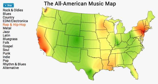
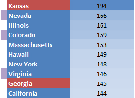
Pornhub continues their analysis of porn viewing demographics in their latest comparison of pageviews per capita between red and blue states (SFW for most, I think). The main question: Who watches more?

    Assuming the porn consumption per capita is normally distributed for each state and that different states have independent distribution of porn consumption per capita, we can say with 99% confidence the hypothesis that the per capita porn consumption of democratic states is higher than the republican states.

    Okay, the result statement sounds a little weird, but when you look at the rates, the conclusion seems clear. The states with the highest viewing per capita is shown above, and for some reason Kansas is significantly higher than everyone else. Way to go.

    For a clearer view, Christopher Ingraham charted the same data but incorporated the percent of Obama voters for each state. Interpret as you wish:

    Obama voting and porn

    Again, note Kansas high on the vertical axis.

    Update: Be sure to read this critique for a better picture of what you see here.

  • Job Board, April 2014

    April 14, 2014

    Topic

    Job Board

    Looking for a job in data science, visualization, or statistics? There are openings on the board.

    Digital Designer, Editorial Content for Bauer Media in Central London.

    Research and Data Visualization Associate for National Journal in Washington, DC.

    Visual Journalist for Money.com in New York.

  • Page 223 of 393
  • <
  • 1
  • ...
  • 220
  • 221
  • 222
  • 223
  • 224
  • 225
  • ...
  • 393
  • >

Analyze, visualize, and communicate data usefully, beyond the defaults.

Become a member →

Recently for Members

May 22, 2025
Conflicting points of view over the same data

May 15, 2025
Step Chart, Enhanced

May 8, 2025
When the data is not what it seems

May 1, 2025
Finding the Right Charts

April 24, 2025
Visualization Tools, Datasets, and Resources – April 2025 Roundup

Second Edition

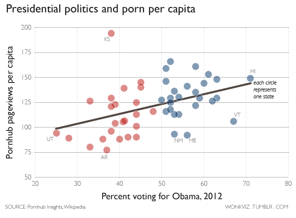
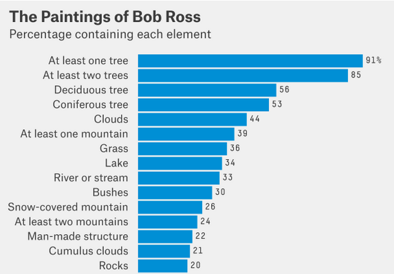
Visualize This: The FlowingData Guide to Design, Visualization, and Statistics (2nd Edition)

Order: Amazon / Bookshop

Browse by Chart Type See All →

Table Glyph Chart Barcode Chart Dot Map Pie Chart Surface Plot Histogram Bump Chart Streamgraph Line Chart

Browse By Topic

  • Visualization

    Seeing data

  • Maps

    Seeing geographic data

  • Infographics

    Explaining data

  • Networks

    Connecting data

  • Statistics

    Analyzing data

  • Software

    Working with data

  • Sources

    Getting data

  • Design

    Making data readable

Made by FlowingData

  • The Process

  • Data Underload

  • Chart Everything

  • Guides

  • Books

  • Shop

  • About
  • Contact
  • Newsletter
  • LinkedIn
  • Instagram
  • Bluesky
  • RSS
Copyright © 2007-Present FlowingData. All rights reserved.