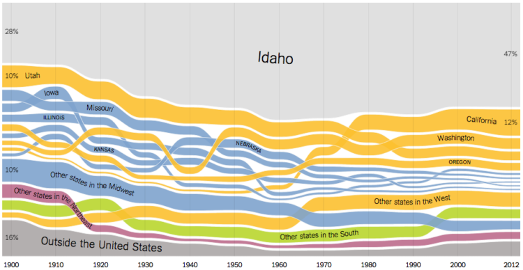
• In something of an homage to the Genealogy of Pop & Rock Music by Reebee Garofalo, designer Larry Gormley visualized 100 years of film.

    This graphic chronicles the history of feature films from the origins in the 1910s until the present day. More than 2000 of the most important feature-length films are mapped into 20 genres spanning 100 years. Films selected to be included have: won important awards such as the best picture Academy Award; achieved critical acclaim according to recognized film critics; are considered to be key genre films by experts; and/or attained box office success.

    Available in print for 34 bones.

  • For the Made by Humans exhibit at the Hyundai Vision Hall in South Korea, Universal Everything turns basic movements into a visual spectacle. Pretty. From the Creators Project:

    As the founder and creative director of Universal Everything, Matt Pyke leads a creative mission to create gorgeous visual spectacles on screen that, while they will never be attained in physical reality, reinterpret the nuances of natural human motion.

    His effectiveness with capturing movements and transforming them into sweeping animated forms allows him to show us shapes we have never seen before while preserving the individual human element in all his creations.

    [via Fast Company]

  • Political analyst and statistician Nate Silver has gotten some flack lately for consistently projecting a 70-plus percent chance of a Barack Obama win this election. But as Jeff Leek explains, the criticism doesn’t spawn from Silver being wrong. Rather, it comes from the critics’ misunderstanding of statistics. Leek provides a quick lesson on how Silver makes his predications and how the methods apply to other things, like the weather.

    Now, this might seem like a goofy way to come up with a “percent chance” with simulated elections and all. But it turns out it is actually a pretty important thing to know and relevant to those of us on the East Coast right now. It turns out weather forecasts (and projected hurricane paths) are based on the same sort of thing — simulated versions of the weather are run and the “percent chance of rain” is the fraction of times it rains in a particular place.

    So Romney may still win and Obama may lose — and Silver may still get a lot of it right. But regardless, the approach taken by Silver is not based on politics, it is based on statistics.

    Don’t fear the black box.

  • The New York Times provides a detailed look at the Sandy aftermath, across states and locally. With millions of people losing power in a short amount of time, the outages map and chart is the most dramatic.

    More than six million customers lost power Monday as Hurricane Sandy felled trees, downed power lines and flooded substations. The storm led to power failures in at least 17 states, including more than a million customers in Pennsylvania and New Jersey and about 660,000 in New York City.

  • Electionary, the new iPad app from TargetPoint Consulting, lets you browse national election data, from 1976 through 2008.

    Electionary is an election resource center that grants users access to over 30 years of county, state, and national election data. Electionary transforms election results into an easy to understand, interactive, and visual format. Users are able to see detailed election results and voter turnout percentages from across the country. Users can compare election results side-by-side and see how one county or state has changed over time or see how two counties or states are different.

    There were a few spots interaction-wise when it didn’t do what I was expecting, such as pinch or double tap to zoom, or when I switched years, the map would re-center on the selected state or county instead of staying where I had panned. But if you’re interested in historical elections data, Electionary ain’t bad, and I can only imagine there’ll be un update after elections night.

  • The New York Times has an updated version of their hurricane tracker up with map, satellite, and radar views. Stay safe, east coasters.

    See also the live wind map by Martin Wattenberg and Fernanda Viegas, which has proven useful a couple of times this year.

  • Some days you take a whiff it’s easy: “Yep. Definitely had asparagus last night.” Other times though, it’s not so clear. This urine wheel by Ullrich Pinder from 1506, provides possible diagnoses based on color, smell, and taste. [via kottke]

  • By designer Stephen Wildish, a taxonomy of arse. No comment necessary.

  • In the Atlas of Design, published by the North American Cartographic Information Society, Timothy Wallace and Daniel Huffman argue for beautiful maps that are a joy to examine.

    Design and aesthetics matter, because form is not secondary to function; form is integral to function. A map cannot function if it remains unread. To truly engage map users requires that we present them with something worth looking at. Something that they will want to spend time studying. Something that acknowledges the human need for beauty. Something that causes the user to think about the map in terms beyond whether or not it simply “works.”

    Yep.

  • Driven by his love for Lord of the Rings, Emil Johansson explores the many facets of the world in charts and graphs. For example, the above chart is the declining lifespan of man.

    It is explicitly stated by Tolkien that the longevity of Men once granted to the Númenóreans decreased over the years. In Letter 156 Tolkien writes that “a good Númenórean died of free will when he felt it be the time to do so”. With the Shadow and the Downfall of Númenor this grace was taken away from them and they died involuntarily with a decreasing lifespan.

    The decreasing life span is seen clearly in the graph. The most dramatic change is shortly before the Downfall of Númenor. The rulers are shown in order. Their number should not be confused with how many generations from Elros Aragorn is since there were more than one line of rulers.

    There’s also a geographic map of where characters traveled, a family tree, a timeline, and even an Android app. I think Johansson might be a superfan. A hunch.

  • USA Today launched a redesigned logo last month. It’s a circle that reflects the day’s news in each section. Stephen Colbert reports.

    [via @albertocairo]

  • The Los Angeles Times released nearly 5,000 records of allegations from the Boy Scouts of America as a browseable map and searchable list. You can also download the data.

    This data­base con­tains in­form­a­tion on about 5,000 men and a hand­ful of wo­men who were ex­pelled from the Boy Scouts of Amer­ica between 1947 and Janu­ary 2005 on sus­pi­cion of sexu­al ab­use. The dots on the map in­dic­ate the loc­a­tion of troops con­nec­ted in some way to the ac­cused. The timeline be­low shows the volume of cases opened by year; however, an un­known num­ber of files were purged by the Scouts pri­or to the early 1990s

    The interactive map helps you narrow down by city, but it’s kind of hard to see cases on a country-wide perspective. Here’s a quick look.

    The worst part is that a lot of the cases went unreported.

  • The ports and packages to make your charts look like they came from the web comic xkcd are coming out in rapid fashion. Dan Foreman-Mackey stylized charts in JavaScript using D3, Mark Bulling did the same in R (dead/spam link), Emilio Torres Manzanera made an xkcd package, and Jake Vanderplas described how he did in Python. Still waiting for a Gangnam theme.

  • In a multipart special report, The Washington Post investigated homicides in the nation’s capital between 2000 and 2011.

    A Washington Post review of nearly 2,300 slayings in the city between 2000 and 2011 found that less than a third have led to a conviction for murder or manslaughter, although the numbers have improved in the past few years. More than 1,000 cases remain unsolved.

    In a 15-month study, The Post individually tracked every homicide in the District between 2000 and 2011 to learn what ultimately happened to each ensuing case. Such studies, known as longitudinal, are not generally produced by law enforcement, because they are considered to be too time-consuming.

    The interactive portion of the report lets you see the data from a number of angles. The focus is on the map, which shows an overview of homicide count and then individual cases as you zoom in to neighborhoods. Navigation on the left lets you filter by case status, race, age, motive, and manner, and the display on the bottom left changes as you change queriers or select different parts of the map. You can also play a time lapse, and the map updates for each year.

    There’s a lot to look at from different angles, and especially if you live in the area, the feature is worth a closer exploration.

    As a side note: The Post graphics team seems to have upped their game as of late. I’m not sure what they put in the water over there, but I hope they keep drinking it. [via Source]

  • Pilot Mark Vanhoenacker describes the history and careful design of the everyday baggage tag, from the synthetic material it’s printed on, to the information each modern tag contains.

    Just as you can track, step-by-step, a package you’ve sent by FedEx, airlines use bar-coded tags to sort and track bags automatically, through the airport, and across the world. That’s a huge change from the old days, when bags were dropped into the “black box” of a manually sorted baggage system. But crucially, an ABT doesn’t just contain a bar code—it’s also custom-printed with your name, flight details, and destination. That made the global implementation of ABTs much easier, because early-adopters could introduce them long before every airport was ready—a huge advantage when it comes to seamlessly connecting the world’s least and most advanced airports. And of course, ABTs can still be read manually when systems break down.

    It’s funny how something so commonplace like a sticky loop label goes through these iterations. There are people behind these things who think about the ins and outs of how something works, no matter how small they might seem, so that we don’t have to. We just tear them off, toss ’em in the trash, and move on to the next one, because that’s what they were made for.

  • ReConstitution 2012, a fun experiment by Sosolimited, processes transcripts from the presidential debates, and recreates them with animated words and charts.

    Part data visualization, part experimental typography, ReConstitution 2012 is a live web app linked to the US Presidential Debates. During and after the three debates, language used by the candidates generates a live graphical map of the events. Algorithms track the psychological states of Romney and Obama and compare them to past candidates. The app allows the user to get beyond the punditry and discover the hidden meaning in the words chosen by the candidates.

    As you let the transcript run, numbers followed by their units (like “18 months”) flash on the screen, and trigger words for emotions like positivity, negativity, and rage are highlighted yellow, blue, and red, respectively. You can also see the classifications in graph form.

    There are a handful of less straightforward text classifications for truthy and suicidal, which are based on linguistic studies, which in turn are based on word frequencies. These estimates are more fuzzy. So, as the creators suggest, it’s best not to interpret the project as an analytical tool, and more of a fun way to look back at the debate, which it is. It’s pretty fun to watch.

    Here’s a short video from Sosolimited for more on how the application works:

  • Mike Bostock and Shan Carter visualized how states have shifted parties over the years, going back to 1952.

    Recent elections have placed a heavy emphasis on “swing states” — Ohio, Florida, and a handful of other states most-easily swayed from one party to the other. Yet in the past, many more states shifted between the Democratic and Republican parties. A look at how the states stack up in the current FiveThirtyEight forecast and how they have shifted over past elections.

    Each row represents an election, and the horizontal axis reflects the size of a lead for a party. So as you scroll down, you can see how much (or little) a state has changed across elections.

    Instead of taking the obvious exploratory route, where you select your state and scroll to the bottom, Bostock and Carter took a story-driven approach. Points of interest are on the left. Click on a button and the relevant states for that insight are highlighted. (Although you can still mouse over states to see their paths and keep states highlighted by with a continuous scroll.) This is a good one worth exploring for a while.

    See also Adrien Friggeri’s interactive from earlier this year that shows Senate agreement.

  • Sustainable Design Lab at MIT and MoDe Studio estimated the potential hotspots for electric photovoltaics in Cambridge, Massachusetts and mapped it.

    “High PV Potential Area” is the footprint, in square feet, of the portions of a roof that, by considering both the real surface projection to its actual slope and this surface’s annual irradiation, yield a “good” to “excellent” result. These values are based on MIT’s calculations and are shown as orange and yellow dots on the viewer, respectively.

    If all the door-to-door salesmen trying to sell me solar panels showed me something like this for where I live, I’d be a lot more receptive.

  • Number of likes and shares for a Facebook post are just simple aggregates that give you an idea of how popular that post was, but they don’t tell you anything about how that post got so popular. For Facebook Stories, Stamen Design explored how a single post can spread through the network, via three viral photos shared by George Takei.

    Each visualization is made up of a series of branches, starting from George. As each branch grows, re-shares split off onto their own arcs. Sometimes, these re-shares spawn a new generation of re-shares, and sometimes they explode in short-lived bursts of activity. The two different colors show gender, and each successive generation becomes lighter as time goes by. And the curves are just for snazz.

    So you see a beautiful burst in the beginning, as the photo is shared by people who follow Takei, and then the photo spreads within smaller groups of friends. The above is from the animation that shows how a graphic for famous failures spread.

  • From the October 10 Boston Metro. Oops. [via]