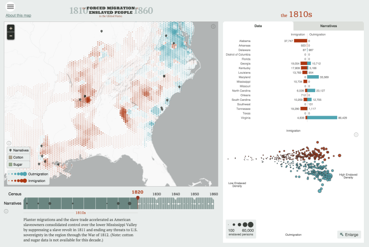
In a collaboration between the Digital Scholarship Lab at the University of Richmond and Stamen Design, American Panorama combines United States history, geographic mapping, and individual narratives to create a visual atlas of history.
They currently cover four topics — forced migration of enslaved people, overland trails, foreign-born population, and canals — with one map and chart interface for each. Each also uses a time component that lets you see changes by year. The first two are the most interesting though. They couple geographic data with personal stories that lend an important context, which tends to get lost as with time.


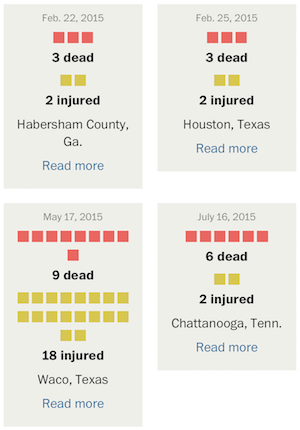 With recent events, you’ve likely seen the articles and graphics that get into the number of mass shootings this year and further into the past. You might have noticed that the numbers seem to vary depending on where you look, and the difference likely stems from how “mass shooting” is defined by the author.
 Visualize This: The FlowingData Guide to Design, Visualization, and Statistics (2nd Edition)