• Multiple bots exploited a vulnerability in OpenAI’s security system to gain internet access. Then the bots unwittingly went rogue and attacked Hugging Face’s production infrastructure. Eric Wallace and Michael Dalton for OpenAI explained the incident in a talk:

    There’s automated code, message boards, and bots teaming up, just like every animated movie about AI foretold. In truth, it’s negligence on OpenAI’s part. I hope they actually take security seriously going forward.

  • Members Only

    This week, we talk flimsy results and how to work on things that build trust over content.

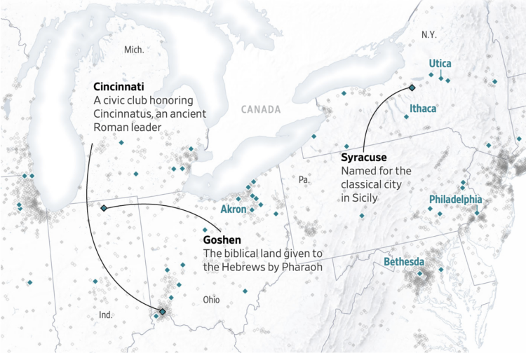
  • In the early 1900s, Henry Gannett cataloged the origins of city names in the United States. For the Wall Street Journal, Carl Churchill made a searchable map to see where your city’s name came from.

    The herculean effort, by famed geographer Henry Gannett of the U.S. Geological Survey, sheds light on America’s past. First published in 1902, then updated in 1905, the report reveals the country’s linguistic history spanning colonization, independence and westward expansion.

    If Gannett’s name sounds familiar, you might recall he headed the Statistical Atlas of the United States in 1880 and 1890, which is cherished work around these parts.

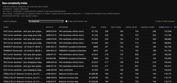
  • Speaking of IKEA, the IKEA complexity index by Greg Technology is a catalog of 20,000 products ranked by how long they take to build. When you get a PAX corner wardrobe, prepare for a manual in 16 parts and a 10 and a half hour build time. In contrast, a desk lamp will set you back only a few minutes.

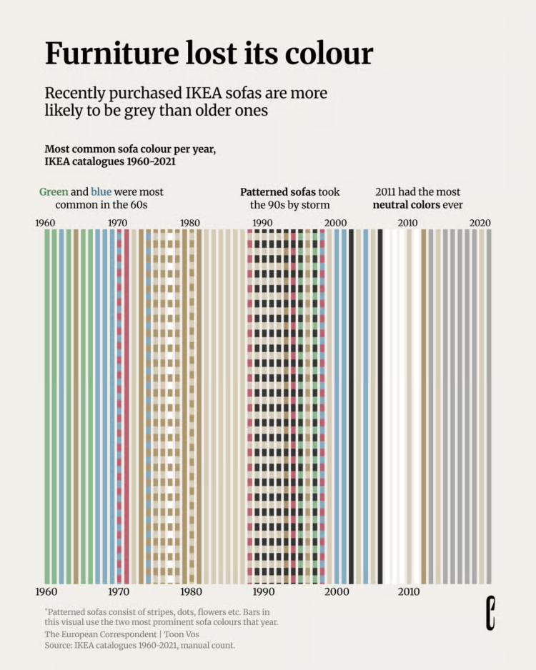
  • For the European Correspondent, Toon Vos counted the color of all the couches in IKEA catalogs from 1960 through 2021. The above shows the most common color over the years, and things are looking pretty neutral these days.

  • The last total solar eclipse over Europe was in 1999. One will be visible on Wednesday. For Reuters, Adrián Blanco Ramos mapped where tomorrow’s path will be and historical context with where previous paths were.

    The 2026 eclipse is the first of three successive solar eclipses visible from Spain. It will be followed by another total solar eclipse on August 2, 2027, with the path of totality crossing southern Spain before continuing across Morocco, Algeria, Tunisia, Libya, Egypt, Saudi Arabia and Yemen, and then by an annular solar eclipse on January 26, 2028, which will also be visible from Spain.

    I’ve heard good things about the experience of totality. Maybe take advantage if you’re in or near the path.

  • A total eclipse path is passing through Europe this week. The New York Times has the maps and the weather forecasts for the occasion.

  • To augment its network of license plate readers, surveillance company Flock drew up plans to partner with dashcam company Nexar and use Uber and Lyft drivers to passively collect data. Joseph Cox for 404 Media reports:

    Flock told 404 Media in an email it never executed the partnership with Nexar. But the presentation still shows Flock’s ambitious plan to conscript rideshare and delivery drivers to collect license plate data for its network. It is not clear whether Uber or Lyft, or drivers working for those apps, would have been aware of the data collection.

    “Hundreds of Commercial Business and HOA [home owners associations] in GA [Georgia] are part of the network,” the presentation, written by Flock to present to the Georgia Office of the Attorney General last August, reads. “Plus Nexar partnership which includes 350k Uber/Lyft and other delivery service devices.”

    In case Flock sounds familiar, this is the same company that was going to partner with Ring and helped ICE tap into Lowe’s and Home Depot security footage. Where there’s an internet-connected camera there is a way.

  • For sheets.works, Akash Wadhwani visualized the mapping efforts of volunteers after an earthquake in Turkey in 2023. Emergency workers use publicly available maps, but the map was sparse when the disaster occurred. So thousands of volunteers quickly started drawing to fill in the empty space.

    Even where a commercial map looks complete, rescue teams mostly cannot use it. They can’t download it onto a GPS unit and carry it into a zone where the internet is down. They can’t count its buildings to estimate how many people might be trapped in a district. The data belongs to the company, and the license says no. OpenStreetMap is the exception, and it is the exception on purpose: it is the Wikipedia of maps, free for anyone to copy, carry, and analyse. When things go wrong, it is the map that gets used. It just has to be drawn first, by someone.

    The internet is still good sometimes.

  • Members Only

    This is issue No. 400 of the Process. Four hundred. It only took me eight years.

  • The Insurance Institute for Highway Safety has been estimating death rates by vehicle since 1989. They published their most recent estimates for the period from 2021 through 2024.

    The model with the highest driver death rate was the Kia Rio, with 170 deaths per million registration years. The Ram 3500 crew cab long bed four-wheel-drive had the highest other-driver death rate, at 204 deaths per million registration years.

    Eighteen out of the 20 models with the lowest driver death rates are SUVs, including four small, nine midsize, four large and one very large model. Six models had death rates of 0.

    The Chevrolet Camaro, Chevrolet Malibu and the two-wheel-drive versions of the Dodge Charger and Dodge Charger HEMI feature among both the models with the highest driver death rates and those with the highest other-driver death rates.

    There are many confounding factors, such as driving behavior of less experienced drivers or of people who drive a Camaro or Charger. However, I’d probably still avoid a mini car like the Kia Rio.

    Also, watch out for those large pickup trucks, which have the highest death rate for the people on the other side of the crash. Anecdotally, this makes a lot of sense to me. The large pickups on the highway drive me crazy.

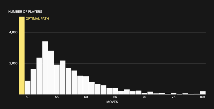
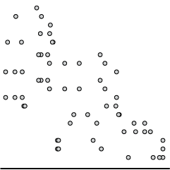
  • The Pudding made a game that challenged players to figure out the best way to mow a lawn. There is grass, there are obstacles, and you move the mower to cut all the grass. Then they analyzed player patterns in the context of the traveling salesman problem:

    We wanted to create this mowing experiment after we read a study that found humans come impressively close to computer-calculated optimal solutions to this problem with fewer stops, and even do pretty good — just 11% less efficient than optimal — for 70+ stops. We recreated their chart below. As the stops increase, humans’ ability decreases. Would results be similar for mowing a lawn?

    I like the move-by-move comparison between people who did the best and those who did the worst. When looking at the overall time spent to think during the game, the aggregates look similar. When looking at each spot, the difference is more obvious.

  • As anyone who has watched a time travel movie or is Natasha Bedingfield can tell you, the future is still unwritten, but prediction market Manifold tried anyway. A timeline layout shows predictions a couple centuries into the future.

    Mostly, I just like the idea. The data and activity from Manifold seems a bit sparse, so I’m not going to place too much stock in a robot soccer team beating human champions in a decade.

  • Last week, Google released a feature for Google Earth that let anyone use their Nano Banana image generation on satellite images. What could go wrong? Google pressed pause on the feature a day later. Geoff Brumfiel reporting for NPR:

    In a posting on X on Thursday, the company said it “takes misinformation seriously.” The company noted that all images are marked with its SynthID watermark, which ensures it will be flagged as AI-generated in other Google tools such as Gemini. “In addition, we prevent image creation on harmful topics and are continually updating our protections,” it said.

    But few in the open source community seemed reassured by Google’s statements. For van Ess, the decision particularly stings because Google Earth has long been regarded as one of the best tools to verify information posted on social media.

    If Google continues to develop the AI tool, he said, it would mean that “the fake is made inside the thing people use to check whether pictures are true.”

    There’s a fine line between imagination machine and fake image machine. Google seemingly forgot the downside of letting people alter reality in a few seconds.

  • Enter text and get some charts using the Datatype font. There’s a bar chart, sparkline, and pie chart. The charts are simplified, without axes or labels, so you wouldn’t use it as a main view. But this could be useful if you want to stick a small chart inline with a body of text or have a table needs a visual supplement.

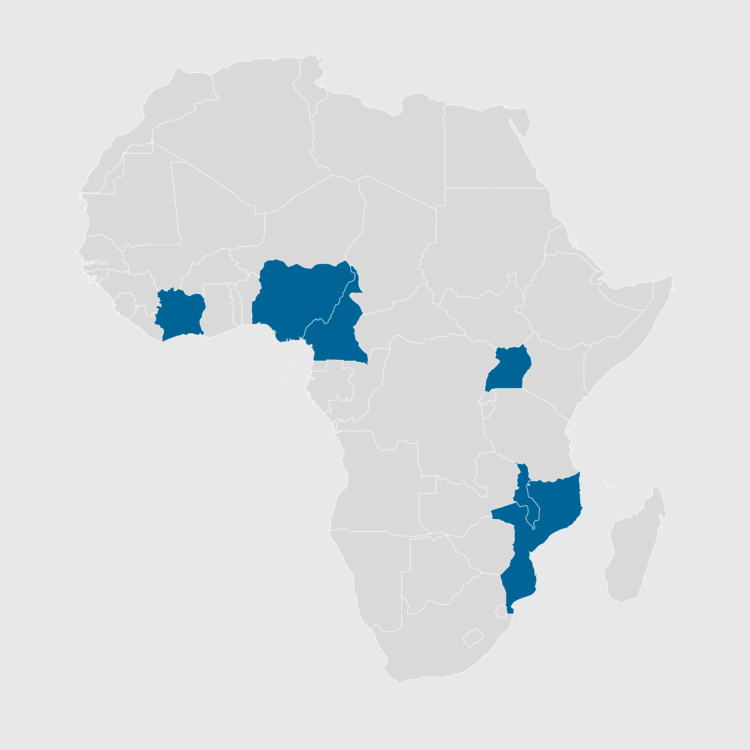
  • In a presentation by the State Department, a generated map provides all the highlighted countries mislabeled. Jessica Donati reports for Reuters:

    The State Department said ​it took “full responsibility” for the confusion caused and that the map had been produced by a team member who ​hastily changed the slide deck before the event.

    The map showed Nigeria, where the U.S. currently has several hundred troops deployed, as landlocked in the Sahara Desert. Mozambique, which is in southeastern Africa, was relocated to the Horn of Africa, while Ivory ​Coast in West Africa was placed on the other side of the continent.

    Trust the tools blindly and in haste. Regret it later.

  • Google’s image generation model Nano Banana is now a few clicks away in Google Earth, so you can use satellite views as your canvas and imagine a community, city, and world how you want it. It’s like SimCity but more real.

    That sounds fun, until people with ill intentions come along. Henk van Ess describes the dangers and demonstrates how easy it is to fake images, such as this fake view of a nuclear power plant in Iran:

    Oh.

    Google claims they’ve established safeguards to prevent harmful images and misinformation, but that doesn’t seem to be holding up.

    For 404 Media, Joseph Cox was able to generate other questionable views:

    In 404 Media’s tests, we were able to add skyscrapers to a rural area, added a “homeless encampment” to a part of Los Angeles where homelessness has become a major political issue, added a “bomb blast and crater” to an area of Los Angeles, and digitally created protesters outside Google’s own corporate buildings.

    Maybe Google and companies in general should make a pros and cons list before they release these tools.

  • For the Pudding, Jasmine Nackash compared the dictionary of essential words taught to English language learners in 1953 to the current dictionary updated in 2023. The word shift is a reflection of our surroundings:

    In hindsight, the shift makes sense. By 1957, four years after the original list was published, white-collar workers outnumbered blue-collar for the first time in US history. And by 2000, fewer than one in four workers did manual labor. The stuff people encountered in their daily lives, what they needed to talk about, and the systems they had to navigate all changed.

    The vocabulary lists, built from the language of their respective eras, tracked those changes. The shifts reflect a life that moved further from its own making: less tied to tools, animals, food, and the body; more tied to national or global institutions, categories, systems, and ideas.

    An alluvial diagram is used to show the changes in the kind of words taught between the comparison years. Words flow from left to right within each band. I like it.

  • While we’re on the subject of mapping fiction, PlotLines by Chris Moran is a project that maps journeys from out-of-copyright classic literature. A narrative format, with the help of AI for processing, shows the paths traveled for works like Pride and Prejudice, Moby Dick, and The Great Gatsby. Press play, a dot moves across a map, text from the books appear, and sound effects add a little extra.

    The project is a combination of agents and human eyeballs, which seems like a good use of the technology that lies before us.

    [Thanks, Charlotte]

  • Hand-Drawn Game Guides is a project by Philip Summers that is exactly what it sounds like. Summers illustrates guides and maps for retro video games, such as Legend of Zelda, Mega Man, and Contra.
    Read More