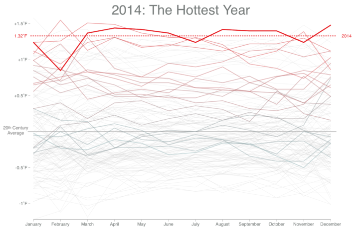
• Membership
  • Newsletter
  • Projects
  • Learning
  • About
  • Member Login
  • Data Underload  /  BLS, featured, industry, jobs, salary

    Where People Work and How Much They Make

    Salaries for occupations with the same job title can vary across industries. This interactive shows you by how much and who works where.

    Read More
  • Accessible Web visuals and code with p5.js →

    August 7, 2014

    Topic

    Coding  /  p5, Processing

    Visualization on the Web can be tricky for those unfamiliar with code. The new JavaScript library p5.js, developed by Lauren McCarthy and collaborators, aims to make your first steps easier and less painful.

    Using the original metaphor of a software sketchbook, p5.js has a full set of drawing functionality. However, you’re not limited to your drawing canvas, you can think of your whole browser page as your sketch! For this, p5.js has addon libraries that make it easy to interact with other HTML5 objects, including text, input, video, webcam, and sound.

    The library follows some of the same philosophy as Processing — that is, straightforward to get up and running — and reimagines the implementation and approach for recent web technology. Even if you’re not into programming, it’s worth visiting if just to watch, listen, and interact with Dan Shiffman as he enthusiastically talks about the library.

  • Wi-Fi strength revealed in physical space →

    August 6, 2014

    Topic

    Data Art  /  WiFi

    Digital Ethereal is a project that explores wireless, making what’s typically invisible visible and tangible. In the piece above, a handheld sensor is used to detect the strength of Wi-Fi signal from a personal hotspot. A person waves the sensor around the area, and long-exposure photography captures the patterns.

    Reminds me of the Immaterials project from a while back, which used a light stick to represent signal strength rather than a signal light.

  • Visual Microphone estimates sound from vibrations in objects

    August 5, 2014

    Topic

    Statistics  /  sound, visual microphone

    A group of researchers from MIT, Microsoft Research, and Adobe Research are experimenting with seemingly inanimate objects as a proxy for sound in the vicinity. They call it the Visual Microphone.

    When sound hits an object, it causes small vibrations of the object’s surface. We show how, using only high-speed video of the object, we can extract those minute vibrations and partially recover the sound that produced them, allowing us to turn everyday objects—a glass of water, a potted plant, a box of tissues, or a bag of chips—into visual microphones.

    See the demo in the video above. It’s impressive. It’s also great that there’s another use for high speed video other than watching water balloons pop and guns fire on the Discovery Channel.

    Find more details on the project here.

  • Google Doodle Venn diagram →

    August 4, 2014

    Topic

    Visualization  /  Doodle, Google, venn diagram

    In celebration of John Venn’s 180th birthday, today’s Google Doodle produces a Venn diagram with the two O’s in Google’s name. Click the play button for a little bit of entertainment.

    For more Venn fun, see also Muppet name etymology, the Venn pie-agram, and what makes a platypus playing a keytar.

  • Cultural history via where notable people died

    August 4, 2014

    Topic

    Maps  /  death, Freebase, influence

    A group of researchers used where “notable individuals” were born and place of death, based on data from Freebase, as a lens into culture history. The video explainer below shows some results:

    From Nature:

    The team used those data to create a movie that starts in 600 bc and ends in 2012. Each person’s birth place appears on a map of the world as a blue dot and their death as a red dot. The result is a way to visualize cultural history — as a city becomes more important, more notable people die there.

    Before you jump to too many conclusions, keep in mind where the data comes from. Freebase is kind of like Wikipedia for data, so you get cultural bias towards the United States and Europe. There are fewer data points just about everywhere else.

    Therefore, avoid the inclination to think that such and such city or country looks unimportant, focus on the data that’s there and compare to what else is in the vicinity. From this angle, this is interesting stuff. [Science via Nature | Thanks, Mauro]

  • Mathematically correct bagel

    August 1, 2014

    Topic

    Miscellaneous  /  bagel

    I don’t know about you, but I like my bagel as two roughly cut, congruent linked halves. I usually use a fork, aluminum foil, and some duct tape. No more. George Hart demonstrates a better way to do it. It’s a good thing too, because I was running low on duct tape.

  • This is Statistics

    July 31, 2014

    Topic

    Statistics  /  ASA, marketing

    Statistics has an image problem. To the general public, it’s old, out of touch, and boring. It’s a problem because we place stock in a younger generation who we (1) want to be more data literate and (2) eventually lead the way, or at least participate, in all data-related realms. It’s beneficial for everyone.

    This is Statistics is a new push by the American Statistical Association to provide a new perspective that doesn’t dwell on sheets of equations.
    Read More

  • Network visualization game to understand how a disease spreads →

    July 31, 2014

    Topic

    Network Visualization  /  contagion, game

    Vax, a game by Ellsworth Campbell and Isaac Bromley, explores how a disease spreads through a network, starting with just one infected person. It’s a simple concept that works well.

    When you start the game, you have a network of uninfected people. The more connected a person is, the more chances that person can infect others upon his or her own infection. Your goal is to strategically administer a limited supply of vaccinations and to quarantine people to prevent as many infections as you can.

    Fun and educational. Woo.

  • Maps  /  human, location, movement, privacy

    Explorations of People Movements

    A new data source gave rise to a different set of visualization projects. We see people.

    Read More
  • Civilian casualties in Gaza →

    July 29, 2014

    Topic

    Infographics  /  deaths, Gaza, icons, Washington Post

    Lazaro Gamio and Richard Johnson for the Washington Post cover civilian deaths in the recent Gaza conflict, namely child civilians. Red icons represent children.

    Similar to a previous piece on the death penalty in the United States, the icons provide more focus on individuals while maintaining a zoomed out view of the situation. However, this piece brings an interactive component that shows deaths over time and more information in tooltips on the mouseover.

  • How well we don’t understand probability

    July 29, 2014

    Topic

    Statistics  /  probability, uncertainty

    All Things Considered on NPR ran a fine series on how we interpret probability and uncertainty. It came in five bits (plus one follow-up), each five to ten minutes long. They explore explanations of risk in different areas such as national security, health, and the daily weather and how people interpret the numbers and words.

    A recurring theme was experts who use alternative descriptions for the seemingly concrete numbers.

    Doctors, including Leigh Simmons, typically prefer words. Simmons is an internist and part of a group practice that provides primary care at Mass General. “As doctors we tend to often use words like, ‘very small risk,’ ‘very unlikely,’ ‘very rare,’ ‘very likely,’ ‘high risk,’ ” she says.

    Not that words always makes understanding numeric probability easier. From the social scientist for the National Weather Service:

    And it’s not just a numbers game — words used to describe weather can be just as confusing. Take “watch” and “warning,” for example.

    “‘Watch’ means that conditions are ripe for something to happen. ‘Warning’ means that it is happening — it is imminent,” Brown says. “It’s easy to get them confused.”

    Both the doctor and the social scientist agree that a combination of numbers, words, and a visual explanation could be the best route.

    Some people think we should forgo trying to explain uncertainty to a general public that doesn’t understand, but the rejectors themselves don’t recognize the importance. Just because you don’t understand something doesn’t mean you should ignore it.

    Listen to the full series. [via Dart-Throwing Chimp]

  • Too many numbers

    July 28, 2014

    Topic

    Miscellaneous  /  short film

    Numbers is a short film by Robert Hloz where some people see numbers appear above others’ heads. What the numbers are varies by the person with the ability, and it turns out knowing can be a blessing and a curse. Worth your nine and a half minutes of undivided attention:

  • A decade of Yelp review trends →

    July 25, 2014

    Topic

    Statistical Visualization  /  reviews, Yelp

    Yelp released an amusing tool that lets you see how the use of word in reviews has changed over the site’s decade of existence.

    From food trends to popular slang to short-lived beauty fads (Brazilian blowout anyone?), Yelp Trends searches through words used in Yelp reviews to show you what’s hot and reveals the trend-setting cities that kicked it all off. Our massive wealth of data and the high quality reviews contributed by the Yelp community are what allow us to surface consumer trends and behavior based on ten years of experiences shared by locals around the world.

    Just type in keywords, select your city, business category, and click the search button to see the changes. For the less used words, the data looks mostly like noise, but there are also some clear trends like in craft beer and chicken and waffles.

  • Senator John Walsh plagiarism, color-coded →

    July 25, 2014

    Topic

    Infographics  /  New York Times, plagiarism

    John Walsh, the U.S. Senator from Montana, is in the news lately for plagiarizing a large portion of his final paper towards his master’s degree. The New York Times highlighted the portions that Walsh copied without attribution (red) and the portions he copied with improper attribution (yellow). About a third of the paper was just straight up lifted from others’ works, including the final recommendations and conclusion, which is basically the grand finale.

    See also: Visualizing Plagiarism by Gregor Aisch, which shows the plagiarized PhD thesis of Germany’s former Minister of Defense.

  • A more visual world data portal →

    July 24, 2014

    Topic

    Data Sources  /  browser, OECD, Portal

    One of the most annoying parts of downloading data from large portals is that you never quite know what you’re gonna get. It’s a box of chocolates. It’s government data sites. It’s lists of datasets with vague or unhelpful titles with links to download. Of course, I’d rather have a hodgepodge than nothing at all, but as with most things, there’s room for improvement.

    The OECD, which maintains and provides data on the country level, takes steps towards a more helpful portal that makes data grabs less of a headache. With the help of Raureif, 9elements, and Moritz Stefaner, the new portal is still in beta, but there’s plenty to like.
    Read More

  • How to Make an Interactive Treemap

    Treemaps are useful to view and explore hierarchical data. Interaction can help you look at the data in greater detail.

  • Large-ish data packages in R

    July 24, 2014

    Topic

    Data Sources  /  package, R

    If you’ve played around with R enough, there comes a time when you just need some data to mess around with. Maybe it’s to learn a new method or to make one of your own. R offers some small-ish, clean datasets to poke at, but sometimes you need bigger, messier data. Hadley Wickham from RStudio released four popular large-ish datasets in package form to help you with that.

    I’ve released four new data packages to CRAN: babynames, fueleconomy, nasaweather and nycflights13. The goal of these packages is to provide some interesting, and relatively large, datasets to demonstrate various data analysis challenges in R. The package source code (on github, linked above) is fully reproducible so that you can see some data tidying in action, or make your own modifications to the data.

    Good.

  • Editing photos as if they were audio files →

    July 23, 2014

    Topic

    Data Art  /  databending, glitch

    Masuma Ahuja and Denise Lu for the Washington Post applied a technique called databending to a bunch of photos. The idea is that computer files — even though they represent different things like documents, images, and audio — encode data in one form or another. It’s just that sound files encode beats, notes, and rhythms, whereas image files encode hue, saturation, and brightness. So when you treat image files as if they were audio, you get some interesting results.

    See Jamie Boulton’s post from a couple of years ago for a detailed description on how to do this yourself with Audacity Effects.

  • Voter approval rates as butt plugs

    July 23, 2014

    Topic

    Data Art  /  butt plugs, government

    From a couple of years ago, but still relevant, I think. Matthew Epler took candidate approval ratings (again, this is from a little while ago), tossed them in a 3-D program, made the molds to match, and poured in some silicon. Boom. Butt plugs that represent data. It’s called Grand Old Party.

    Epler describes his project best:

    Grand Old Party demonstrates that as a people united, our opinion has real volume. When we approve of a candidate, they swell with power. When we deem them unworthy, they are diminished and left hanging in the wind. We guard the gate! It opens and closes at our will. How wide is up to us.

    So true.

  • Page 216 of 391
  • <
  • 1
  • ...
  • 213
  • 214
  • 215
  • 216
  • 217
  • 218
  • ...
  • 391
  • >

Analyze, visualize, and communicate data usefully, beyond the defaults.

Become a member →

Recently for Members

May 8, 2025
When the data is not what it seems

May 1, 2025
Finding the Right Charts

April 24, 2025
Visualization Tools, Datasets, and Resources – April 2025 Roundup

April 17, 2025
Breaking Out of Chart Software Defaults

April 15, 2025
Line Chart with Decorative Neon Accents

Browse by Chart Type See All →

Packed Bubble Chart Baseline Chart Grid Map Bump Chart Choropleth Map Gantt Chart Slope Chart Alluvial Diagram Connected Scatter Plot Venn Diagram

Browse By Topic

  • Visualization

    Seeing data

  • Maps

    Seeing geographic data

  • Infographics

    Explaining data

  • Networks

    Connecting data

  • Statistics

    Analyzing data

  • Software

    Working with data

  • Sources

    Getting data

  • Design

    Making data readable

Get the Book

Visualize This: The FlowingData Guide to Design, Visualization, and Statistics

Available now.

Order: Amazon / Bookshop

Made by FlowingData

  • The Process

  • Data Underload

  • Chart Everything

  • Guides

  • Books

  • Shop

  • About
  • Contact
  • Newsletter
  • LinkedIn
  • Instagram
  • Bluesky
  • RSS
Copyright © 2007-Present FlowingData. All rights reserved.