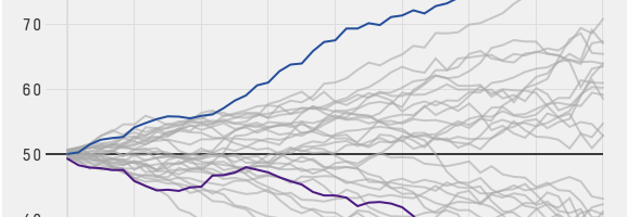
Ipsos MORI, primarily a marketing research group I think, released results of their study on public perception of demographics versus reality, on numbers such as immigration, religion, and life expectancy. The key takeaway is that out of the people they polled from fourteen countries, the average person typically over- or underestimated — by a lot.
Read More
-
-
Accompanying their segment on Halloween stores stocking costumes, NPR ranks bestsellers for the past four years, based on data from the National Retail Foundation. Note that these are rankings for adult costumes, so it’s safe to assume that all of these costume names are preceded by “sexy.” (Kidding.)
I’m surprised there aren’t more topical costumes towards the top. For example, the segment touches on Walter White costumes flying off the shelves last year, but I’m guessing the data probably only covers the pre-packaged stuff. Also guessing a similar reason for why Superman and Batman aren’t counted as generic superhero, or Dracula as vampire.
-
Say you have time series data and you want to detect significant changes, but there’s also a lot of noise to sift through. Twitter released an open source R package, BreakoutDetection, to help with that.
Our main motivation behind creating the package has been to develop a technique to detect breakouts which are robust, from a statistical standpoint, in the presence of anomalies. The BreakoutDetection package can be used in wide variety of contexts. For example, detecting breakout in user engagement post an A/B test, detecting behavioral change, or for problems in econometrics, financial engineering, political and social sciences.
Was a quick installation and worked as expected for me. Twitter has released plenty of open source projects, but I think this is the first R package. Nice.
-
Adam Cohen and his group are using genetically-modified neurons that light up when the cells activate to see the communication between neurons in high detail.
Cohen’s team is using the technique to compare cells from typical brains with those from people with disorders such as motor neuron disease or amyotrophic lateral sclerosis. Rather than taking a brain sample, they remove some of the person’s skin cells and grow them alongside chemicals that rewind the cells into an embryonic-like state. Another set of chemicals is used to turn these stem cells into neurons. “You can recreate something reminiscent of the person’s brain in the dish,” says Cohen.
Couple that with super slow motion video. Then patterns.
-
The New York Times takes a data-centric look at the progress of the Affordable Health Care Act here in the United States. It’s a team effort seven-parter describing changes in uninsured percentages, affordability, and changes to the health care industry as a whole. Probably want to save this one for later.
-
Jeff Leek was trying to explain the curse of dimensionality and realized that there had to be a better way! Leek’s student Prasad Patil cooked up an interactive to demonstrate the curse.
From Leek:
I recently was contacted for an interview about the curse of dimensionality. During the course of the conversation, I realized how hard it is to explain the curse to a general audience. One of the best descriptions I could come up with was trying to describe sampling from a unit line, square, cube, etc. and taking samples with side length fixed. You would capture fewer and fewer points. As I was saying this, I realized it is a pretty bad way to explain the curse of dimensionality in words.
Here’s the Wikipedia page on the curse, if you like. Or you can just give Patil’s interactive a whirl.
-
Data Fluency: Empowering Your Organization with Effective Data Communication, by Zach and Chris Gemignani, is the latest addition to the FlowingData book series.
You can order it now.
Read More -
Looking for a job in data science, visualization, or statistics? There are openings on the board.
Business Intelligence Analyst for American Speech-Language-Hearing Association in Rockville, Maryland.
Front End Developer for Seed Scientific in New York.
Director of Visualization Services for North Carolina State University Libraries in Raleigh, North Carolina.
Middleweight Designer for Information is Beautiful Studio in Shoreditch, London.
-
When news breaks, maps often accompany stories (or the maps are the story), and cartographers and graphics people have to work quickly. The New York Times does this really well. Cartographer Tim Wallace of the New York Times describes some of the process for Wired. I like the bit about uncertainty.
They also have to deal with incorporating uncertainty into their maps. A recent map of territory held by ISIS in Iraq and Syria, for example, uses blurry red and yellow shading to indicate regions controlled by ISIS and areas of recurring attacks. The same map uses light grey hatching to indicate sparsely populated regions. “You don’t want to put a hard line around that,” Wallace said. “It’s not like you cross a river and all of a sudden it’s sparsely populated.”
When I was over there as a lowly graphics intern years ago, I was always impressed by the map department. Actually, I think the map department had just been combined with graphics to work more closely together. Maybe they split them back up again. Anyways, they sit next to each other, and I was impressed by everyone.
I’d occasionally make location maps — mostly small stuff with a few dots on them. Then I’d give it to the map department for checking. Their speed and accuracy was always top notch, which was a fine way for me to see how much I had to learn.
-
George Murphy visualized the results of this year’s skateboarding tournament Battle at the Berrics 7. Even if you don’t like or know anything about skateboarding, this is a fun one to scroll through.
Skaters match up head-to-head in a bracket format, and compete in a style similar to the basketball game of H-O-R-S-E. One person does a trick, and if completed cleanly, the other person has to match. If the second person fails to match, he or she receives a letter. The first person to S-K-A-T-E loses.
Murphy takes you through the tournament with video clips and transitions through a handful of charts. You see how a match plays out and what individual skaters did. Fun.
-
Moving Past Default R Charts
Customizing your charts doesn’t have to be a time-intensive process. With just a teeny bit more effort, you can get something that fits your needs.
-
So here’s a sport I don’t see or hear much about. F1 racing, which requires a different sort of strength and agility than say football or basketball, has a wide range of ages. Drivers can be in their teens. Some are in their late 40s (and successful). Peter Cook visualized the ages and races of drives through F1 racing history, since 1950.
Each row represents a driver’s career, and each color-coded dash in a row represents a race. Colors indicate wins, a trip to the podium, and a top 10 finish.
My favorite part is the tour on initial load. The interactive points out highlights in the data, such as the youngest, oldest, and drivers of interest.
-
Wired wrote a short profile for Cynthia Brewer, best known for Color Brewer, a tool that provides visually apt color schemes for maps (and charts).
Brewer has been thinking about these issues since her graduate days at Michigan State. But the idea for Color Brewer grew out of a sabbatical she did with the U.S. Census Bureau, overseeing the atlas that accompanied the 2000 Census. “We were trying to be really systematic with color throughout the atlas,” she said. Other mapmakers liked the color sets they developed and began asking for them, and Brewer set up Color Brewer to make them more readily available.
If you’ve looked at thematic maps at all, you’ve likely come across a color scheme from Color Brewer. I wouldn’t say it’s ubiquitous quite yet, but it’s close. I just like how something so widespread came from a couple of people in a room who wanted to streamline the process of putting together the decennial atlas.
-
The BBC has a fun piece that shows changes over your lifetime. Enter your date of birth, gender, and height, and you get personalized data nuggets, categorized by how you changed, how the world changed, and how people changed the world during your years on this planet.
For me: 161 major volcano eruptions, 72 solar eclipses, and a 2.7 billion increase in global population.
Naturally, as with most global numbers, these are based on estimates from a wide range of sources, so keep that in the back of your mind as you scroll.
-
In an interesting use of the before-and-after slider, this Washington Post graphic by Bonnie Berkowitz and Laura Stanton contrasts an unhealthy office environment against a healthy one.
As a whole, the graphic represents a full office, and the section is broken into categories for an unhealthy environment on the left and a healthy one on the right. For each section, slide all the way to the left or right to see a fuller picture of the respective habit, covering topics such as ergonomics, hygiene, and air quality.
FYI: Rats and dead plants send the wrong message to your employees.
-
There’s a new addition to the FlowingData book series on the way. It’s called Data Fluency: Empowering Your Organization With Effective Data Communication. It’s by the founders of Juice Analytics Zach and Chris Gemignani and is available for pre-order at the major online booksellers. Copies are also making their way to the brick-and-mortars.
Nice.
As I assumed the technical editor role for the first time, I’ll talk more about the book soon, but Zach and Chris probably sum it up best:
Our hope is that this book starts a new kind of conversation in the analytics field — one that incorporates the people side as much as the tools, techniques, and technologies. We hope it spurs individuals and organizations to start on a journey toward making data a more useful tool for sharing ideas.
-
The Internet Archive makes millions of digitized books available in the form of scanned pages, and these books are categorized into thousands of subjects. Focusing on book images, Mario Klingemann mapped subjects, based on tag similarity. Browse and discover new reading material.
This map offers an alternative way to browse the 2,619,833 images contained in the Internet Archive’s book collection. It shows 5500 different subjects which have been algorithmically arranged by their thematic relationships. The size of each link resembles the amount of images that are available for that topic. Clicking on a link will open the flickr page containing all the pictures for that subject. Rolling over a link will highlight all the topics that have a direct link with the subject.
I recommend browsing towards the middle in the medical cluster for some weird, old-school healing techniques.
-
Kirk Goldsberry, with help from Andy Woodruff, looked at how rebounds work in the NBA from a statistical perspective.
When a player shoots the ball and misses, there’s a tendency for the ball to go in certain directions and distances. Long shots for example often mean long rebounds away from the basket. After years of experience, players gain an intuition for these sort of bouncebacks and can try to position themselves for a rebound. These days more detailed data (via camera technology) is available, which is what these court maps show.
The interactive version in the middle of the article is especially interesting. Mouse over the court, and you can see where players typically rebound after a missed shot from the selected spot.
-
We know that there are more people per square mile in some places than others, but it can be a challenge to understand the magnitude of the differences. The same goes for the other way around. So Ben Blatt for Slate made the Equal Population Mapper, which lets you select an area of interest such as Los Angeles county or the state of Wyoming and see how many counties it takes to equal the population of said area.
For example, the above shows coastal counties as the point of reference, and you see the counties it takes to equal the coastal population in red. That’s a big section in the middle.
Might remind you of the Per Square Mile project from a while back which used cities around the world as point of reference and US states as the mode of comparison.
-
This is what you get when you group streets by their geographic orientation and color them accordingly with a neon paintbrush. From the ever curious Stephen Von Worley:
That’s every public street, colored by the predominant orientation of itself and its neighbors, thickened where the layout is most “grid-like” — to use an old-school woodworking metaphor, it’s as if we brushed some digital lacquer over the raw geographic transportation network data to make the grain pop.
Above is the map for Los Angeles. You see a lot of north-south grids in the red-orange color, but head towards the center of the map in the downtown area, and you get pockets of misdirection. In cities like Tokyo and Paris it looks like there’s no order at all to the roads, whereas Chicago’s road network looks like one big grid.
Lots to ponder, especially if you live in the cities.
See also the level of gridded-ness by Seth Kadish.