In a discussion of context and visualization, Jen Christiansen pulls out a good snippet from Jacob Bronowski’s The Observer (1952) on design constraints.
Read More
-
-
The most recent episode of RadioLab is on social experimentation and social networks. More specifically, Facebook and their timeline tinkering.
Read More -

Mosaic provides a simple comparison of brain size in a handful of animals so that you can compare to the average human. Select among several measures such as actual weigh, percent of body mass, or number of neurons. These measures don’t seem to say much about smarts.
Absolute brain size clearly isn’t what really matters, otherwise people would be cognitive pygmies compared to whales and elephants. But brain size relative to body size doesn’t seem to be a particularly informative measure either. Marmosets — diminutive monkeys that are not thought to be among the brightest of primates — have brains that tip the scales at around 2.7 per cent of body mass, easily beating our own 2.0 per cent.
-
The ghosts in Pac-Man have different personalities represented by their search technique. For example, Pinky tries to predict where you will be in four moves. I had no idea. Game/Show provides an overview of the in-depth details covered by The Pac-Man Dossier by Jamey Pittman.
Read More -

Andrew Van Dam and Renee Lightner for the Wall Street Journal provide a couple of useful linked views of unemployment and job gains and losses. The former comes as a grid where each cell represents the unemployment rate, and the standard time series is shown below that.
Read More -
The New York Times mapped the vaccination rate for every kindergarten in California. Bubbles are sized by enrollment and colored by rate, where red represents under 60 percent and blue represents at or above the rate recommended by the CDC for herd immunity.
Glad the Times was able to get this data together. Important.
-
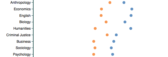
Based on about 14 million reviews on RateMyProfessor, this tool by Ben Schmidt lets you compare words used to describe professors, categorized by gender and discipline. For example, the above is the usage rate of “smart” in reviews, and you see lower rates with professors who are women than for men, for every discipline. This is true when you look at all reviews at once, just positive ones, or just negative ones.
Telling. And just the beginning. Do your own search and find out more about the data and models on Schmidt’s FAQ.
-
A handy chart by Andrew M.H. Alexander. Treemap conversion from one gallon, down to a teaspoon.
-
The Upshot has a detailed, chart-filled summary of the shrinking middle class, categorized by age, education, race, and family status.
Read More -

You’ve probably heard about herd immunity by now. Vaccinations help the individual and the community, especially those who are unable to receive vaccinations for various reasons. The Guardian simulated what happens at various vaccination rates.
Luckily, the measles vaccine — administered in the form of the MMR for measles, mumps and rubella — is very effective. If delivered fully (two doses), it will protect 99% of people against the disease. But, like all vaccines, it’s not perfect: 1% of cases are likely to result in vaccine failure, meaning recipients won’t develop an immune response to the given disease, leaving them vulnerable. Even with perfect vaccination, one of every 100 people would be susceptible to measles, but that’s much better than the alternative.
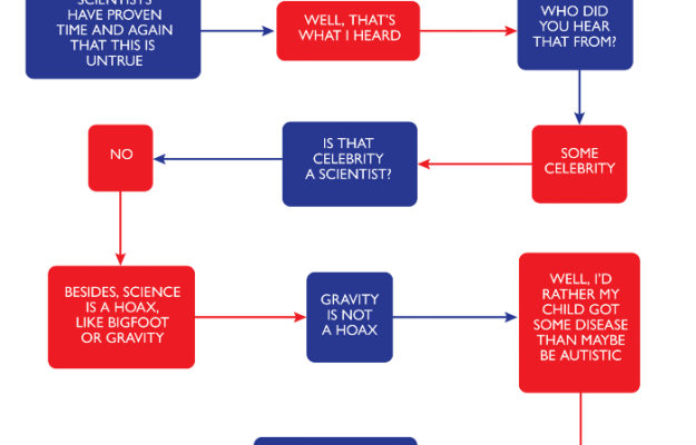
If you’re still unsure, please consult this flowchart to decide.
-
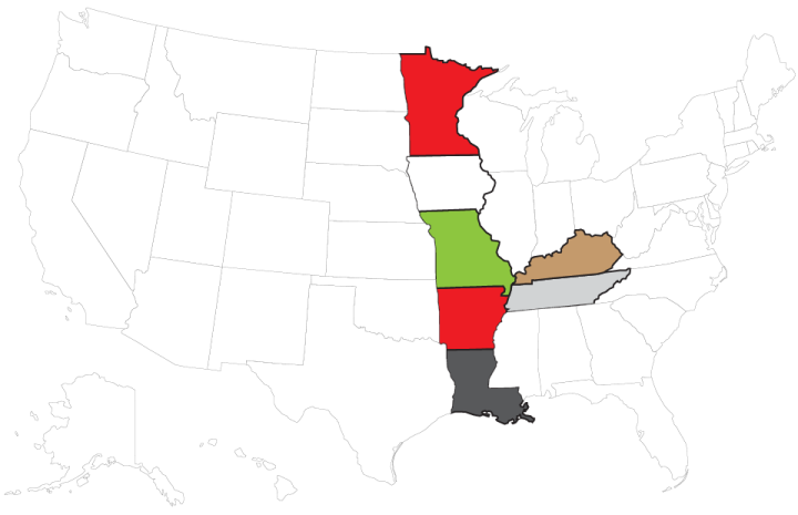
There are an estimated 60 million more men than women on this planet, based on data from World Bank. David Bauer takes a look at the places where the male majority is largest.
Read More -
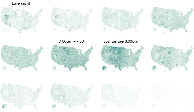
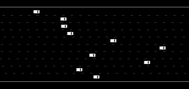
We don’t all start our work days at the same time, despite what morning rush hour might have you think.
-

In Soundweaving, Zsanett Szirmay used embroidery as a score to feed into a music box. Each stitching square is a punch hole, and because of the repeating patterns in “embroidered shirts and pillows from the Transylvanian Bukovina,” the results aren’t so farfetched as musical notes.
Read More -
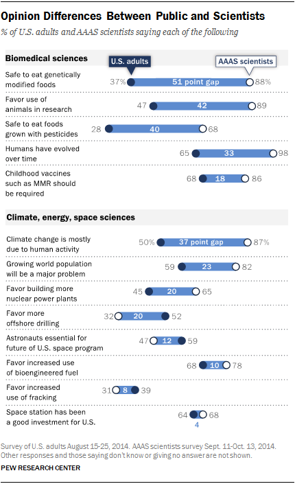
Pew Research Center released a report that compares the public and scientists’ views on science and society.
On some things, such as the space station, fracking, and bioengineered fuel, U.S. adults and scientists a part of the American Association for the Advancement of Science share similar sentiments. On other issues, such as genetically modified foods, animals in research, and climate change, there are big differences.
-
Here’s a fun searchable map from the New York Times. Enter a street’s name, and you can see how many other streets have the same name in other states. Based on Zillow data, you also get a quick comparison of estimated worth of houses on your street versus homes with the same street name but different suffix.
Read More -
Yes. Yes. Yes. Yes. Yes. Yes. Yes. Yes. Yes. Yes. Yes. Yes. Yes. Yes. Yes. Yes. Yes. Yes. Yes. Yes. Yes. Yes. Yes. Yes. Yes. Yes. Yes. Yes. Yes. Yes. Yes. Yes. Yes. Yes. Yes. Yes. Yes. Yes. Yes. Yes. Yes. Yes. Yes. Yes. Yes. Yes. Yes. Yes. Yes. Yes. Yes. Yes. Yes. Yes. Yes. Yes. Yes. Yes. Yes. Yes.
-

It’s a common belief that if someone has a medical condition, a patient can take a treatment and the condition gets better or goes away. That is, improvement is directly related to intake. However, as it turns out, there’s often a good chance the patient would have gotten better without the treatment. There’s also a chance a treatment does nothing.
Austin Frakt and Aaron E. Carroll for the Upshot describe these chances through a metric called number needed to treat, or N.N.T. The simple animations throughout the article provide a great dose of perspective to the odds.
-
A data-centric look at New England Patriots fumble rates at home made the rounds this week. The most cited tidbit was that there is only a 1 in 16,233 chance that the Patriots achieved the lower rate via randomness. Therefore, the Patriots must have cheated. Gregory J. Matthews and Michael Lopez explain, finding by finding, why the results from Sharp Football Analysis are suspect.
Even if you’re not into football, read it for the statistics lesson.
Read More
Recently for Members
Second Edition
 Visualize This: The FlowingData Guide to Design, Visualization, and Statistics (2nd Edition)
 Visualize This: The FlowingData Guide to Design, Visualization, and Statistics (2nd Edition)
New tools, refined process.
Browse by Chart Type See All →


