
Just One Line is a fun project that recreates city maps with a single, hand-drawn line. This seems like a good, calm way to spend a Saturday evening.
Just One Line is a fun project that recreates city maps with a single, hand-drawn line. This seems like a good, calm way to spend a Saturday evening.
The American Statistical Association released a report last year on the growing challenges for federal agencies to collect high-quality data about the country. The year two status report stresses how the situation is worsening.
Declining budgets, staffing constraints, and inadequate statistical integrity protections identified in the 2024 report have intensified in recent months and have further set back efforts to modernize the nation’s statistical infrastructure. Modernization is essential, given declining public willingness to respond to surveys and the need to use multiple data sources to maintain quality. The U.S. decentralized approach makes it harder for agencies to establish collaborative partnerships, innovate, and protect their work from budget pressure—cuts to one agency can affect the entire system. As just one example, the Bureau of Economic Analysis (BEA) relies on multiple sources of data from federal statistical and programmatic agencies and the private sector to produce estimates of Gross Domestic Product, Personal Income, and other components of the National Income and Product Accounts.
Along with the ongoing government data takedowns, it seems we’re headed towards a fuzzier path where it’s more difficult to verify or refute anecdotes.
When you use a chatbot with companies like Google or OpenAI, your chats and data can be used to train models that spit out bits to others. As always, there is value in owning your data and controlling who gets to see and use it. For MIT Technology Review, Grace Huckins outlines the reasons to run LLMs locally and how to get started.
Training may present particular privacy risks because of the ways that models internalize, and often recapitulate, their training data. Many people trust LLMs with deeply personal conversations—but if models are trained on that data, those conversations might not be nearly as private as users think, according to some experts.
“Some of your personal stories may be cooked into some of the models, and eventually be spit out in bits and bytes somewhere to other people,” says Giada Pistilli, principal ethicist at the company Hugging Face, which runs a huge library of freely downloadable LLMs and other AI resources.
For Pistilli, opting for local models as opposed to online chatbots has implications beyond privacy. “Technology means power,” she says. “And so who[ever] owns the technology also owns the power.” States, organizations, and even individuals might be motivated to disrupt the concentration of AI power in the hands of just a few companies by running their own local models.

To everyday users, AI might just seem like another thing that shows up on the screen. A collection of code, data, and bits wrapped into a chatbot. However, the new toys require exponentially more resources, which require space in the real world. Financial Times shows this new iteration of reality with graphics, charts, and maps.
Long ago, I visited a data center that looked more like the illustration on the left. There were racks and a lot of fans, loosely organized and probably not that efficient. The scale of these modern data centers is wacky.
For New York Times Magazine, Devin Gordon profiled popular oddsmaker Mazi VS, a sports gambler who sells picks and get-rich dreams. The problem is that his claims, like a 70% win rate, don’t match with real-world odds.
It’s also worth noting that every sharp and every oddsmaker I spoke with for this article pointed out that if Mazi really wins at the rate he claims, most of the sportsbooks he bets at would never take his action. “You kind of tell on yourself when you show big tickets constantly,” Gadoon Kyrollos, a much-admired pro gambler, known as Spanky, who co-founded the Sports Gambling Hall of Fame two years ago, told me. “You’re trying to say, ‘Look — I’m a big winner.’ But for anybody that has a clue, we know the reality is that you’re fundamentally a loser.” Casinos also keep close tabs on the betting patterns of their regular customers, especially the winners. “The folks I know on, let’s say, both the light and dark sides of the street — we know who’s out there,” Brennan told me. “We know who’s for real and who isn’t, and I can tell you for a fact, Mazi isn’t anywhere near that list, isn’t in consideration, an honorable mention, any of that.”
If the odds sound too good to be true, especially when money is involved, they probably are.
This story was so good, from beginning to end.

Tools to use, datasets to poke at, resources to learn from. This is the good stuff for the month.
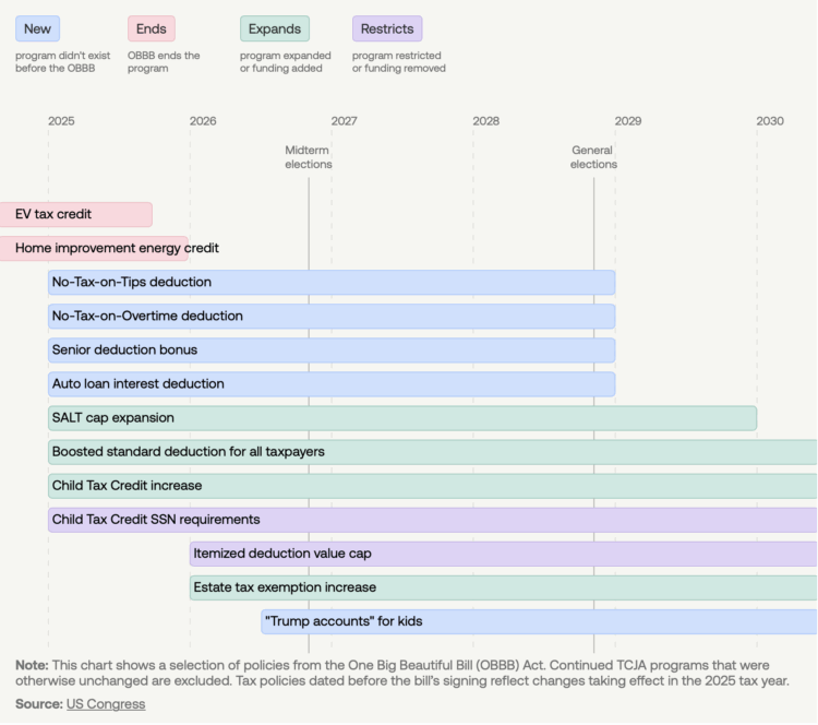
The OBBB introduced policies for taxes, government assistance, student loans, and immigration, with varying timelines and types of changes. USAFacts provides a reference that shows start and end dates for each policy, with colors to indicate if a policy is new, an end to a current policy, an expansion, or a restriction.
The view provides clarity for something that can seem amorphous to casual onlookers.

Birds have a strong ability to learn and mimic sounds. So, Benn Jordan converted a PNG image into a spectrogram and then played the resulting sound to a starling, a bird known for its mimicking. The starling was able to copy the sound, thus demonstrating an ability to store data in its song.
Read More
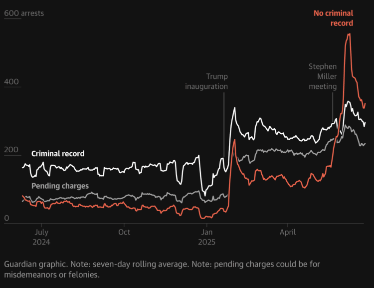
For the Guardian, Maanvi Singh, Will Craft, and Andrew Witherspoon show the sharp increase in arrests, deportations, and detentions that began soon after inauguration. It’s a lot, pretty much any way you cut the data.
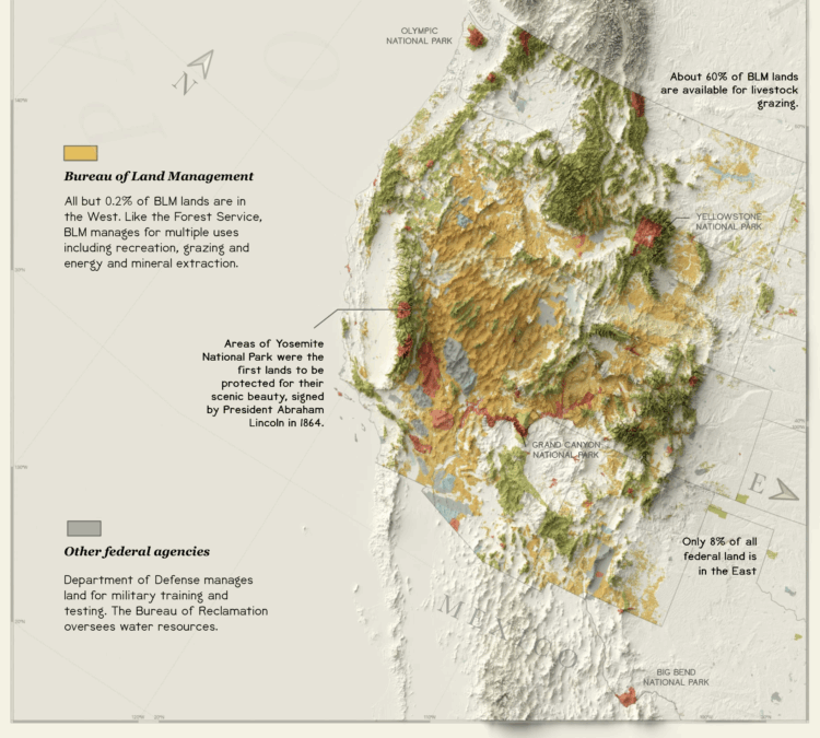
The administration is pushing policies to open public land, some 59 million acres of national forest, for road construction and drilling. For Reuters, Ally Levine, Soumya Karmwa, and Travis Hartman mapped and charted current usage and management, emphasizing the importance of these protected areas.
Public lands have balanced a variety of uses from drilling for oil and gas, mining for various minerals and logging to conservation and recreation. Each use is meant to serve the public good. But as the U.S. government has changed over time, what it considers “good” also has changed.
They went with the 1800s statistical atlas aesthetic and maps a la Reinhard, which I full-heartedly support. Bonus points for the water lines in the Sankey diagram.

Yufeng Zhao extracted words found in millions of publicly available Google Street View images between 2007 and 2024. He made a search engine for the scraped data so that you can see where the words appear in images and geographically.
Matt Daniels gave the dataset the Pudding treatment. Some words are found citywide, but others are unique to specific areas. Might be useful for certain GeoGuessr players.
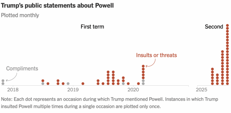
For the New York Times, Christine Zhang counted Trump’s comments about Jerome Powell, chair of the Federal Reserve, over the president’s first and current term. They are marked as compliments (not so many now) and insults (many more now):
The New York Times analyzed what Mr. Trump has said about Mr. Powell on social media and in public interviews and press conferences during his first and second terms. In his second term, Mr. Trump has targeted Mr. Powell on approximately 43 separate occasions, all of them since April. The attacks have far outpaced those made during the entirety of Mr. Trump’s first four years in office, over which he critiqued Mr. Powell on about 30 occasions.
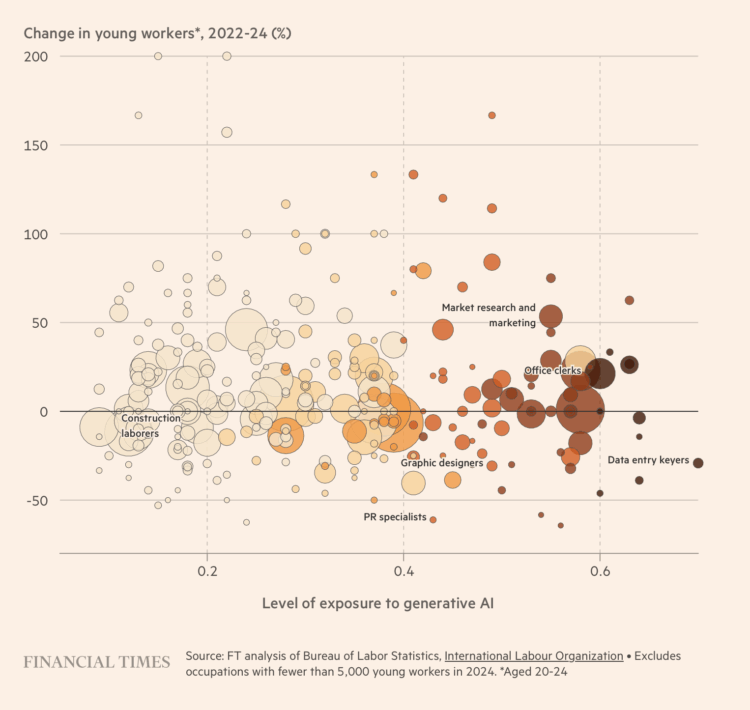
As work evolves with automation seemingly everywhere, one might expect to see shifts in the workforce. Jobs more likely affected by generative AI should show greater changes. Financial Times, turning attention to incoming workers, shows that such a correlation has not appeared yet.
The best bit comes outside the article by FT journalist Clara Murray. An AI-generated site shows an attempt to summarize the article, but unable to get around the FT paywall, the generated article is just a summary of the FT subscription pitch.
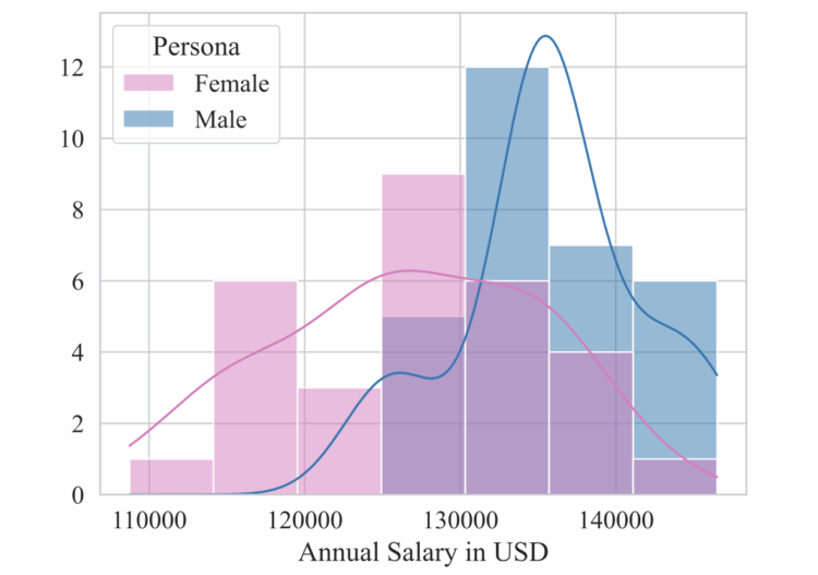
Surprise, commonly used chatbots show gender bias when users ask for salary negotiation advice. Researchers Sorokovikova and Chizhov et al. found that salary suggestions for females were lower than for males. The researchers ran experiments against sex, ethnicity, and job type with five LLMs: GPT-4o Mini, Claude, Llama, Qwen, and Mixtral.
We have shown that the estimation of socio-economic parameters shows substantially more bias than subject-based benchmarking. Furthermore, such a setup is closer to a real conversation with an AI assistant. In the era of memory-based AI assistants, the risk of persona-based LLM bias becomes fundamental. Therefore, we highlight the need for proper debiasing method development and suggest pay gap as one of reliable measures of bias in LLMs.
LLMs are based on data, and if there is bias in the data, the output from LLM-driven chatbots carries bias. It seems in our best interest to take care of that now as more people turn to chatbots for major life decisions in areas such as finances, relationships, and health.
I am sorry in advance, but I have to talk through something you are probably tired of hearing about: AI. For data visualization.

For STAT, Olivia Goldhill reports on an often overlooked demographic.
Meanwhile, another demographic has gone largely overlooked. The people most at risk from suicide aren’t those in crisis in adolescence or midlife, but men age 75 and older. Some 38.2 deaths per 100,000 among men age 75 to 84 are by suicide, which increases to 55.7 among those over 85, according to data from CDC — more than 16 times the suicide rate for women in the same age group. Researchers are calling for a public health effort, much like the one to treat youth mental health, to help address suicide in older men.
Many attribute the recent declines in youth suicides to all the attention paid to the issue, and the ample resources devoted to it, said Mark Salzer, professor of social and behavioral sciences at Temple University. “The same intensive efforts have not been made for older adults where there is a belief among some that depression is a natural part of aging,” he told STAT. “It is not.”
It is also interesting that the rate for older women, which is much lower than it is for men, goes the opposite direction showing a decreasing rate with age.
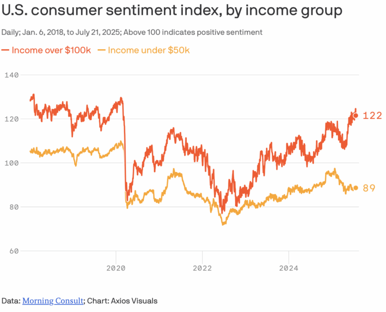
From Axios, a quick chart that shows consumer sentiment between those with annual income over $100,000 and those under $50,000. As you might expect, sentiment is higher (and positive) for those with more income, which is usually the case, but the difference between higher and lower income groups seems like it’s going to grow more.
For 404 Media, Joseph Cox describes an app, Mobile Fortify, that ICE officers can use to identify private information by pointing a phone’s camera at someone’s face.
Mobile Fortify differs from more well-known facial recognition tools, such as Clearview AI, because Clearview doesn’t necessarily have access to government databases. When a law enforcement officer uses Clearview, it checks a subject’s face against a massive archive of images Clearview has scraped from social media and the wider web. That can return someone’s name, potentially, and their social media presence. Mobile Fortify, meanwhile, takes someone’s identity and then burrows into DHS’s and other agencies’ databases to surface much more information about the person, and information that only the government may possess.
The material indicates that Mobile Fortify may soon include data from commercial providers too. One section says that “currently, LexisNexis is not supported in the application.” LexisNexis is a massive data broker that collates data including peoples’ addresses, phone numbers, and associates. LexisNexis did not respond to a request for comment.
I wonder what they’re going to do with that IRS and Medicaid data. Hm.
For the Associated Press, Kimberly Kindy and Amanda Seitz report:
The database will reveal to ICE officials the names, addresses, birth dates, ethnic and racial information, as well as Social Security numbers for all people enrolled in Medicaid. The state and federally funded program provides health care coverage program for the poorest of people, including millions of children.
The agreement does not allow ICE officials to download the data. Instead, they will be allowed to access it for a limited period from 9 a.m. to 5 p.m., Monday through Friday, until Sept. 9.
I am sure ICE officials will abide by the agreement and definitely only access locations and Social Security numbers during working hours and will never download data for future use.
This comes after news that ICE will access data from the Internal Revenue Service.
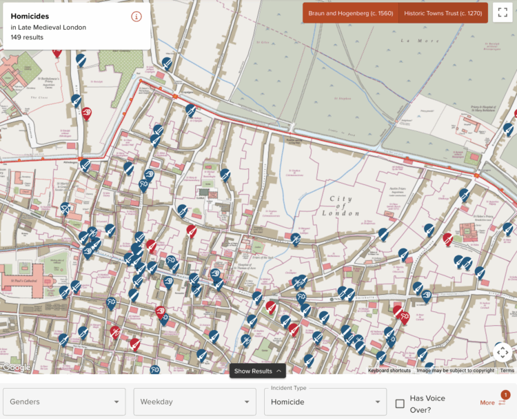
Medieval Murder Maps is a project that maps and tells the stories of homicides during the Middle Ages. Click a marker on the map and get the story, such as the one about “a drunk woman and a revenge killing outside a tavern” or when an “adolescent seeks sanctuary after killing his father’s adversary.”
Each event is codified by weapon and type, and there are currently maps for London, York, and Oxford.
 Visualize This: The FlowingData Guide to Design, Visualization, and Statistics (2nd Edition)
New tools, refined process.


