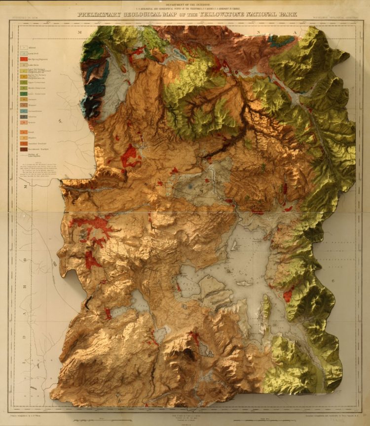
This vintage recreation by graphic designer Scott Reinhard fills all the right checkboxes for me.
Vintage map with modern 3-D elevation
Second Edition
 Visualize This: The FlowingData Guide to Design, Visualization, and Statistics (2nd Edition)
 Visualize This: The FlowingData Guide to Design, Visualization, and Statistics (2nd Edition)
New tools, refined process.