In their annual survey that tests public perception against reality, Ipsos Mori asked people about their own country’s numbers. What’s the obesity rate in your country? What percentage of people in your country are immigrants? The Guardian setup the quiz so that you can see how your own perceptions compare against both reality and others’ in your country.
Read More
-
-
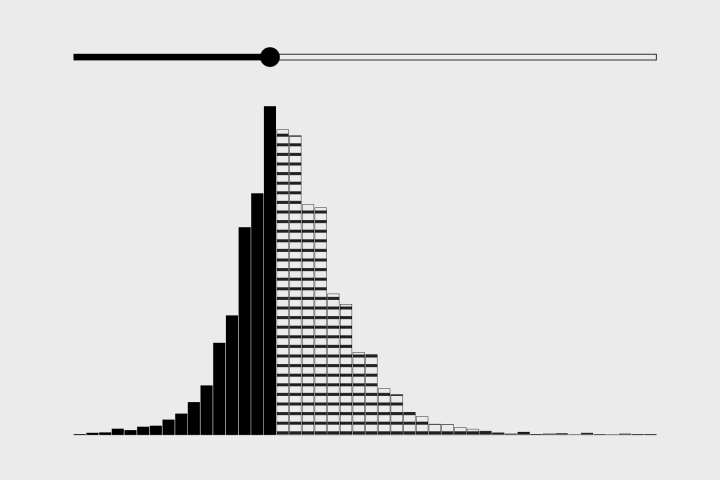
How to Make an Interactive Bar Chart With a Slider
Provide a slider for the standard bar chart so that users can shift focus to a point of interest.
-
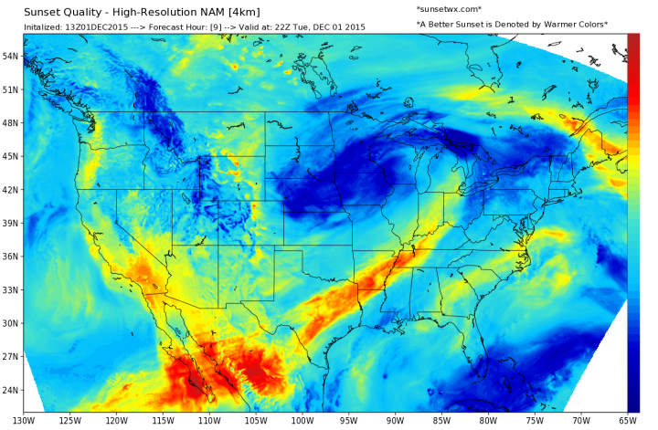
Forget temperature and rain weather forecasts. I want to know when the sunset will look really good in a picture. Good thing SunsetWx now exists. It predicts “sunset quality” based on a mix of meteorlogical factors.
[A]s a landscape photographer, there are certain variables I look for each evening before making the decision to take time out of my day and photograph the sunset. The most important factor I look for is sky cover, and more specifically, the existence of high clouds over the area. High clouds not only provide moisture to refract the sunlight, their ‘wispy’ formation also provides “texture” to the sky and are high enough in the atmosphere for the sun to scatter light below. Think of these as a movie theatre screen, in which light can be projected upon.
[via Slate]
-

Ant activity can seem mysterious at times. The pack seems to start out slow as a few head out in your house in search for food. Before you know it, the entire colony is en route to a few crumbs that your toddler dropped on the floor a few hours ago.
Such a pain — but at the same time kind of impressive.
Read More -

Everything — all two items — in the FlowingData shop is half off. Use the code HALFOFF at checkout for half off your order. Half off.
-

Typical time use varies by who you talk to. This interactive shows you the differences when you vary age and sex.
-
NeuralTalk2 uses neural networks to caption images quickly. To demonstrate, the video below shows a webcam feed that continuously updates with new image captions based on what the computer sees. It’s not perfect of course, but the performance is impressive.
-
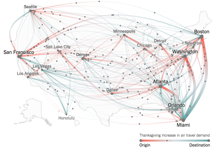
Millions of Americans will fly home this Thanksgiving weekend. (Based on my morning commute, the holiday already started a couple of days early.) Josh Katz and Quoctrung Bui for the New York Times mapped the difference in flight volume for this weekend against the norm, based on Google Flights search data.
Read More -
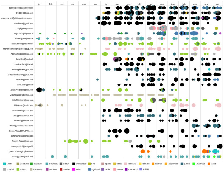
Metadata can tell you a lot, and most of us agree that it’s not “just metadata” at this point. The Share Lab shows what one can find, just using everyday tools and relatively straightforward analysis.
Although our investigation primarily discovered relations, patterns and anomalies of someone’s work life, it still gave us an insight into that person’s habits that border with private life. In the end, metadata scans someone’s behaviors on a much deeper level than traditional surveillance practice related to content could ever do.
The graphic above shows how people in the sample dataset emailed with others over. There’s no email content, but the headers provide enough information to sniff out connections.
-
It’s true. Sometimes it’s okay for the y-axis to start at a non-zero value, which is why Johnny Harris and Matthew Yglesias for Vox tell people to shut up about the y-axis.
The video might seem contradictory to what I said about bar chart baselines, but we basically say the same thing. The context must match the visual, charts that don’t use length as the visual encoding can start at non-zero baselines, and take a second before you sputter a knee-jerk reaction.
-
-
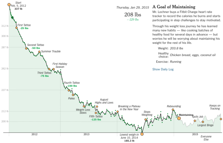
With the availability of weight and food tracking apps these days, there are thousands of people building out their time series every day. Albert Sun for the New York Times visualized the outlier case of Steve Lochner who lost over 100 pounds during a three-year period.
Once again, the annotation makes it. As you scroll, the timeline plays out and significant events such as spikes, drops, and milestones are marked and explained. Keep on scrolling and you see how Lochner, labeled as a “super tracker”, compares to others who set a 50-plus pound weight loss goal.
-
Keith Collins for Quartz made an interactive that showed how much more daylight you get because of Daylight Saving Time. But it was generalized to a single location. Andy Woodruff is on it, and added a geographic component.
It’s noted on that page that the chart’s data “assume you are located in New York, but differences are minimal across the contiguous 48 states,” but I’m a geographer and must always disagree with any and all spatial claims, by anyone. I live in the same time zone where I grew up, but the sunrise/set times are almost an hour different between the two places.
-
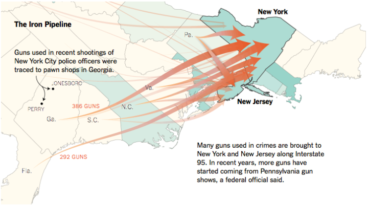
In states with stricter gun laws, firearms still find their way in. Based on data from the Bureau of Alcohol, Tobacco, Firearms and Explosives, maps by Gregor Aisch and Josh Keller for the New York Times show where the guns came from in 2014.
The data represents about 50,000 out-of-state guns used in crimes for the year, and of course, this is just a percentage of what actually gets across.
-
 Plotly, a service that lets you make interactive charts online, open-sourced their main JavaScript charting library.
 Today, Plotly is announcing that we have open-sourced plotly.js, the core technology and JavaScript graphing library behind Plotly’s products (MIT license). It’s all out there and free. Any developer can now integrate Plotly’s library into their own applications unencumbered. Plotly.js supports 20 chart types, including 3D plots, geographic maps, and statistical charts like density plots, histograms, box plots, and contour plots.
Should be useful if you need some web-based, interactive charts in a pinch.
-
Bloomberg put together their list of 50 companies to watch in 2016. For each business is a chart or graphic, and the whole thing is in ASCII text. And in case you’re wondering, yes, you can view it as a plain text file. All I need now is my old dot matrix printer.
-
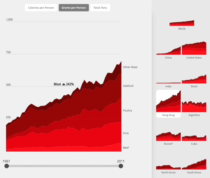
Diets vary around the world. Fathom Information Design for National Geographic charted the differences between countries using data from FAOSTAT. Small multiples on the right panel provide a wideout view of countries over time, and when you click on one, you get a more detailed view. Toggle between categories and filter by years.
I always thought the United States had the highest meat consumption and that it was by a lot. Based on these estimates, not so much.
-
-
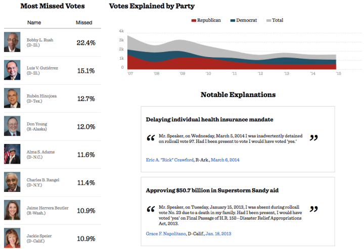
When members of the House of Representatives miss a vote, it is customary to provide a reason. ProPublica put together a database of these reasons, going back to 2007.
The reasons lawmakers cite most for missing votes range from the mundane (travel delays, often due to weather, or remaining in their districts for job fairs) to more personal (the birth of a child or a graduation ceremony or illness). Lawmakers have missed more than 2,000 votes for medical reasons, and thousands more for personal and family reasons.
-

You’ve likely seen projects that take the average of people’s faces, but you probably haven’t seen the average of faces in inanimate objects. That’s what Robby Kraft did. No pictures of actual people were used to produce the averaged image above. [via @zachlieberman]
Recently for Members
Second Edition
 Visualize This: The FlowingData Guide to Design, Visualization, and Statistics (2nd Edition)
 Visualize This: The FlowingData Guide to Design, Visualization, and Statistics (2nd Edition)
New tools, refined process.
Browse by Chart Type See All →


