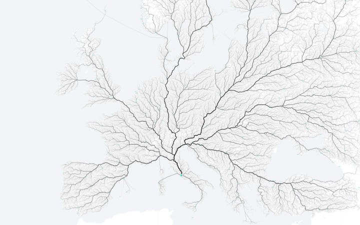
As the saying goes, “All roads lead to Rome.” Folks at the moovel lab were curious about how true this statement is, so they tested it out. They laid a grid on top of Europe, and then algorithmically found a route from each cell in the grid to Rome, resulting in about half a million routes total. Yep, there seems to be a way from Rome from every point.
Above is the map of these routes. Road segments used more frequently were drawn thicker, and as you might expect you get what looks like a root system through the continent. I’m guessing thicker lines are highways and freeways.
Moovel did the same with cities named Rome in the United States and the state capitals. Pretty sweet.
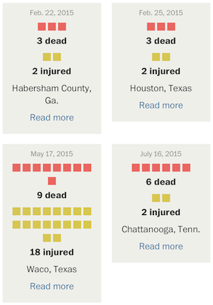 With recent events, you’ve likely seen the articles and graphics that get into the number of mass shootings this year and further into the past. You might have noticed that the numbers seem to vary depending on where you look, and the difference likely stems from how “mass shooting” is defined by the author.


 Plotly, a service that lets you make interactive charts online,
  Visualize This: The FlowingData Guide to Design, Visualization, and Statistics (2nd Edition)


