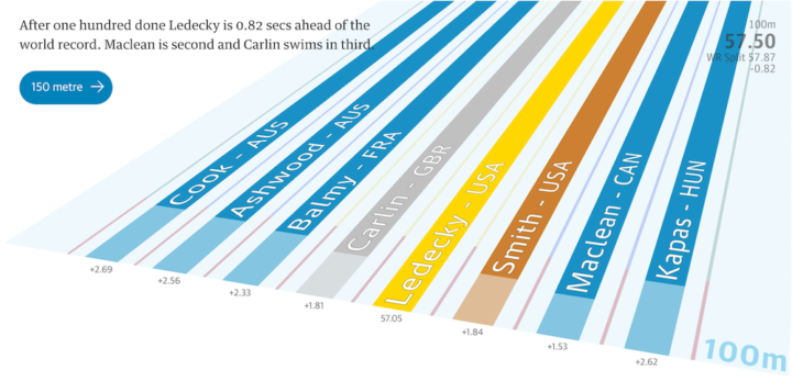
Dan Burns explains some properties of time and space using marbles and two large pieces of spandex sewn together in a classroom demonstration.
Read More
-
-
-
The individual data points of life are much less predictable than the average. Here’s a simulation that shows you how much time is left on the clock.
-
-
-
Trey Causey just finished an interview roundabout for data science jobs. He outlines his experiences and describes what interviewers seem to want, what questions to expect, and what to expect from yourself.
Sooner or later you’re going to find yourself looking for a data science job. Maybe it’s your first one or maybe you’re changing jobs. Even if you’re fully confident in your skills, have no impostor syndrome, and have tons of inside leads at great companies, it’s a tremendously stressful experience. The process of looking for a new job is often one that occurs secretly and confidentially and then is so exhausting that discussing the process is the last thing you want to do. I hope to change that.
A must-read for those about to get your feet wet.
See also Causey’s short guide on getting started with data science.
-
In a clean and simple set of slope charts, Alyson Hurt for NPR shows the shifts in power sources — coal, gas, nuclear, hydroelectric, and renewables — from 2004 to 2014. As you might guess, coal power output is down in most states and natural gas is up. On a national scale, the hydroelectric and renewable sources need more time.
Grab the data from the U.S. Energy Information Administration to look yourself.
-
Luis Dilger made a set of fine-looking prints that show city landscapes in 3-D. They look like little cardboard cutouts.
Read More -
You know the thing. It’s the triangle of numbers that you learned about in high school. Each number in a row is the sum of the two numbers above it in the previous row. Of course, as explained in the video below, there’s more to it than that. SECRETS REVEALED.
[via kottke]
-
It is estimated that over 200,000 people have been killed during the Syrian civil war. That’s a lot of lives. Lives. In a striking representation by the New York Times, a dot represents each life lost.
-
Work changed over the years. Salaries changed over the years. I was curious: If you compared your personal income from present day, how would it compare to the distribution of salaries in previous decades?
-
In a very non-government-like release (in a good way), the U.S. Department of Education provides detailed data for college debt, graduation rates, test scores, and more. It’s at the program-level, and there’s even a front-facing College Scorecard that lets you look up information for your university.
And it doesn’t look and work like an outdated government site. With all of my frustrations with government sites, the education release feels pretty great. It’s as if the department actually wants us to look at the data. Imagine that.
You can download the data as a single ZIP file, access it via the data.gov API, and most importantly, there’s documentation.
Seriously, this is good stuff, and if it’s any indicator for where government data is headed, there could be good things to come.
-
So you have your data neat and tidy in a single spreadsheet, and it’s finally time to explore. There’s a problem though. Maybe you don’t know what to look for or where to start. Maybe you’re not in the mood for a trip to clicksville to make all those charts. With a new exploration tab, Google Sheets might be a good place to start.
Read More -
Here’s a fun project to try over the weekend. Hannah Mitt and Andrew Morrison came up with a neat hack using an old Android device and a two-way mirror to make a future-y information display. It shows date, time, and weather, reminders, and the most recent xkcd.
Just import their project to your device, mount it to the mirror, and mount the whole thing to the wall. Done.
-
There are a lot of trees on this planet. But how many trees there actually are is still kind of fuzzy, because the estimates are based on satellite imagery. It’s hard to gauge density. Research by T. W. Crowther et al., recently published in Nature, used on-the-ground sampling to estimate more accurately.
The global extent and distribution of forest trees is central to our understanding of the terrestrial biosphere. We provide the first spatially continuous map of forest tree density at a global scale. This map reveals that the global number of trees is approximately 3.04 trillion, an order of magnitude higher than the previous estimate. Of these trees, approximately 1.39 trillion exist in tropical and subtropical forests, with 0.74 trillion in boreal regions and 0.61 trillion in temperate regions.
-
Apps peak and die on a regular basis. One day everyone is giving an app a go and your feed fills up with links to the service, and the next it’s business as usual. BuzzFeed took a straightforward look at such trends through the eyes of tweets. All they had to do was count tweets that linked to particular service over time.
-
Stock market spoofers put in orders to buy with the intent to cancel. This can shift prices up with fake interest, or it can shift prices down with a wave of cancellations. The spoofers then take advantage of the shifts by buying and selling accordingly. Bloomberg has an interesting stepper that walks you through the process for how one might catch such spoofers.
It starts with an overview. A minute of buying, selling, and cancellations whiz across the screen, and all looks hunky-dory. But then it zooms in on the details to show you what to look for, and it doesn’t look like such a flurry anymore.
The challenge is that regular people cancel orders all the time, and the activity itself is not illegal. More data needed.
-
Venn diagrams seem straightforward, but why all the mistakes? Here’s a guide to avoid the snafus.
-
Damien Saunder, a cartographer at ESRI, likes to use mapping methods to evaluate tennis player patterns and tendencies.
When I look at tennis, I see it moving on a grid. I see space and x/y coordinates [position] and I see z values [height], and I see trajectories of the balls, and space opening up. I started GameSetMap to try and educate people of the value of mapping where people are on the court, storing the data in a GIS, and visualizing it.
-