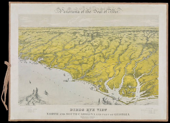
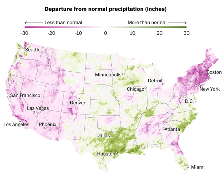
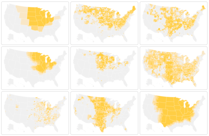
There are a lot of visualization-related tools out there. Here’s a simple categorized collection of what’s available, with a focus on the free and open source stuff.
This site features a curated selection of data visualization tools meant to bridge the gap between programmers/statisticians and the general public by only highlighting free/freemium, responsive and relatively simple-to-learn technologies for displaying both basic and complex, multivariate datasets. It leans heavily toward open-source software and plugins, rather than enterprise, expensive B.I. solutions.
I found some broken links, and the descriptions need a little editing, but it’s a good place to start.
Also, if you’re just starting out with visualization, you might find all the resources a bit overwhelming. If that’s the case, don’t fret. You don’t have to learn how to use all of them. Let your desired outcomes guide you. Here’s what I use.


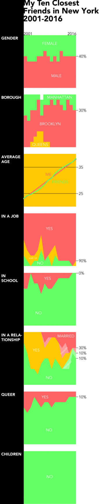 We tend to think of demographics on a large scale. Countries, counties, and cities. Then we look at trends over time for thousands or millions of people. But it can be equally, if not more, interesting to look at the same trends at a personal level. This is what Dorothy Gambrell did.
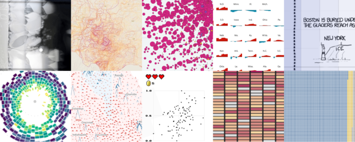
 Visualize This: The FlowingData Guide to Design, Visualization, and Statistics (2nd Edition)


