There were some ripples in the space time continuum recently about a pizza and a pie chart. It looked like a pie chart but was actually just a pizza with numbers around it. Those numbers didn’t sum to 100 percent, so there were pitch forks and burning and like I said, ripples in the space time continuum.
Read More
-
-
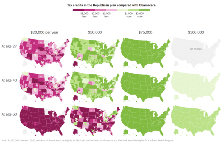
Based on estimates from the Kaiser Family Foundation, Kevin Quealy and Margot Sanger-Katz for The Upshot compare the tax credits for individuals under the Republicans’ proposed health care plan against Obamacare.
The biggest losers under the change would be older Americans with low incomes who live in high-cost areas. Those are the people who benefited most from Obamacare.
For some people, the new tax credit system will be more generous. The winners are likely to be younger, earn higher incomes and live in areas where the cost of health insurance is low.
Hm.
-

There was a time when charts and infographics were drawn by hand, because computers weren’t affordable or commonplace. John Grimwade provides a run down of the tools he used back in the day. The thing above was used to draw different sized circles. On paper. With a pen.
The tools remind me a lot of my dad’s that he used to have laying around. He’s a civil engineer and used to pull out all these blueprints with measurements and codes. Now they just have giant, high-resolution computer screens.
I wonder what my kids will think of the tools I use when they’re older. “You mean you have to use your hands to visualize your data? That’s like a baby’s toy.”
-
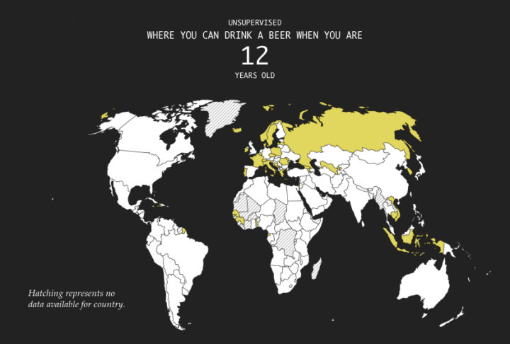
As you probably know, different countries have different legal age limits for drinking alcoholic beverages. In the United States, the age is 21. In some places in the world, there is no set age. In most places, the legal age is 18 to drink a non-spirit beverage such as beer in a public place without a guardian.
The map above, based on data from Wikipedia, shows where in the world you’re legally allowed to drink a beer in a public place. It’s slightly generalized and doesn’t take into account that in some places you have to be older to purchase the beverage, but it gives you a good idea of the age limits globally.
This by the way is part of new category I’m calling my sketchbook. I need a place where I can mess around with different formats without worrying about what is the “right” way to do it.
Relevant tutorials: Choropleth Maps and Shapefiles in R / How to Make an Animated Growth Map in R
-

The nice thing about animated GIFs for visualization is that they can get a message across pretty quickly, which lends itself to potential shares. You’d think there would be a Twitter bot by now tweeting GIFs non-stop. In any case, Lena Groeger put together a nice collection of them.
-
There are two main reasons annotation is often a challenge. The first is that writing copy that is succinct with the right amount of detail is tricky. The second is that implementation can be a pain, because you always have to muck around with placement in an ad hoc fashion. To help out with the second reason, Susie Lu developed d3-annotation. It takes away much of the main of adding labels and context to your charts with d3.js.
The whole writing part is still up to you, but at least you don’t have to think so much about implementation.
-
Facebook released Prophet, which is a procedure to quickly forecast with time series data.
Prophet is a procedure for forecasting time series data. It is based on an additive model where non-linear trends are fit with yearly and weekly seasonality, plus holidays. It works best with daily periodicity data with at least one year of historical data. Prophet is robust to missing data, shifts in the trend, and large outliers.
Plus it’s available in both Python and R. What. Should be worth a look.
-
The Washington Post talked to three experts on the American workforce and innovation and how immigration restrictions to the US might impact future progress. Aside from the important topic the ratio of words to charts is interesting. I’ve gotten used to seeing pieces that are chart-heavy or word-heavy, but this is more one-to-one. I like it.
-
-

Ken Schwencke and Al Shaw from ProPublica with a set of straightforward maps that show bomb threats to Jewish community centers and organizations:
Since Jan. 1, at least 89 locations of Jewish organizations in the United States — including schools, Jewish Community Centers, and offices of the Anti-Defamation League — have received a total of 114 bomb threats. The majority have come in five of what the JCC Association of North America calls “waves” — groups of robocalls coming on a single day. So far, none of the threats have been carried out.
Gross.
-
Elijah Meeks is running a detailed survey about data visualization people to gain a better understanding of who we are as a community. The work we do these days spans a wide range of applications, across a wide spectrum of art to analysis, and it should be useful to see the results. Once the survey is done, anonymized survey results will be available to download.
But first, make sure you put in your voice so we get a complete picture.
-
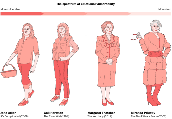
Here’s a fun piece from Stephanie Merry and Shelly Tan for The Washington Post that covers the acting range of Meryl Streep, from accents to personality traits.
See also: the Meryl Streep scatterplot.
-
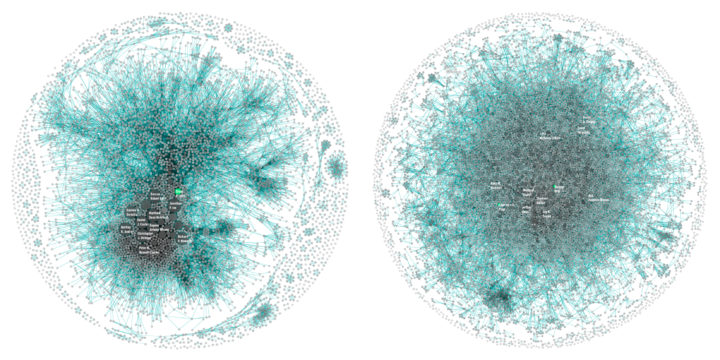
For Co.Design, Periscopic compared patent ownership between Apple and Google, which ends up providing a good idea of company structure.
Read More -
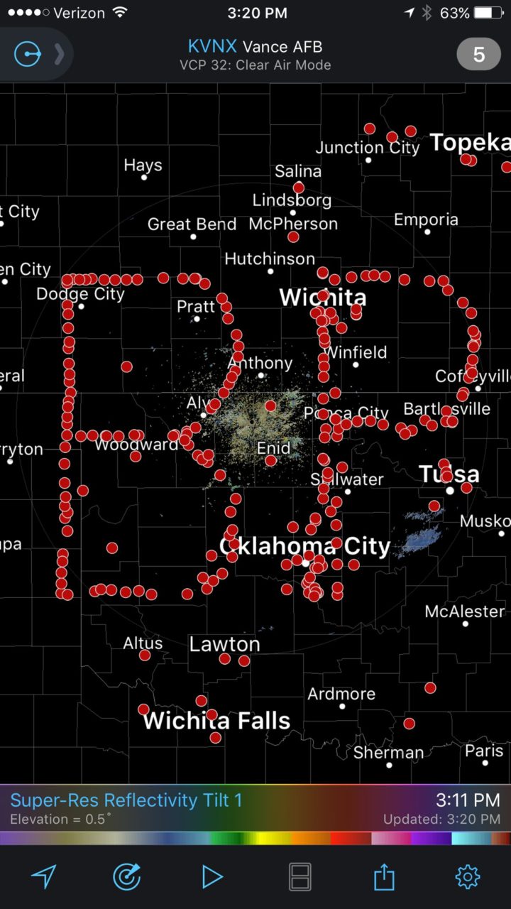
Bill Paxton, who played a storm chaser in Twister, died on Sunday. To honor him, storm spotters gathered at various coordinates to form Paxton’s initials.
I don’t know much about storm chasing or the man, but this seems special. It’s like a hello sent to the skies.
-
Many government organizations release microdata for surveys every year. It comes as anonymized responses from each survey participant for each question in said survey. However, those who want to use this data often run into the challenge of downloading and parsing. It’s rarely straightforward.
So, Anthony Damico provides a big helping of R scripts to easily download data from a bunch of surveys. He calls the site Analyze Survey Data for Free.
Governments spend billions of dollars each year surveying their populations. If you have a computer and some energy, you should be able to unlock it for free, with transparent, open-source software, using reproducible techniques. We’re in a golden era of public government data, but almost nobody knows how to mine it with technology designed for this millennium. I can change that, so I’m gonna. Help. Use it.
The site has been around for a few years but I just discovered it. I’m not sure we’re in a “golden era of public government data” right now (although I’d be happy if you prove me wrong).
I recently used a modified script to download data from the CDC, and it saved me a bunch of time.
-
When Americans had sex, moved in with someone, and so on. Often not average. Far from normal.
-
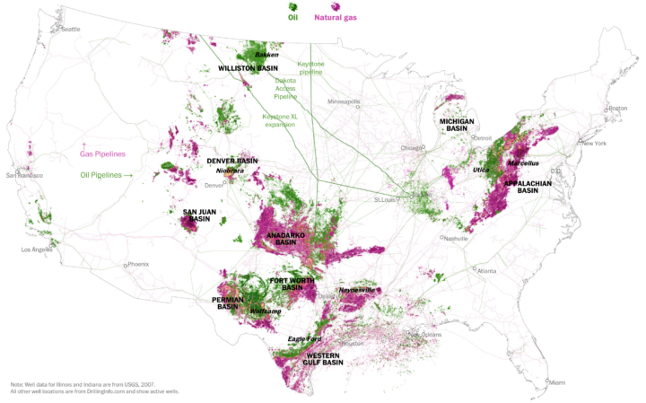
Tim Meko and Laris Karklis for The Washington Post take a dive into oil and gas wells in the United States.
Since 2010, the United States has been in an oil-and-gas boom. In 2015, domestic production was at near-record levels, and we now produce more petroleum products than any other country in the world. President Trump said he plans to double down on the oil and gas industry, lifting regulations and drilling on federal land. Here is the state of the petroleum extraction industry that the new administration will inherit.
-
“Normal America.” I’m not sure what that means anymore, but at some point it had a lot to do with demographics. Naturally, the “normal” that you look at or want bleeds into policy-making and the like. Jed Kolko for FiveThirtyEight looks into the states most similar to the country overall — the one from 1950 and from today.
But the places that look today most like 1950 America are not large metros but rather smaller metros and rural areas. Looking across all of America, including the rural areas, the regions that today look most demographically similar to 1950 America are the portion of eastern Ohio around the towns of Cambridge and Coshocton and the Cumberland Valley district in southeastern Kentucky.
The states most similar demographically to today’s America: Illinois, New York, New Jersey, Connecticut, and Virginia.
-
From Josh Begley, this quickfire flip book shows every New York Times front page since 1852. Watch the shift from all words, to a handful of small pictures, to larger pictures, to color, and then more color pictures.
It reminds me of the flip book for the Hawaiian Star and the comparison of pages for popular science magazines, which show a similar evolution.
Recently for Members
Second Edition
 Visualize This: The FlowingData Guide to Design, Visualization, and Statistics (2nd Edition)
 Visualize This: The FlowingData Guide to Design, Visualization, and Statistics (2nd Edition)
New tools, refined process.
Browse by Chart Type See All →


