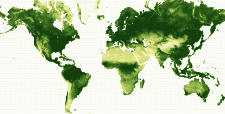
• Membership
  • Newsletter
  • Projects
  • Learning
  • About
  • Member Login
  • History of data visualization

    January 13, 2017

    Topic

    Infographics  /  history, vintage

    I have an affinity for new things designed as old things, so this brief history of data visualization by RJ Andrews hits the spot.

    I have placed cartoons representing important works of data visualization along a fictitious scroll map in the style of Ogilby’s atlas. The road marches you through time, passing many charts, through towns (named for key contributors whose charts make up said towns), and over waterways that mark important dates.

    If you’re interested in a comprehensive compendium, you should check out Michael Friendly’s Milestones project.

  • Balloon maps

    January 12, 2017

    Topic

    Maps  /  balloon, vintage

    There was a time when the best way to get a view from above was to hop into a hot air balloon, which eventually led to the so-called “balloon map.” Cara Giaimo for Atlas Obscura starts the story with a ballooner named Thomas Baldwin.

    In an age of transatlantic flights and Google Earth, Baldwin’s suggestions seem a bit quaint. But in his time, when almost everyone was stuck on the ground, Baldwin’s attempts to pin down an accurate sky-view were heroic. Over the following century, entrepreneurs, military spies, and tourist boards alike would follow his lead, transforming some of the world’s most vital views into lovely, quirky “balloon maps.”

    Hand-drawn, detailed maps and graphics like this — before computers — always blows my mind.

  • National Geographic Infographics, the book

    January 12, 2017

    Topic

    Infographics  /  book, National Geographic

    Infographics devolved a bit in recent years, but there was a time the term wasn’t immediately associated with content marketing. (And there is still plenty of good infographic work that actually informs.) National Geographic is one such source of inspiration, and now you can get a best-of collection in book form that spans over a century.

    With an essay by Nigel Holmes, charting the evolution of National Geographic over the decades and its pioneering use of graphics, as well as four fold-outs mimicking original pull-outs or inserts in the magazine, the book stands as a defining record of one of the world’s best-known publications as much as it is a beautifully presented repository of discovery and learning.

    Get it on Amazon.

  • Data with the feels

    January 11, 2017

    Topic

    Design  /  empathy, lunch talk

    Data can be fact and analytical. It can help you make objective decisions. Data can also evoke the feels, helping you understand and relate to something that used to be foreign. Lisa Charlotte Rost, currently a Knight-Mozilla OpenNews fellow at NPR, makes the case in this talk.

    [arve url=”https://www.youtube.com/watch?v=5kzYTt8omjs”/]

  • Going local on gun violence

    January 10, 2017

    Topic

    Maps  /  guns, homicide, local

    Sometimes data can look really noisy when you zoom in close, and so you zoom out to get a better look at an overall trend. Sometimes it goes the other way. The Guardian looks at gun violence data at the local, census tract level, to focus on not just cities, but the clusters within the cities.

    America’s gun policy debate is usually driven by high-profile mass shootings that seem to strike at random, and it focuses on sweeping federal gun control or mental health policies. But much of America’s gun homicide problem happens in a relatively small number of predictable places, often driven by predictable groups of high-risk people, and its burden is anything but random.

    I like the scroll action that first shows the map with randomly distributed dots and then transitions to reality. Drives the point home.

  • Football catches visualized

    January 9, 2017

    Topic

    Infographics  /  football, New York Times

    It’s always fun to go back to sports articles and graphics that were a lead-up to a game the day after. The newest addition: this graphic from The New York Times that shows wide receiver Odell Beckham Jr.’s catches this season. It shows route patterns, the catch, yards after the catch, and touchdown paths. If you’re not into football, just take it in as a small multiples example.

  • How to Make an Animated Map in R, Part 4

    In the the last part of the four-part series, you make a longer animation with more data and annotate.

  • Giant map for inauguration planning

    January 6, 2017

    Topic

    Maps  /  inauguration, scale

    In planning for the upcoming inauguration, the U.S. military is using a giant multi-part rollout map to do walkthroughs. Yep.

    [arve url=”https://www.youtube.com/watch?v=Dvy2r8T0pkg”/]

  • Change in rain, 2016

    January 5, 2017

    Topic

    Maps  /  rain, Washington Post, weather

    In some areas of the United States it poured down rain, which caused historic floods, and in other areas there was a lack of rain, which caused historic drought. The Washington Post has a map for that. Purple means less rain than usual, and green means more.

  • Looking for America’s heartland

    January 4, 2017

    Topic

    Maps  /  heartland, quiz, Upshot

    By definition, heartland is some central place of importance of a country. But ask people where to find America’s heartland, and the actual boundaries of this so-called area grows fuzzy. The Upshot asks its readers the same question with a multiple-choice poll.

    First, it gets you to think about your concept of the heartland. Second, it provides a baseline to compare against others. Third, it goes into more detail for each option. And by the end, well, you still don’t quite know where the heartland is, but at least you learn something.

    I have a feeling we’ll see this story format more this year.

  • Charting friend demographics over time

    January 3, 2017

    Topic

    Self-surveillance  /  demographics, Friends

    We tend to think of demographics on a large scale. Countries, counties, and cities. Then we look at trends over time for thousands or millions of people. But it can be equally, if not more, interesting to look at the same trends at a personal level. This is what Dorothy Gambrell did. She charted her ten closest friends in New York.

    I like how even though the charts are for only ten people, we see similar patterns that we might see for millions.

  • 2016.

    December 30, 2016

    Topic

    Site News  /  annual review

    That was fast. Just when you get used to dating with 2016, 2017 comes along. A big thank you to all of you who make this site possible. I thank my lucky stars that this is what I get to do every day, and I hope I get to do it for years to come.

    This year I made a conscious effort to learn to visualize data with d3.js. I still used R for exploration and data preparation, but on the presentation side of things, I always tried to go native in the browser first.

    The popularity of my experiments and learning exercises took me by surprise. This was the ninth year of FlowingData, and from a pageviews perspective, it was almost twice that of any other year. And keep in mind that blogs were supposed to have died multiple times over already.
    Read More

  • Visualization  /  best-of

    Best Data Visualization Projects of 2016

    Here are my favorites for the year.

    Read More
  • U.S. culture through TV show geography

    December 28, 2016

    Topic

    Maps  /  facebook, television, Upshot

    Map who “likes” television shows on Facebook, by ZIP code, and you get a good idea of cultural boundaries. This is what Josh Katz for the Upshot did for 50 of the most liked shows in the United States, finding three distinct regions: “cities and their suburbs; rural areas; and what we’re calling the extended Black Belt.”

  • Where people use certain words

    December 28, 2016

    Topic

    Maps  /  dialect, Quartz, Twitter

    Nikhil Sonnad for Quartz mapped the top 100,000 words used in tweets. Search to your heart’s content.

    The data for these maps are drawn from billions of tweets collected by geographer Diansheng Guo in 2014. Jack Grieve, a forensic linguist at Aston University in the United Kingdom, along with Andrea Nini of the University of Manchester, identified the top 100,000 words used in these tweets and how often they are used in every county in the continental United States, based on location data from Twitter.

    See also the dialect quiz and maps by Josh Katz from a few years back.

  • How Bayesian inference works

    December 27, 2016

    Topic

    Statistics  /  Bayes

    You might remember Bayes mentioned a few times in your introduction to statistics course. Or maybe you hear it every now and then in the news, and maybe you’re not quite sure what people are talking about. Here’s an introduction video to Bayesian statistics by Brandon Rohrer.

    [arve url=”https://www.youtube.com/watch?v=5NMxiOGL39M”/]

    There’s also a text version, if you prefer that over video. [via Revolutions]

  • Interpolate your data for animation in R

    December 23, 2016

    Topic

    Coding  /  animation, package, R

    The tweenr package in R, by Thomas Lin Pedersen, helps you interpolate data for easier animated transitions.

    tweenr is a small package that makes it easy to interpolate your data between different states, specifying the length of each change, the easing of the transition and how many intermediary steps should be generated. tweenr works particularly well with gganimate but can be used for any case where interpolation of data is needed.

    Why I’m just now learning about this, I have no clue. I thought we were friends.

  • Minimizing discrimination in machine learning

    December 23, 2016

    Topic

    Statistics  /  discrimination, machine learning

    From Google Research, a look at how discrimination in machine learning can lead to poor results and what might be done to combat:

    Here we discuss “threshold classifiers,” a part of some machine learning systems that is critical to issues of discrimination. A threshold classifier essentially makes a yes/no decision, putting things in one category or another. We look at how these classifiers work, ways they can potentially be unfair, and how you might turn an unfair classifier into a fairer one.

  • Map of New York City shadows

    December 22, 2016

    Topic

    Maps  /  New York Times, shadows

    Shadows cast by buildings affect the feel and flow of a city, and lack of sunlight can change aspects of daily living, such as rent. In a place like New York City, where there are tall buildings aplenty, the effects are obvious. Quoctrung Bui and Jeremy White for The New York Times mapped the darkness.
    Read More

  • Christmas Movies as Charts

    December 22, 2016

    Topic

    Chart Everything  /  Christmas, movies

    It’s been quite the year of randomness and things we never would have imagined at any other time before they occurred. So in the spirit of this year, here’s A Christmas Story for you.
    Read More

  • Page 168 of 392
  • <
  • 1
  • ...
  • 165
  • 166
  • 167
  • 168
  • 169
  • 170
  • ...
  • 392
  • >

Analyze, visualize, and communicate data usefully, beyond the defaults.

Become a member →

Recently for Members

May 8, 2025
When the data is not what it seems

May 1, 2025
Finding the Right Charts

April 24, 2025
Visualization Tools, Datasets, and Resources – April 2025 Roundup

April 17, 2025
Breaking Out of Chart Software Defaults

April 15, 2025
Line Chart with Decorative Neon Accents

Browse by Chart Type See All →

Density Plot Donut Chart Bump Chart Square Pie Chart Mosaic Plot Word Cloud Step Chart Stacked Area Chart Glyph Chart Parallel Coordinates

Browse By Topic

  • Visualization

    Seeing data

  • Maps

    Seeing geographic data

  • Infographics

    Explaining data

  • Networks

    Connecting data

  • Statistics

    Analyzing data

  • Software

    Working with data

  • Sources

    Getting data

  • Design

    Making data readable

Get the Book

Visualize This: The FlowingData Guide to Design, Visualization, and Statistics

Available now.

Order: Amazon / Bookshop

Made by FlowingData

  • The Process

  • Data Underload

  • Chart Everything

  • Guides

  • Books

  • Shop

  • About
  • Contact
  • Newsletter
  • LinkedIn
  • Instagram
  • Bluesky
  • RSS
Copyright © 2007-Present FlowingData. All rights reserved.