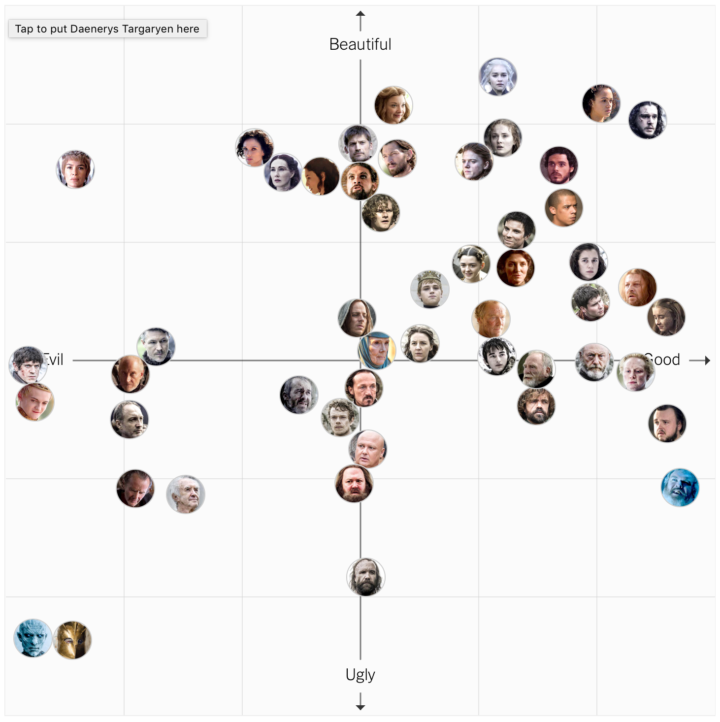
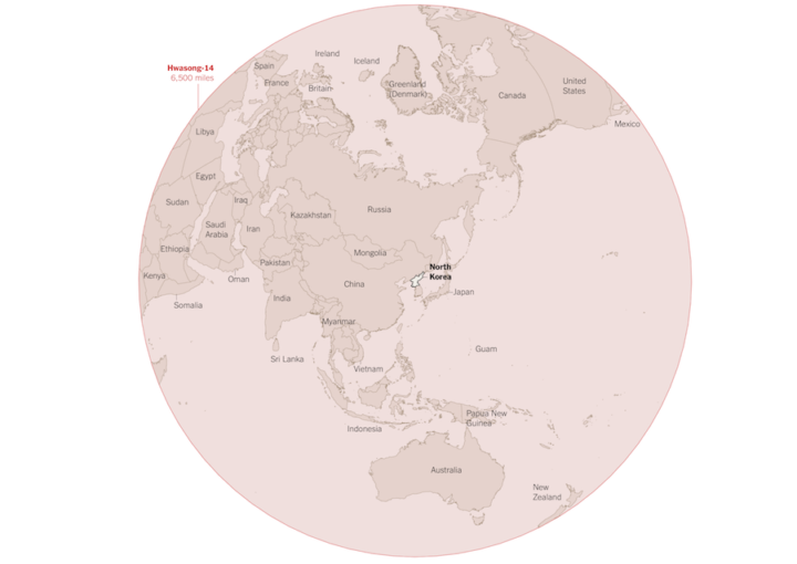
It’s been three years since the Affordable Health Care Act. Margot Sanger-Katz and Quoctrung Bui for The Upshot look at how this changed the percentage of those who were uninsured in this country. In some places the percentages didn’t change much, but in many others, there are much fewer uninsured.
-
For anyone who watched the presidential debates, I think it was fairly obvious what emotion each candidate projected at various moments. However, a group of graduate students from Columbia University applied computer vision and sentiment analysis to get a more quantitative gauge. Because, sure, why not. Sarah Slobin for Quartz explains the results.
-
This is too good not to watch. It’s a 1961 documentary on cartography and geography from the United States Air Force. Watch in all its vintage glory below.(You might want to turn down the volume during the first half minute.)
[via @mapdragons]
-
There’s been a lot of talk about building a wall at the U.S.-Mexican border lately. Seems straightforward enough, right? Just put some bricks up and be done with it. Well, it’s not really that easy, just from a logistics standpoint. Nevermind the politics. Josh Begley for the Intercept grabbed satellite images for the 1,954 miles of boundary line and then strung together the 200,000 images in a time-lapse to show the scale of what “build that wall” means.
-
Map making is a finicky challenge where oftentimes your map data — points, lines, and polygons — must align just right with your external data that exists as a CSV file or related. Mapshaper is an online tool that helps you massage your geographic data to where it needs to be.
The online application has been around for a while, but I only recently used it, and it’s kind of magical. It’s one of those things where you half expect the whole thing to fail, and then when it seems to be working you still expect there to be some wrinkle that makes using the tool a pain. Not so with Mapshaper.
-
One of best ways to learn visualization in any given software is to look at examples and apply to your own data. The R graph gallery helps you with the first part providing plenty of examples and the code snippets to make them. It’s still relatively new, but it should prove useful as it grows (hopefully). [via Revolutions]
-
Adam Pearce for the New York Times charted ad spending for Clinton and Trump, starting 20 weeks out from the election up to present. I like the John McCain, Mitt Romney, and Barack Obama spends as a point of reference.
-
Transitioning Map, Part 1: Mapping Irregular Data with Interpolation in R
Rarely do you have evenly-spaced data across an entire geographic space. Here is a way to fill in the gaps.
-
The Donald Trump campaign has a habit of highlighting poll results with a bar chart that just shows the top portion. The bottom baseline fades away somewhere or the values follow a random scale. They’re supposed to start at zero.
John Muyskens for the Washington Post highlights the campaign’s bar chart usage, and why it’s problematic. Sometimes if the bars were placed correctly, the results would show more favorable for Trump. The bar charts are just decorative, basically.
-
Interactive charts in R are still so-so, but if you don’t mind giving up some flexibility and just want something quick without having to learn a new language, there are a handful of options. RStudio highlights the highcharter package, which is a wrapper around the JavaScript-based Highcharts.
So the story goes that Torstein Hønsi, the founder and Chief Product Officer of Highcharts. was looking for a simple charting tool for updating his homepage with snow depth measurements from Vikjafjellet, the local mountain where his family keeps a cabin. Frustrated with the common flash plug-ins, and other proprietary solutions available at the time, he decided to build a standards-based solution of his own and then, of course, share it.
Write R. Get an interactive chart to export.
While we’re at it, you might also be interested in the R wrapper for Plotly, which is another JavaScript charting library, and htmlwidgets, which lets you work with JavaScript libraries within R (and highcharter makes use of).
-
Photographer Mike Kelley visited airports around the world, took pictures of airplanes leaving, and then pieced the photos together in a series of composite photos. The result was Airportraits.
A bit about the arduous process:
I often get asked exactly just how ‘real’ these images are. And on one hand, they are as real as they get. I’d sit in one place for an entire day, and take a burst of pictures of each plane as it crossed in front of me. I’d then take one of those captures, wherever I thought I’d like that plane to be, and put it on my base image. Every plane in every picture was actually right in front of me at that point in time, and they are all exactly where they were relative to other planes in the frame. If you went to some of these spots, you’d see the exact same thing that I saw.
I want to buy a camera.
-
Choice of color scale can make a big difference in how the data reads. A careless choice might make the data appear skewed too far low or too far high, so you need to look at the data and decide what’s right for the context. But, sometimes you just gotta make a lot of charts or maps. Or, you just don’t feel like manually picking the colors.
David Schnurr describes a way to use clustering to pick the natural breaks in a more automatic fashion. The best part:
In an effort to make it easier for anyone to use this technique in data visualizations, I’ve ported this new algorithm to JavaScript and created a custom d3 scale called d3-scale-cluster. You can find d3-scale-cluster on Github and npm–give it a try and shoot me a tweet @dschnr with your thoughts!
And I await for someone to make an R package.
-
I think many of us can relate to this during the odd election cycle. Marcus Wohlsen for Wired describes the constant visits and refreshes to FiveThirtyEight for new polls and projections.
Evan is a poll obsessive, FiveThirtyEight strain—a subspecies I recognize because I’m one of them, too. When he wakes up in the morning, he doesn’t shower or eat breakfast before checking the Nate Silver-founded site’s presidential election forecast (sounds about right). He keeps a tab open to FiveThirtyEight’s latest poll list; a new poll means new odds in the forecast (yup). He get push alerts on his phone when the forecast changes (check). He follows the 538 Forecast Bot, a Twitter account that tweets every time the forecast changes (same). In all, Evan says he checks in hourly, at least while he’s awake (I plead the Fifth).
This was me for a while, and no matter what the forecasts say, I never feel good about what I see. Because there’s always a chance.
-
Past Visions, a visual archive of Frederick William IV’s, shows thousands of drawings penned by the Prussian king.
Frederick William IV of Prussia (1795 – 1861) left a collection of drawings behind. They bear witness to historical events such as wars and revolutions, literary influences or personal obsessions with the devil. Numerous sheets reveal the planning eye of the King in the form of architectural visions and dreamy drafts.
Quickly browse the drawings by time and by category, all in high resolution. Nice.
-
Watch the regional changes across the country from 1990 to 2016.
-
Mapzen just released a Tron-style slippy map.
Today we introduce TRON version 2 as a fully realized Mapzen house style, rebuilt from the ground up to take advantage of the latest features of the Tangram graphics engine and Tangram blocks. With this new version, visual forms and elements transform per zoom, revealing new cartographic details and a deep exploration of scale transformations.
It’s slick. Be sure to zoom in.
-
I love the statistics lessons coming out of the Upshot, in the context of the upcoming election. In their most recent, Nate Cohn goes into varying statistical weights and how just one man can unknowingly shift the polls.
Our Trump-supporting friend in Illinois is a surprisingly big part of the reason. In some polls, he’s weighted as much as 30 times more than the average respondent, and as much as 300 times more than the least-weighted respondent.
Alone, he has been enough to put Mr. Trump in double digits of support among black voters. He can improve Mr. Trump’s margin by 1 point in the survey, even though he is one of around 3,000 panelists.
He also put Hillary Clinton ahead recently, because he wasn’t in the sample.
-
Last month Pitch Interactive launched an online tool for tiled cartograms, or tilegrams for short. Upload your state-by-state data, and it does the rest. Now you can make them in R, thanks to Bhaskar Karambelkar, since I know you’re just itching to make your own election maps.