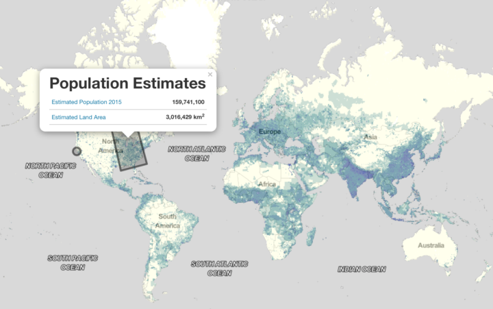
FiveThirtyEight used a dataset on broadband as the basis for a couple of stories. The data appears to be flawed, which makes for a flawed analysis. From their post mortem:
We should have been more careful in how we used the data to help guide where to report out our stories on inadequate internet, and we were reminded of an important lesson: that just because a data set comes from reputable institutions doesn’t necessarily mean it’s reliable.
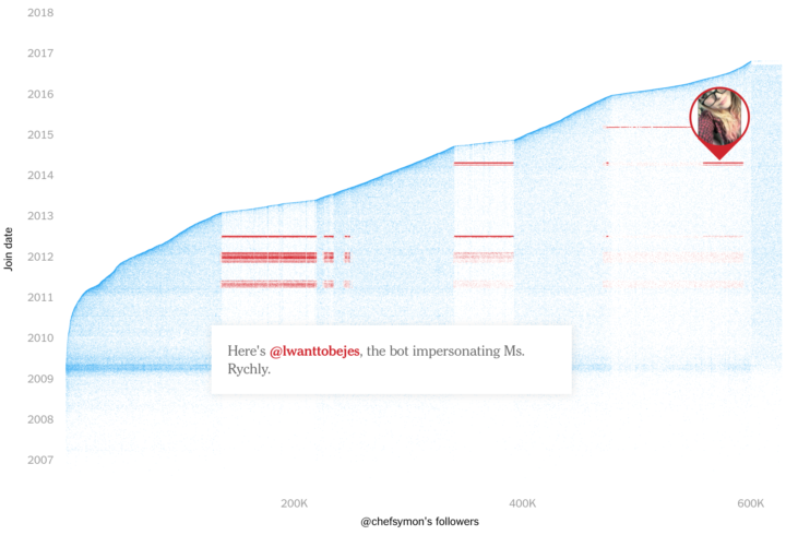
Then, from Andrew Gelman and Michael Maltz, there was the closer look at data collected by the Murder Accountability Project, which has its merits but also some holes:
if you’re automatically sifting through data, you have to be concerned with data quality, with the relation between the numbers in your computer and the underlying reality they are supposed to represent. In this case, we’re concerned, given that we did not trawl through the visualizations looking for mistakes; rather, we found a problem in the very first place we looked.
There’s also the ChestXray14 dataset, which is a large set of x-rays used to train medical artificial intelligence systems. Radiologist Luke Oakden-Rayner looked closer, and the dataset appears to have its issues as well:
In my opinion, this paper should have spent more time explaining the dataset. Particularly given the fact that many of the data users will be computer scientists without the clinical knowledge to discover any pitfalls. Instead, the paper describes text mining and computer vision tasks. There is one paragraph (in eight pages), and one table, about the accuracy of their labeling.
For data analysis to be meaningful, for it to actually work, you need that first part to be legit. The data. If the data collection process rates poorly, missing data outnumbers observations, or computer-generated estimates aren’t vetted by a person, then there’s a good chance anything you do afterwards produces questionable results.
Obviously this isn’t to say avoid data altogether. Every abstraction of real life comes with its pros and cons. Just don’t assume too much about a dataset before you examine it.

 Visualize This: The FlowingData Guide to Design, Visualization, and Statistics (2nd Edition)


