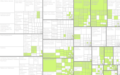
American Daily Routine
Sleep. Work. Play. Rinse and repeat. This is the gist of most people’s daily routine, but the amount of time varies as more responsibilities kick in. Some people spend more time taking care of others in the house, some don’t have a paying job, and of course, the weekday schedule is usually different from the weekend’s.
The chart below shows a picture of the American daily routine and how it changes for different groups. Each bar represents an activity, and they sort by the time of day that most people are engaged in an activity. Color indicates the percentage of people during a given time frame.
So reading from top to bottom you get a sense of a schedule.
As a parent of two, I’m always interested in the balance between work and taking care of kids. So it’s interesting to see “caring for household members” shift up and down when you toggle between male and female. The percentages are always low for males.
Or, if you toggle between employed and unemployed, you see a routine of sleep, work, commute, and relax for the former. You see dark colors in fewer bars. But when you switch to unemployed, the color range looks more sparse and the schedule shifts to the right for later wake-up times.
Maybe the most important thing I learned is that schedule of the male not in the labor force (“not looking” above) on a weekend looks pretty sweet. That’s the dream right there.
 A Day in the Life of Americans
I simulated an average day for 1,000 Americans.
Notes
- This is based on 2015 and 2016 data from the American Time Use Survey. I used the IPUMS time use extract builder to download the data, which is much easier than sifting through the government FTP.
- I used Python to aggregate the data, R to analyze and play around with the aggregates, and d3.js to visualize here.
Chart Type Used

Become a member. Support an independent site. Make great charts.
See What You Get