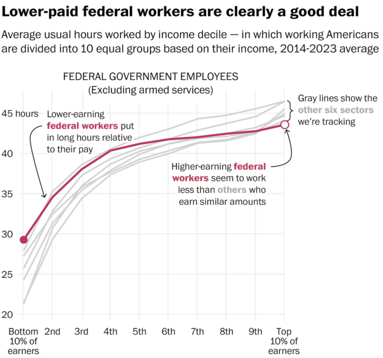
• Membership
  • Newsletter
  • Projects
  • Learning
  • About
  • Member Login
  • Data Underload  /  age, employment, work

    Employment Rates and Age, More Work and More Years

    In 1935, the United States Congress passed the Social Security Act to provide financial support to those 65 years and older. Full retirement age would slowly rise to 67 by 2022. We can see how this changed the scales of who works and for how long through employment rates by age and time.

    Read More
  • Evolution of the love song

    November 13, 2024

    Topic

    Statistical Visualization  /  David Mora, love, Michelle Jia, Pudding, song

    For The Pudding, David Mora and Michelle Jia examine the death of the love song, or rather, the evolution of the love song to include other types alongside the sappy and puppy dog types.

    Each bubble represents a song, and bubble size represents the number of weeks each song spent in the Billboard Top 10. Then they go back and forth between the bubble view above, beeswarm charts, and an alluvial diagram below.

    FD readers will likely be interested in the footnotes at the end of the piece. There are notes on methodology, song classification, and a link to download the data.

    The Pudding has been publishing at a rapid pace these past couple months. It’s quite a treat.

  • See you on Bluesky

    November 12, 2024

    Topic

    Site News

    Bluesky, maybe best pitched as a place for those who liked Twitter and Google Reader more than a decade ago, is having a moment right now. You can find me there.

    It’s always hard for these things to maintain momentum, but we’ll see. The shift feels real this time. A good portion of the visualization community is over there, and some, like me, are rediscovering social media.

    Sky Follower Bridge is a useful plugin for Chrome and Firefox to find the people you used to follow on X.

    Hope to see you there.

  • Dot density map for election results

    November 12, 2024

    Topic

    Maps  /  Economist, election

    With what is now a common mapping method, The Economist used a dot density map to show election results by county. The dot counts are scaled to population density.

    At first glance, I thought it was a 2024 version of this 2020 election map that shows the mix of voting within regions. A two-dimensional angle for grains of sand. But the map above shows just the winner of each county, which caught me off guard, because I associate the method with mixing demographic groups.

  • Mapping every voter as a grain of sand

    November 12, 2024

    Topic

    Maps  /  election, metaphor, Washington Post

    To show the mix of votes across the country, the Washington Post used a sand pile metaphor. Each grain of sand represents a vote for red or blue, and more votes create larger piles. Some piles are more red and some are more blue, but overall, you get a lot of mixed piles.

    This is in contrast to a choropleth map that shows the winner in each region. One is not necessarily better than the other. Instead, this sand map shows a different angle to the data.

  • Days without rain

    November 12, 2024

    Topic

    Statistical Visualization  /  Bloomberg, drought, rain

    New York City recently issued a drought warning because of an abnormally dry fall. For Bloomberg, Denise Lu used a heatmap to highlight day streaks without rain via precipitation measurements in Central Park.

    It’s more of an event-driven graphic than a pattern-driven one. I wonder if reversing the color scale would be useful here. Would it make the longer streaks appear “dryer” with empty space?

  • 23andMe sinking

    November 11, 2024

    Topic

    Data Sharing  /  23andMe, BBC

    For BBC, Zoe Kleinman reports:

    Not so long ago, 23andMe was in the public eye for all the right reasons.

    Its famous customers included Snoop Dogg, Oprah Winfrey, Eva Longoria and Warren Buffet – and millions of users were getting unexpected and life-changing results.

    Some people discovered that their parents were not who they thought they were, or that they had a genetic pre-disposition to serious health conditions. Its share price rocketed to $321.

    Fast forward three years and that price has slumped to just under $5 – and the company is worth 2% of what it once was.

    What went wrong?

    It’s mostly wishful thinking on my part, but maybe people started to feel strange about sending their DNA to a company they didn’t know that much about.

  • What might have sank the Bayesian superyacht

    November 8, 2024

    Topic

    Infographics  /  New York Times, superyacht

    A $40 million superyacht called the Bayesian sank off the coast of Sicily, but the exact cause is unknown. The New York Times illustrated the possibilities:

    Reports immediately after the disaster raised the possibility that the Bayesian had been hit by a tornado-like disturbance called a waterspout, but the authorities don’t think that happened. Still, the wind was doing something dangerous: It was changing direction.

    According to a nearby weather station, it was blowing west-southwest then southwest, then north-northwest. This increased the chances of getting ambushed by a random gust that could slam into the side of a boat, which can tilt even a big vessel.

  • Members Only

    Random Everyday Walk

    November 7, 2024

    Topic

    The Process  /  random, uncertainty

    This week we talk randomness in the everyday.

  • Make the Chart: Scatterplot Using Text Instead of Dots

    I made a chart about Halloween candy. Even dumb charts need attention and require that choices are made.

  • European night train map

    November 7, 2024

    Topic

    Maps  /  Europe, train, travel

    The Night Train Map is for Europeans who want to travel at night:

    Have you ever wondered to which destinations you can travel by night train? Are you looking for inspiration for your next holiday? Then we got you covered: This is a map of all night train lines currently running in Europe, based on our night train database. The database and map are updated regularly to reflect time table changes and announcements of new night train services.

    The emotion I am feeling is envy.

  • Restored rose and lily illustrations from the Pierre-Joseph Redouté collection

    November 6, 2024

    Topic

    Infographics  /  catalog, flowers, Nicholas Rougeux, Pierre-Joseph Redouté

    In the early 1800s, botanist and painter Pierre-Joseph Redouté painted hundreds of lily and rose species. Nicholas Rougeux restored the illustrations by hand for an accurate and browsable catalog of flowers. Rougeux documented the tedious process.

    The illustrations organized by color are available as posters.

    (In case you need something nice to look at after a long night.)

  • Jello map as states are called

    November 5, 2024

    Topic

    Maps  /  Bloomberg, election, food, physical

    The Bloomberg Graphics desk is building out a jello map as states are called. Because sure why not.

  • Electoral vote cartogram

    November 5, 2024

    Topic

    Maps  /  Bloomberg, election

    The major news outlets all have electoral vote cartograms, but I appreciate Bloomberg’s version that is extra Tetris-like. I think it’s the spacing and extra thin grid lines.

  • Why states swing while counts come in

    November 5, 2024

    Topic

    Statistical Visualization  /  election, Washington Post

    Some might wonder why early results lean towards a party and then shift decisively over time. The mistake comes when one assumes that results are about the same everywhere in a state, regardless of voting method. For the Washington Post, Bonnie Berkowitz, Szu Yu Chen, and Mark Berman illustrate what’s happening through the lens of the 2020 election.

    In short, suburban counties usually get their counts in first, and they tend towards Republican. City centers and mail-in ballots come in later, and they tend towards Democrat.

  • Live map of county shifts

    November 5, 2024

    Topic

    Maps  /  election, tracker, Washington Post

    The Washington Post has a live county map that shows the shift towards Democrat or Republican compared to the 2020 election. It updates every 30 seconds.

    Angled arrows show the magnitude and direction of the shift. A larger arrow represents a larger shift and a left or right direction represents a shift to Democrat or Republican, respectively. Color reinforces the direction.

    They also have these pendulums to show the swings in broader categories:

    I like the metaphor.

    As of this writing, it’s still early, so there’s not much to see yet, but it could be interesting to watch as more polls close.

  • Election touchscreen really deep dive by The Onion

    November 5, 2024

    Topic

    Maps  /  election, humor, Onion, scale

    The Onion gained access to the most granular election data yet. Technology sure has come a long way.

  • Presidential candidate preferences, by offbeat demographics

    November 5, 2024

    Topic

    Statistical Visualization  /  demographics, election, YouGov

    You’ve seen the voting tendencies among standard demographic groups, but there is so much more to explore. For YouGov, David Montgomery has the breakdown for less standard groups.

    It is so dumb yet so necessary.

  • When to expect results from each state, based on previous elections

    November 5, 2024

    Topic

    Statistical Visualization  /  elections, results

    Some states count quickly, whereas others can take days. For NYT, Alicia Parlapiano and Lazaro Gamio show how long it took states to call elections in 2020 and 2022 for an idea of what to expect tonight. Instant gratification is probably not on the way.

  • When the polls close

    November 5, 2024

    Topic

    Maps  /  election, New York Times, time

    For The New York Times, June Kim, Leanne Abraham, and Maggie Astor provide a reference for when the polls close this election day. A series of maps show the status in each state for the hours between 4:00pm and 11:00pm Mountain Time, with half-hour maps at 5:30pm and 6:30pm, as some polls close earlier.

  • Page 15 of 392
  • <
  • 1
  • ...
  • 12
  • 13
  • 14
  • 15
  • 16
  • 17
  • ...
  • 392
  • >

Analyze, visualize, and communicate data usefully, beyond the defaults.

Become a member →

Recently for Members

May 8, 2025
When the data is not what it seems

May 1, 2025
Finding the Right Charts

April 24, 2025
Visualization Tools, Datasets, and Resources – April 2025 Roundup

April 17, 2025
Breaking Out of Chart Software Defaults

April 15, 2025
Line Chart with Decorative Neon Accents

Browse by Chart Type See All →

Density Plot Choropleth Map Treemap Gantt Chart Frequency Trails Difference Chart Dot Density Map Square Pie Chart Line Chart Word Cloud

Browse By Topic

  • Visualization

    Seeing data

  • Maps

    Seeing geographic data

  • Infographics

    Explaining data

  • Networks

    Connecting data

  • Statistics

    Analyzing data

  • Software

    Working with data

  • Sources

    Getting data

  • Design

    Making data readable

Get the Book

Visualize This: The FlowingData Guide to Design, Visualization, and Statistics

Available now.

Order: Amazon / Bookshop

Made by FlowingData

  • The Process

  • Data Underload

  • Chart Everything

  • Guides

  • Books

  • Shop

  • About
  • Contact
  • Newsletter
  • LinkedIn
  • Instagram
  • Bluesky
  • RSS
Copyright © 2007-Present FlowingData. All rights reserved.