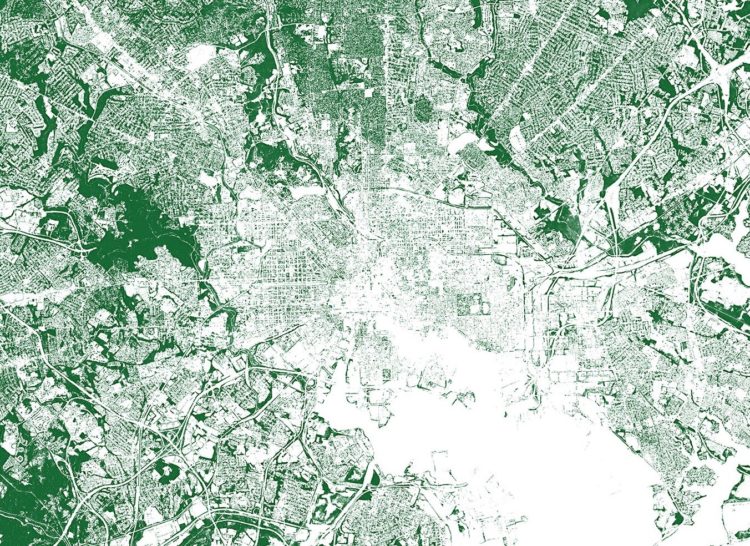
-
Morph, by Datavized in collaboration with the Google News Initiative, is a tool to generate abstract images from data:
Morph exists to engage users in the creative expression of data without having to code. Generative art based algorithms turn data into a visual representation and the user can affect how their data interacts with the final visual via the algorithm. The algorithms themselves are not fixed; the user can randomly mutate, evolve and generate new algorithms creating new visuals, encouraging the sense of creative exploration and discovery.
Just upload your data, select some options to map variables to visual encodings (or have the app pick random ones for you), and see what you get. Be sure to try the “evolve” option at the end, which shows a bunch of variations of your generated image.
The results are pretty abstract, so I’m not sure if it has practical uses in the traditional data settings, but it’s fun to play with. And maybe it could be useful to quickly flip through visual encodings.
-
While a drink a day might increase your risk of experiencing an alcohol-related condition, the change is low in absolute numbers.
-
Here’s a fun piece by Andy Bergmann that shows the timeline of Earth. It’s a long-ish, straightforward scroller that vertically spaces significant events during the history of the planet. You start with the formation of Earth 4.6 billion years ago and work your way up to present day.
-
Hey, no one told me that baby name analysis was back in fashion. Dan Kopf for Quartz, using data from the Social Security Administration, describes the downfall of the name Heather. It exhibited the sharpest decline of all names since 1880.
Talking to Laura Wattenberg:
Wattenberg says the rise and fall of Heather is exemplary of the faddish nature of American names. “When fashion is ready for a name, even a tiny spark can make it take off,” she says. “Heather climbed gradually into popularity through the 1950s and ’60s, then took its biggest leap in 1969, a year that featured a popular Disney TV movie called Guns in the Heather. A whole generation of Heathers followed, at which point Heather became a ‘mom name’ and young parents pulled away.”
-
Members Only
-
How to Make a Tiled Bar Chart with D3.js
Show individual data points by splitting bars into smaller cells.
-
We talk about geographic bubbles a lot these days. Some areas are isolated, in their own bubble. Other areas seem more connected. Emily Badger and Quoctrung Bui for The Upshot looked at this geographic connectedness through the lens of Facebook friendships.
In the millions of ties on Facebook that connect relatives, co-workers, classmates and friends, Americans are far more likely to know people nearby than in distant communities that share their politics or mirror their demographics. The dominant picture in data analyzed by economists at Facebook, Harvard, Princeton and New York University is not that like-minded places are linked; rather, people in counties close to one another are.
There are two main parts to the piece. The first one is a county map that you can mouse over to see the likelihood of friendship with those in other counties. The second part imagines a country split up into regions based on Facebook connections. Be sure to catch them both.
-
Hurricane Florence brought a lot of rain, which in turn made river levels rise. The New York Times animated the rise over a five-day period. The height of the bars represents the rise of the river level, as compared to levels on Thursday.
I like the visual metaphor of bars going up with river levels. I’m not sure the sudden rise and falls in such short periods of time would appear as surprising.
-
What are the ingredients that make each cuisine? I looked at 40,000 recipes spanning 20 cuisines and 6,714 ingredients to see what makes food taste different.
-
When you try to describe the size of something but don’t have an exact measurement, you probably compare it to an everyday object that others can relate to. Using the Google Books Ngram dataset, Colin Morris looked for how such comparisons changed over the past few centuries.
I especially like the bits of history to explain why some words fell into and out of fashion.
-
There are endangered species where the remaining few in the world could fit on a single car train. Mona Chalabi for The Guardian imagined such a scenario.
Usually when we talk about scale and putting numbers into perspective, it’s about imagining the large ones. What does a million look like? A billion? Chalabi’s illustrations take it the other direction.
-
Typhoon Mangkhut went through the northern end of the Phillipines a few days ago. At least 25 people died. The New York Times provides a scrolling 3-dimensional view using data collected by NASA satellites.
-
I talked with Moritz and Enrico on Data Stories, my favorite visualization podcast. They’ve been providing a healthy balance of practice and research since 2012.
I don’t dare listen to myself, but based on the show notes we talked about FlowingData over the years, some of the changes in visualization, and answered listener questions. You can listen here.
-
The Weather Channel is using a realistic 3-D depiction surrounding a reporter to show what a storm surge might bring. Here, just watch it:
[arve url=”https://www.youtube.com/watch?v=q01vSb_B1o0″ /]
-
Waffle House activated their storm center in preparation for Hurricane Florence. Their restaurants are open 24/7, so they need to keep track of which ones need to close or limit their menus. This might also have to do with an informal Waffle House Index that FEMA described last year:
If a Waffle House can serve a full menu, they’ve likely got power (or are running on a generator). A limited menu means an area may not have running water or electricity, but there’s gas for the stove to make bacon, eggs, and coffee: exactly what hungry, weary people need.
It’s more than just a Waffle House though.
Businesses in communities are often some of the biggest drivers of recovery. If stores can open, people can go back to work. If people can go back to work, they can return to at least one piece of a normal life—and that little piece of normalcy can make a big difference.
Hold up. I think I got it. If we just keep all the businesses open, we can avoid all disaster. That’s how causation-correlation works, right? Nailed it.
(Stay safe, Carolinians.)
-
Brian House collected polluted water with acid mine drainage in the Tshimologong Precinct, Johannesburg and translated pollution levels to sound:
Acid Love comprises vessels of AMD gathered from a mine on the outskirts of the city. These are connected in an electrical circuit that measures the conductivity from the metals of the water and coverts it into sound. The sound is further modulated by data gathered from remediation efforts at the mine. The installation itself also performs a remediation process—over time the metals will precipitate to the bottom of the vessels, and both the sound and the color of the water will change as it is purified.
[via @blprnt]
-
Hurricane Florence is forecast to touch down Thursday night or Friday, and what’s become the norm, there are several ways to see where the hurricane is and where it might go. Here are a handful of views. Each focuses on different aspects of potential storm.
Read More