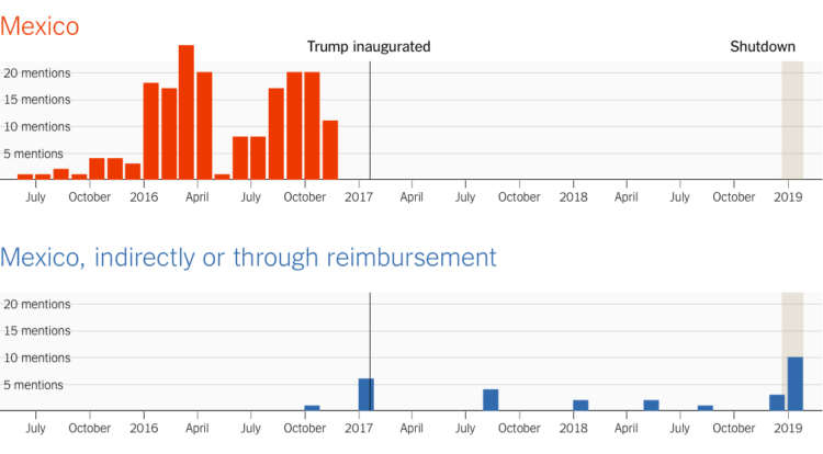
For The Upshot, Kevin Quealy continues on his path looking at the words used by Donald Trump. This time Quealy examines descriptions of the wall and who will pay for it, pre- and post-inauguration.
For The Upshot, Kevin Quealy continues on his path looking at the words used by Donald Trump. This time Quealy examines descriptions of the wall and who will pay for it, pre- and post-inauguration.
Gustavo Turner for Logic on his experiences covering the porn industry and the introduction of data into the stream:
Over the course of these experiences, I learned about a major new force reshaping the industry: data. That day on set, the director’s instructions came directly from the production company, which decided on the topic and vetted the script. And the company based its creative direction on specific fantasies proposed by paying customers on an online forum that it owned. […]
In the pre-internet days, a producer might notice that a particular kind of porn movie sold well, and then try to make more like it. Today, a corporate porn conglomerate can analyze a continuous stream of information from online viewers, who supply feedback in the form of comments, and leave behind a data trail as they travel around porn sites.
What a time to be alive.
Only 15 people have done it, since you know, it’s not really easy to do. Here’s how and when they did it.

Kjetil Golid made an interactive that lets you generate a noise field using a gradient from an image of your choosing. Fun. And excellent wallpaper material.
It’s the scale of significant Star Wars characters, objects, and ships from Episode I through VIII, plus Rogue One and Solo. Need I say more?
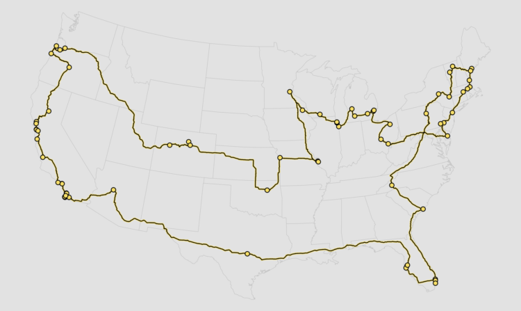
Visit the best American breweries of 2018, based on RateBeer rankings, while minimizing travel time and distance.
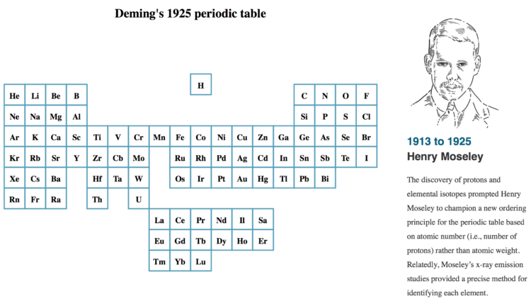
As more elements were discovered, the table grew and changed layout. For Science Magazine, Jake Yeston, Nirja Desai, and Elbert Wang provide a visual history.

In visualization, there are tools, templates, and defaults, which are meant to be copied and reused. Then there are data graphics that are designed with a specific purpose and dataset, which are something more than a certain chart type.
Jan Willem Tulp visualized train travel times using distance and color as an indicator. His reasoning:
When a train starts running from one station to the next station, conceptually, these two stations will temporarily be closer to each other. And that is exactly what this visualization shows: whenever a train moves to the next station — and only for as long as a train is moving — the origin station moves towards the destination station.
Be sure to watch the animation run with organic-looking behaviors.
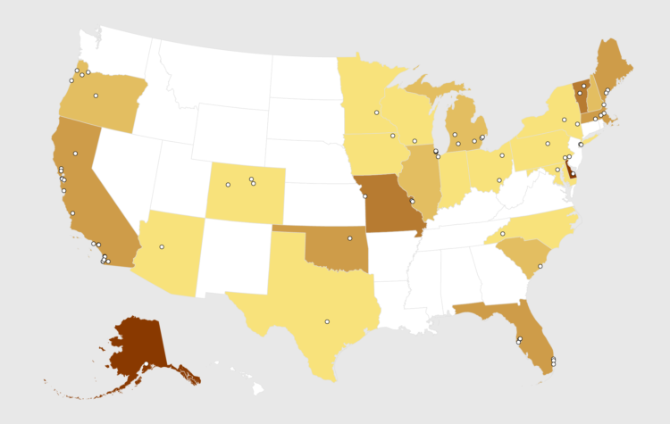
RateBeer puts out a list every year for top 100 breweries in the world. Here are the states that cracked the list.

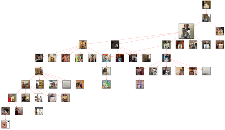
It started with a mom holding her painting of a bird. Then someone painted that photo and took a picture of himself holding the painting. Then someone painted the photo of the man holding the painting of the picture of the mom holding the bird. The recursion continued. Luckily someone diagrammed all of the iterations:
Just wow.
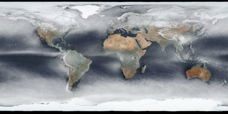
Using a year’s worth of daily images from NASA’s Visible Infrared Imaging Radiometer Suite (VIIRS), Johannes Kroeger constructed the average snapshot for 2018. Fun.
Many parents stop at two kids. Most are done by three. Still, everyone has their own timelines. Here are 1,000 of them.
Throughout the month I collect new tools for data and visualization and additional resources on designing data graphics. Here’s the new stuff for January.
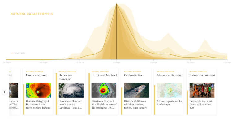
A wideout view of the news cycle can look like a series of rise and falls. Something captures the general public’s attention, and then it fades off. Thank you, next. This collaboration between Schema Design and Google Trends charts search volume for news stories and aligns them by their peaks, so that you can see these rise and falls.
Transparent areas overlaid on each other show an “average” trend, and the more irregular shapes are made obvious because they stand out from the rest.
See also the simpler view by Axios, who contributed stories to the project.
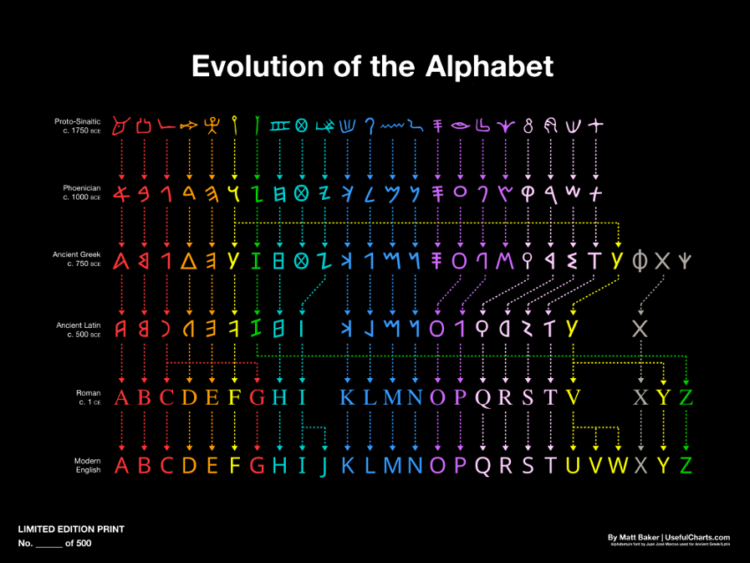
Matt Baker provides this nifty diagram on how the alphabet changed over the centuries, evolving to what it is now. Grab the print.
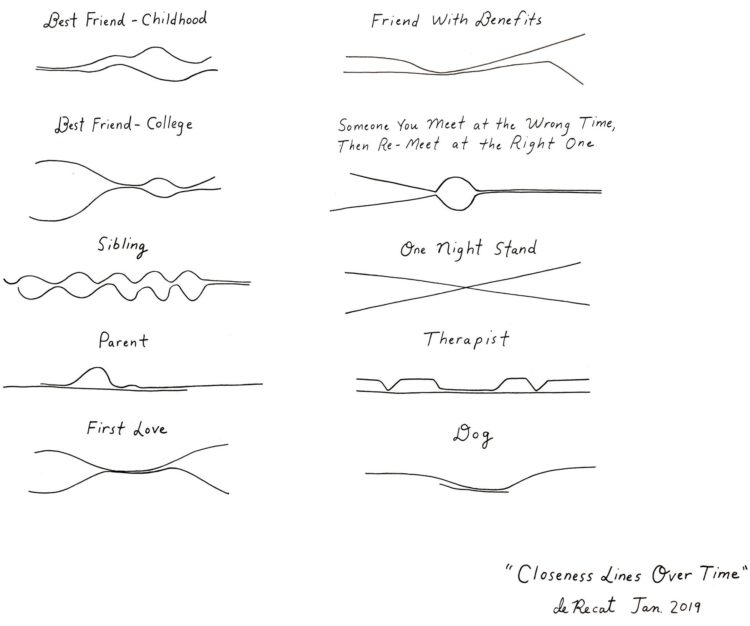
Cartoonist Olivia de Recat illustrated the closeness over time for various relationships. Charming. Unfortunately, the print is sold out. Sad trombone.
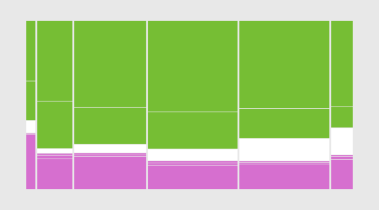
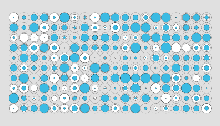
Also known as a Marimekko diagram, the mosaic plot lets you compare multiple qualitative variables at once. They can be useful, sometimes.

First comes love, then comes marriage, then comes baby in the baby carriage. Sometimes.
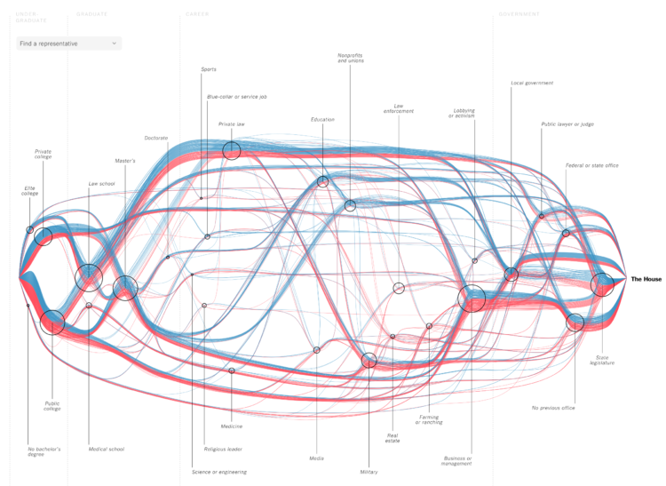
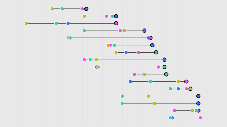
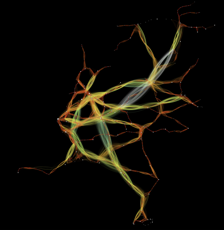
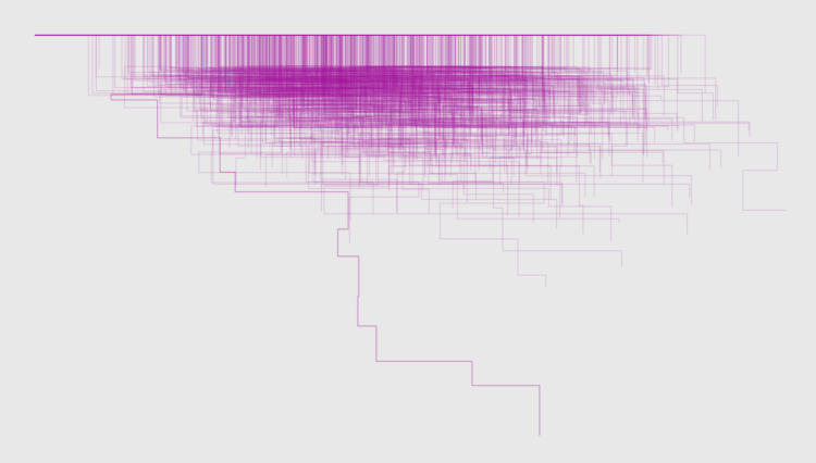
For The New York Times, Sahil Chinoy and Jessia Ma visualized the path to Congress for every member. See it all at once like above or search for specific members. The vertical scale represents previous categories of work and education and looks like it’s sorted by how common the categories were among Republicans and Democrats. The horizontal scale represents time, which starts at undergraduate and finishes at the House. Nice.
 Visualize This: The FlowingData Guide to Design, Visualization, and Statistics (2nd Edition)
New tools, refined process.


