News outlets tend to highlight the first 100 days of a new administration, and they like to show the changes with charts. It gives a feel for a true direction instead of empty claims and where we might be headed for the next few years. This time around was no exception.
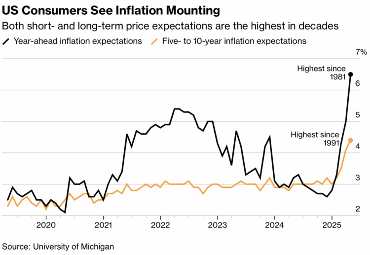
For Bloomberg, Mark Niquette and Gregory Korte charted the economy, which is complex and can’t be shown with a single metric, so they showed several, such as inflation expectations:
For Axios, Jacque Schrag and Natalie Daher used a timeline of events, color coded by type:

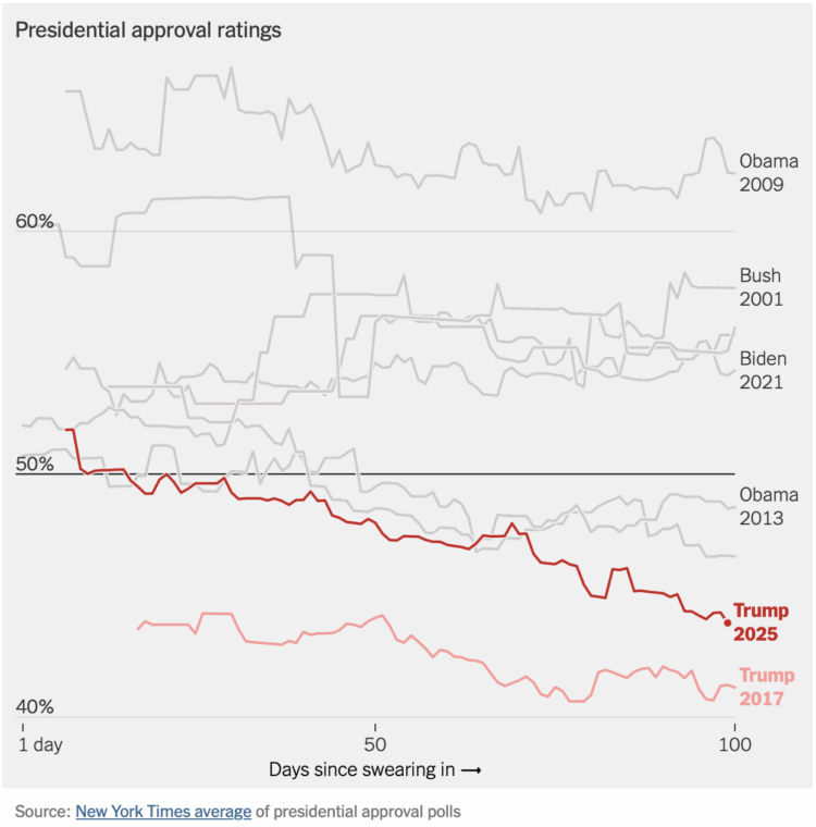
Irineo Cabreros and Aatish Bhatia, for NYT’s the Upshot, used eight charts, closing with approval rating:
Not to be outdone, the Washington Post used ten charts and made sure to number them. On executive orders aimed at the bureaucracy:

Financial Times (paywalled) also went with ten charts to show the first 100 days. Reuters used 47 photos instead.
I am sure there were many more, but you get the picture.


 Visualize This: The FlowingData Guide to Design, Visualization, and Statistics (2nd Edition)


