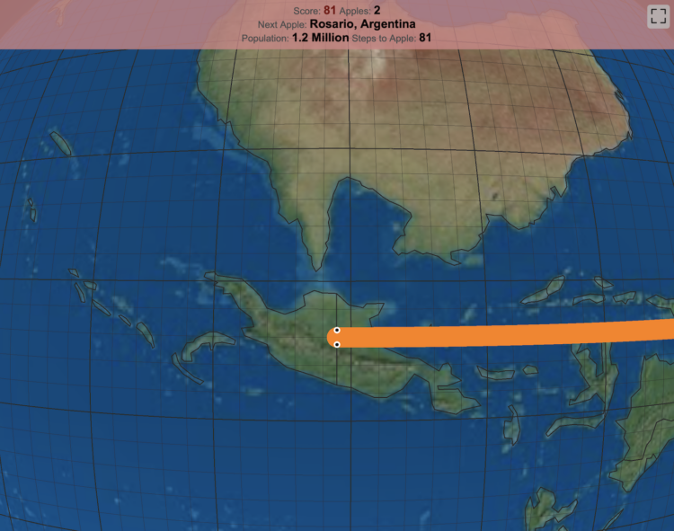
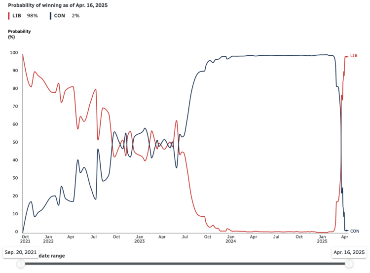
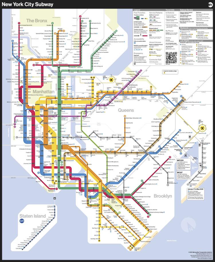
The goal of Snake is to direct a snake towards food, and each time the snake eats, it gets longer. The game ends when the snake crosses itself. This version of the game by Engaging Data puts the snake on a globe.
The game includes the largest cities in the world and tests your geographical knowledge about country and city locations. Your challenge is to move to the next apple and city in the most efficient manner, moving only along lines of longitude or latitude. But remember you are on a sphere so you can move around the globe in any of four directions: over the poles and east and west.
The game ends when the snake crosses itself or it takes too long to reach the next city. Fun and educational.
I spent many hours in high school playing Snake on my TI-83 Plus graphing calculator, so this was delightful.

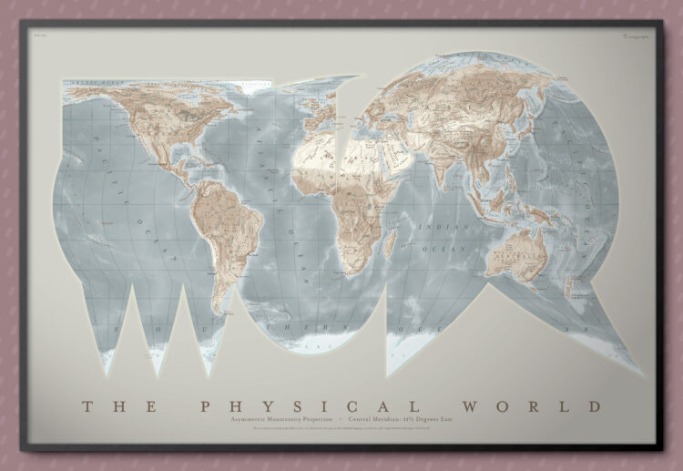


 Visualize This: The FlowingData Guide to Design, Visualization, and Statistics (2nd Edition)


