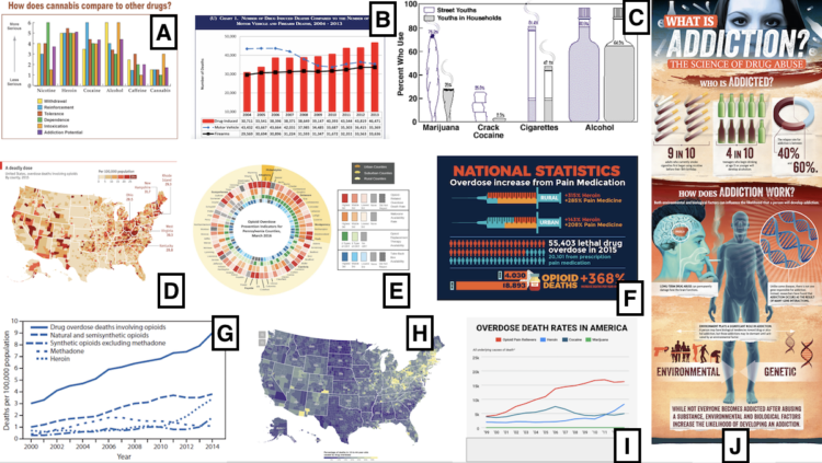
Researchers went around rural Pennsylvania, showing people the charts above and asking what they thought about them. Evan Peck with one of the main findings from the study:
As we analyzed and coded our interviews, we were reminded of something that we often forget — data can be intimate and personal. If someone found a personal connection to any graph, it didn’t matter the color, the style or the technique. For the people we talked to, charts with personal connections superseded all other design dimensions.
Small data caveat: there were only 42 interviews.
But still, ever since I got into visualization for an audience, this was always my thought. Some say people are self-centered so readers want to know about themselves first. Maybe that’s partially true, but I also think we just like to start with what’s familiar.
So, if the data allows for it, make that familiarity and quick connection to the data easy to access.


 Visualize This: The FlowingData Guide to Design, Visualization, and Statistics (2nd Edition)
