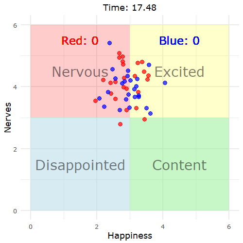
Got a chuckle out of me:
Me explaining why standardizing your variables is important: pic.twitter.com/mQKj0nEJ0G
— Chelsea Parlett Pelleriti (@ChelseaParlett) June 12, 2019

I compared time use for those with children under 18 against those without. Here’s where the minutes go.
Got a chuckle out of me:
Me explaining why standardizing your variables is important: pic.twitter.com/mQKj0nEJ0G
— Chelsea Parlett Pelleriti (@ChelseaParlett) June 12, 2019
Assuming you have a dataset in hand, how do you decide what visualization method to use?
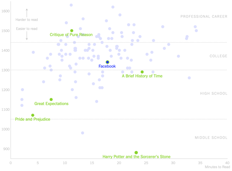
For The New York Times, Kevin Litman-Navarro plotted the length and readability of privacy policies for large companies:
To see exactly how inscrutable they have become, I analyzed the length and readability of privacy policies from nearly 150 popular websites and apps. Facebook’s privacy policy, for example, takes around 18 minutes to read in its entirety – slightly above average for the policies I tested.
The comparison is between websites with a focus on Facebook, but the main takeaway I think is that almost all privacy policies are complex, because they’re not there for the users.

Machine learning can feel like a foreign concept only useful to those with access to big machines. Runway ML aims to make machine learning easier to use for a wider audience, specifically for creators. It provides a click-and-drag interface that lets you link algorithms, import datasets, and most importantly, experiment.
Looks like fun. Give it a go.
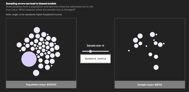
In its inaugural issue, Parametric Press describes how bias can easily come about when working with data:
Even big data are susceptible to non-sampling errors. A study by researchers at Google found that the United States (which accounts for 4% of the world population) contributed over 45% of the data for ImageNet, a database of more than 14 million labelled images. Meanwhile, China and India combined contribute just 3% of images, despite accounting for over 36% of the world population. As a result of this skewed data distribution, image classification algorithms that use the ImageNet database would often correctly label an image of a traditional US bride with words like “bride” and “wedding” but label an image of an Indian bride with words like “costume”.
Click through to check out the interactives that serve as learning aids. The other essays in this first issue are also worth a look.
From Tableau CEO Adam Selipsky:
In 2003, Tableau set out to pioneer self-service analytics with an intuitive analytics platform that would empower people of any skill level to work with data. Our customers grew with us to form the strongest analytics community in the world. And today, that mission to help people see and understand data grows stronger.
I’m excited to announce that Tableau has entered into an agreement to be acquired by Salesforce in an acquisition that combines the #1 CRM with the #1 analytics platform. By joining forces we will accelerate our ability to accomplish our mission. Together, Salesforce and Tableau share a deep commitment to empowering their respective communities and enabling people of every skill level to transform their businesses, their careers, and their lives through technology.
I’m an outsider looking in, so this surprised me, but maybe it was expected for those closer. Tableau sponsored this little site of mine for nearly a decade, so I think it might have appeared smaller to me than it actually is.
Anyways, it’ll be interesting to see where Tableau goes from here, especially for those who worked with the software outside a marketing context.
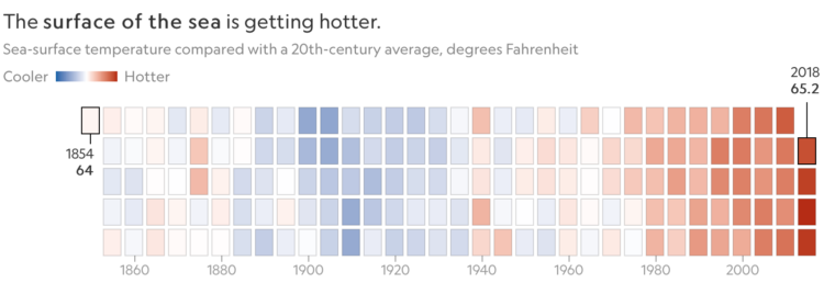
For National Geographic, Kennedy Elliot made a series of heatmaps that show the relative shifts in the ocean:
The oceans don’t just soak up excess heat from the atmosphere; they also absorb excess carbon dioxide, which is changing the chemistry of seawater, making it more acidic. “Ocean acidification is one simple and inescapable consequence of rising atmospheric CO2 that is both predictable and impossible to attribute to any other cause,” says oceanographer John Dore of Montana State University.
Great.
During a game, the range of emotions can vary widely across a crowd. Will Hipson, making use of some emotion dynamics, simulated how that range can change through a game:
What I’m striving to simulate are the laws of emotion dynamics (Kuppens & Verduyn, 2017). Emotions change from moment to moment, but there’s also some stability from one moment to the next. Apart from when a basket is scored, most fans cluster around a particular state (this is called an attractor state). Any change is attributable to random fluctuations (e.g., one fan spills some of their beer, maybe another fan sees an amusing picture of a cat on their phone). When a basket is scored, this causes a temporary fluctuation away from the attractor state, after which people resort back to their attractor.
I want to simulate emotion dynamics for all the things now.
ProPublica just released a search tool for nonprofit tax records:
The possibilities are nearly limitless. You can search for the names or addresses of independent contractors that made more than $100,000 from a nonprofit, you can search for addresses, keywords in mission statements or descriptions of accomplishments. You can even use advanced search operators, so for instance you can find any filing that mentions either “The New York Times,” “nytimes” or “nytimes.com” in one search.
Have a go here.

Don’t step so far away from the data that you miss the details that provide meaning to the overviews.
Apparently ladybugs migrate this time of year, and it’s enough to show up on the radar as a giant rain cloud. Yeah.
The large echo showing up on SoCal radar this evening is not precipitation, but actually a cloud of lady bugs termed a "bloom" #CAwx pic.twitter.com/1C0rt0in6z
— NWS San Diego (@NWSSanDiego) June 5, 2019
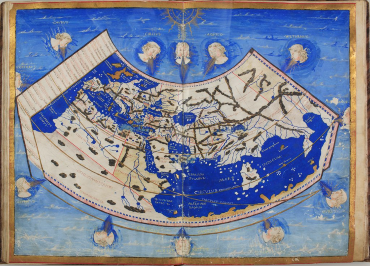
For Lapham’s Quarterly, Elizabeth Della Zazzera turns back the clock to maps used for navigation, starting with the 1300s and through 1720:
From the fifteenth to the eighteenth century, European powers sent voyagers to lands farther and farther away from the continent in an expansionist period we now call the Age of Exploration. These journeys were propelled by religious fervor and fierce colonial sentiment—and an overall desire for new trade routes. They would not have been possible without the rise of modern cartography. While geographically accurate maps had existed before, the Age of Exploration saw the emergence of a sustained tradition of topographic surveying. Maps were being made specifically to guide travelers. Technology progressed quickly through the centuries, helping explorers and traders find their way to new imperial outposts—at least sometimes. On other occasions, hiccups in cartographic reasoning led their users even farther astray.
I particularly liked the part where in fourteen hundred ninety two, Columbus sailed the ocean blue — and made miscalculations because he misread the units on a map and ended up in the wrong part of the world.
Krist Wongsuphasawat, who recently interviewed for a healthy helping of visualization jobs, outlines the questions asked and the general flow of things.
[T]here are some sessions that your data visualization skills will play the key roles, but there will be tests for other skills as well. As I have mentioned earlier, data visualization is one of the main skills, but having only that is usually not good enough to land the roles. So do your homework, figure out what are the skills required for the target roles and make sure you can tick all of the checkboxes. If you are choosing the engineering track, there will be lots of expectations for front-end engineering skills.
From there, the tasks presented to you seem to vary a lot depending on what a company is looking for. Sounds stupendous.
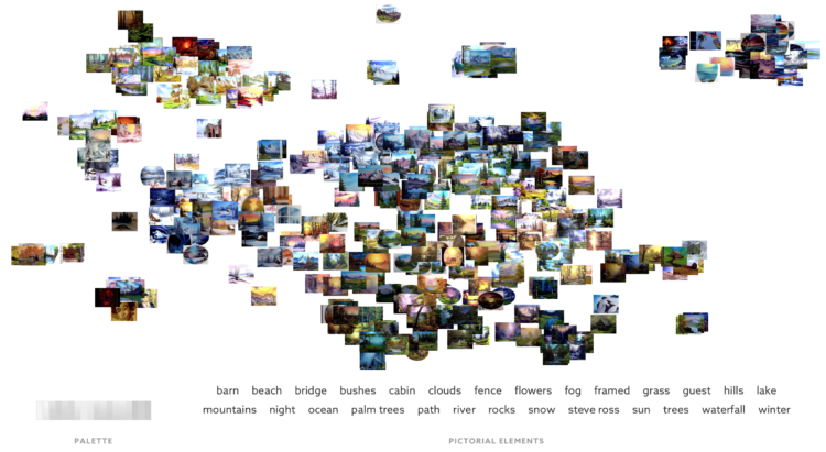
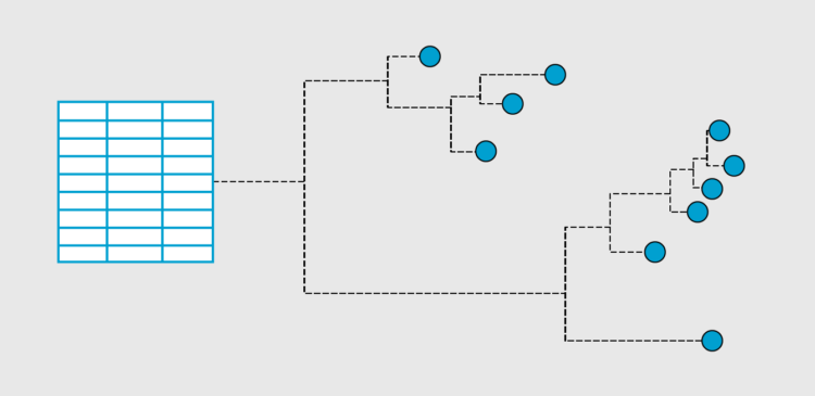
Fathom Information Design recently made tools to find patterns in documents of text. They applied their tools to Bob Ross:
Using custom tools we’ve built to understand large document sets, we analyzed the transcripts of all 403 episodes of Bob Ross’ “The Joy of Painting” to see how his famous phrases evolved over 31 seasons. That analysis, which you can read in detail, revealed the clusters shown here, which are formed by patterns in the language Ross uses when talking about each episode’s painting.
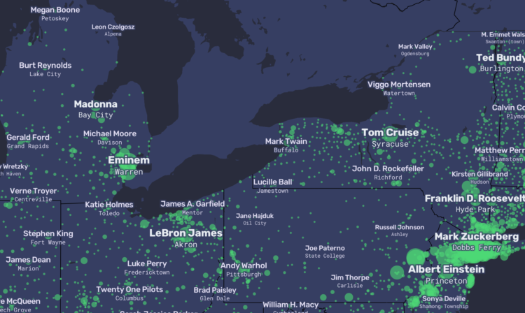
For The Pudding, Matt Daniels and Russell Goldenberg used Wikipedia pageviews to replace city names with each city’s most popular resident:
Person/city associations were based on the thousands of “People from X city” pages on Wikipedia. The top person from each city was determined by using median pageviews (with a minimum of 1 year of traffic). We chose to include multiple occurrences for a single person because there is both no way to determine which is more accurate and people can “be from” multiple places.
So you end up with LeBron James for Akron, Barack Obama for Chicago, etc.
Fun.
See also the (non-data-driven) USA song map, which inspired this one. My favorite in this map genre is the series from R. Luke DuBois, who used online dating profiles to replace city names with the most unique personal qualities.
James Holzhauer is on a record-breaking Jeopardy! win streak. It’s not so much for the number of wins in a row — an impressive 30 so far — but for how much he wins per game. He’s on pace to break current record-holder Ken Jennings’ total winnings of $2.5 million in less than half the number of games.
Chicago Tribune made this chart to show Holzhauer’s cumulative sum:
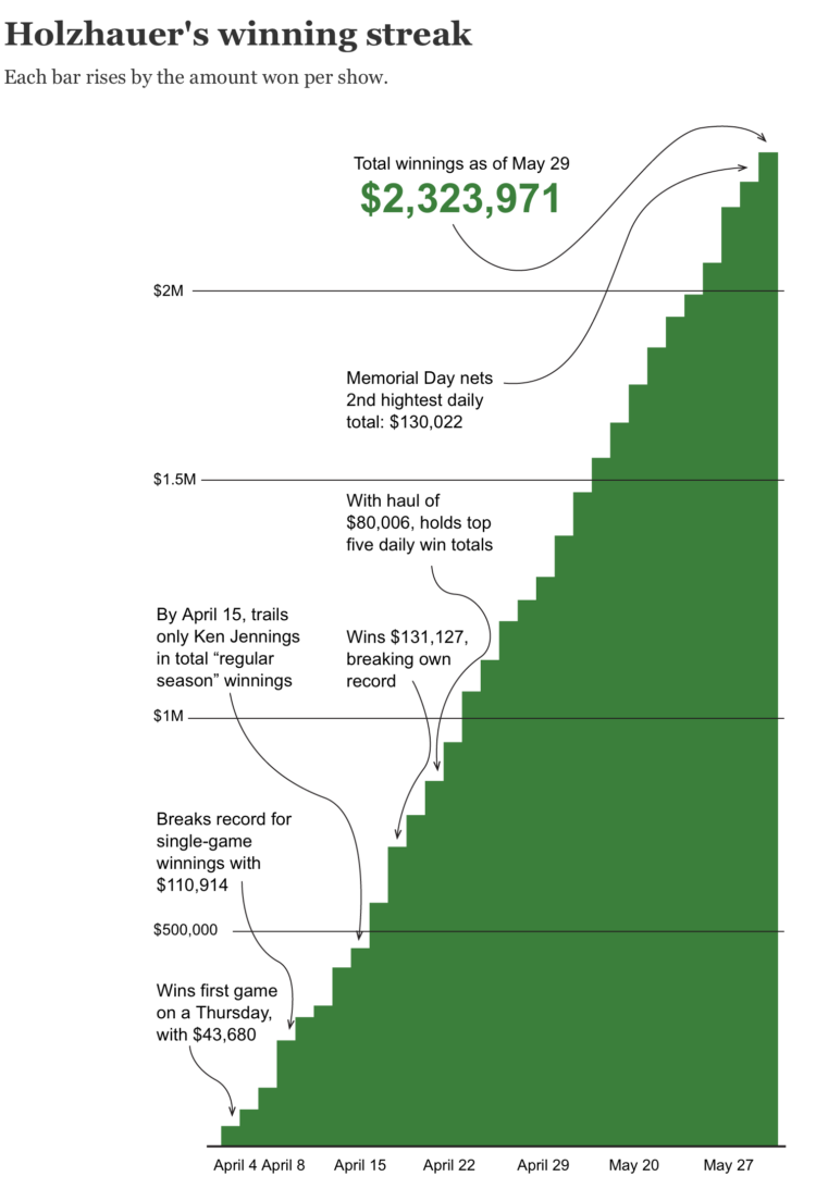
Holzhauer commented: “This needs a @KenJennings overlay. Call it the bunny slope”
Ken Jennings responded: “In fairness to the graphic designer, it’s really hard to fit such a long streak on this teeny Holzhauer-scale chart.”
Not sure what’s more nerdy: the jokes or that I find them amusing.

Every month I collect links to visualization tools and resources. Here’s the good stuff for May 2019.

Christine Sun Kim, a deaf artist known for her work visualizing and creating experiences around sound, recently took up charts as a medium. From Anna Furman for The New York Times Style Magazine:
Channeling her experiences into images of geometric angles, musical notes and meme-like pie charts, Kim playfully combines different sign systems to create what she calls a “common language that all people can connect to.”
What’s she’s reading right now:
Maggie Nelson’s “The Art of Cruelty” and W.E.B. Du Bois’s “Data Portraits: Visualizing Black America.” I’m really into depictions of data. Du Bois’s book is a series of hand drawings and data graphs that visualize America. It’s just beautiful.
Nice.
Vox delves into why Ls and Rs often get replaced by Asian speakers using English as a second language. Some sounds aren’t prevalent in other languages, and it’s not the same across all Asian languages.


 Visualize This: The FlowingData Guide to Design, Visualization, and Statistics
Available now.