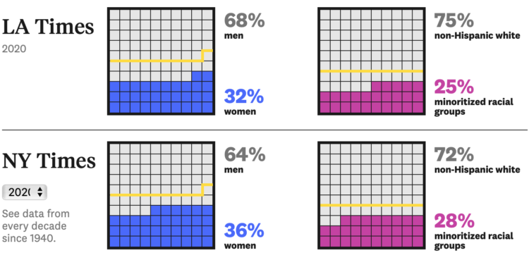
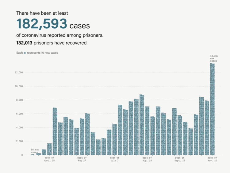
• Emily Baumgaertner reporting for The New York Times:

    But critics of the change and experts in the Census Bureau itself have said that, amid a fiery immigration debate, the inclusion of a citizenship question could prompt immigrants who are in the country illegally not to respond. That would result in a severe undercount of the population — and, in turn, faulty data for government agencies and outside groups that rely on the census. The effects would also bleed into the redistricting of the House and state legislatures in the next decade.

    Welp.

    Justin Elliot reporting for ProPublica:

    The full census, however, hasn’t included questions about citizenship since 1950. The Census Bureau has gathered such data in other surveys. The bureau switched the method of those surveys after the 2000 census. Today, it conducts the American Community Survey every year, which includes questions about citizenship, along with many other questions. The survey covers a sample of residents of the United States.

    Experts said the Justice Department’s letter was misleading. And they questioned the Justice Department’s explanation in the letter, noting that the American Community Survey produces data on citizenship that has been used in Section 2 cases.

    Welp.

    WELP.

  • Vega-Lite is a grammar for interactive graphics primarily used for analysis. Altair is a visualization library in Python that is based on this grammar.

    With Altair, you can spend more time understanding your data and its meaning. Altair’s API is simple, friendly and consistent and built on top of the powerful Vega-Lite visualization grammar. This elegant simplicity produces beautiful and effective visualizations with a minimal amount of code.

    Jim Vallandingham just put up a useful introduction to the library if you’re looking to get your feet wet.

    I do very little visualization-wise with Python since my current toolset typically covers my bases, but this has me curious.

  • The USA National Phenology Network uses a computer model to estimate heat build-up and the “first leaf” appearance across the country. Jeremy White for The New York Times animated it.

  • Issie Lapowsky for Wired:

    The change that’s already come to Pennsylvania may not have been possible without the research Kennedy and three other expert witnesses brought to light. They took the stand with a range of analyses, some based in complex quantitative theory, others, like Kennedy’s, based in pure cartography. But they all reached the same conclusion: Pennsylvania’s map had been so aggressively gerrymandered for partisan purposes that it silenced the voices of Democratic voters in the state. Here’s how each came to that conclusion—and managed to convince the court.

    This is a great story of visualization and data put to use for a greater good. The analyses solidify the points, and the charts drive them home.

  • As you can imagine, there was plenty of conversation between Earth and Apollo 11 en route to the moon. Nicholas Rougeux visualized the back and forth with an interactive timeline.

    During the historic mission to the moon and back, some of the most famous words ever said were transmitted between the Apollo 11 spacecraft and Earth. Between those icons moments was a great deal of chatter—mostly about technical matters but also about how the Earth looked from space, bounding around on the moon, and even sandwiches.

    Also available in print.

  • Research by Raj Chetty, Nathaniel Hendren, Maggie Jones, and Sonya Porter from the Equality of Opportunity Project suggests that black boys who grow up in rich families are still much more likely to fall into lower income levels than white boys who grow up in equally rich families. The shift from low income to higher levels also appears to be a greater challenge, which makes closing the gap that much harder.

    Emily Badger, Claire Cain Miller, Adam Pearce, and Kevin Quealy for The Upshot cover the data extensively with a series of charts, driven visually with a particle-based Sankey diagram (above). The individual points provide a vehicle to show variation over aggregates.

    Take your time with this one.

    You can grab the aggregated data from the Equality of Opportunity Project. Here’s the research paper in full (pdf) if you’re interested. And if you’re interested in the Sankey implementation.

  • Army ants function without a leader and yet accomplish very organized-looking things, such as building bridges across gaps:

    Researchers from the Swarm Lab believe they can break down the bridge-building process into a simple, two-rule system. Rule 1: If fellow ants are walking over you, stay put. Rule 2: If the number of ants walking over you isn’t higher than some rate, get moving again.

    Full paper here (pdf).

  • Frustrated with vehicles blocking bus and bike lanes, Alex Bell applied some statistical methods to estimate the extent.

    Sarah Maslin Nir for The New York Times:

    Now Mr. Bell is trying another tack — the 30-year-old computer scientist who lives in Harlem has created a prototype of a machine-learning algorithm that studies footage from a traffic camera and tracks precisely how often bike lanes are obstructed by delivery trucks, parked cars and waiting cabs, among other scofflaws. It is a piece of data that transportation advocates said is missing in the largely anecdotal discussion of how well the city’s bus and bike lanes do or do not work.

  • Michael W. Kearney implemented a classifier for Twitter bots. It’s called botornot:

    Uses machine learning to classify Twitter accounts as bots or not bots. The default model is 93.53% accurate when classifying bots and 95.32% accurate when classifying non-bots. The fast model is 91.78% accurate when classifying bots and 92.61% accurate when classifying non-bots.

    Overall, the default model is correct 93.8% of the time.

    Overall, the fast model is correct 91.9% of the time.

    You can enter Twitter accounts to see what the model projects here. It’s barebones, and I’m not sure what the curve represents, but it’s fun to poke at.

  • The Upshot has used a needle to show shifts in their live election forecasts, because many readers don’t understand probability. Nate Cohn and Josh Katz:

    This was evident before the result of the 2016 election, and as a result we tried something new: a jitter, where the needle quivered to reflect the uncertainty around the forecast. Although many readers disliked it, the jitter reflected an earnest attempt to give tangible meaning to abstract probabilities. Nonetheless, we turned the jitter off for all of our 2017 forecasts.

    Tonight, readers will have the option to turn the jitter off. We expect that some readers will opt to do so, but remember this: Switching it off only hides the uncertainty — it doesn’t make it go away.

    Read the whole thing for why the needle, what the needle means, and how The Upshot is using it.

    As much as I hated what the needle showed me the first time I saw it, I’ve grown to appreciate the uncertainty it represents.

  • Kofi Annan for Nature on the importance of data in ending poverty and hunger:

    Such fine-grained insight brings tremendous responsibility to act. It shows governments, international agencies and donors exactly where to direct resources and support. The Sustainable Development Goals — which UN member states endorsed when the Millennium Development Goals expired in 2015 — include the first targets for reducing stunting and wasting. The data indicate that no African country is currently on track to reach all the targets associated with ending hunger, achieving food security and improving nutrition.

    This shows how crucial it is to invest in data. Data gaps undermine our ability to target resources, develop policies and track accountability. Without good data, we’re flying blind. If you can’t see it, you can’t solve it.

  • Many cities provide free bus tickets for homeless people who want to relocate. The Guardian compiled data from sixteen cities to show where thousands of people bussed to over a six-year period.

    The data from these cities has been compiled to build the first comprehensive picture of America’s homeless relocation programs. Over the past six years, the period for which our data is most complete, we are able to track where more than 20,000 homeless people have been sent to and from within the mainland US.

    Lots of maps and charts in this one, mixed with individual narratives.

  • Speaking of outliers, it’s not always obvious when and why a data point is an outlier. The Overview of Outliers package in R by Antony Unwin lets you compare methods.

    Articles on outlier methods use a mixture of theory and practice. Theory is all very well, but outliers are outliers because they don’t follow theory. Practice involves testing methods on data, sometimes with data simulated based on theory, better with `real’ datasets. A method can be considered successful if it finds the outliers we all agree on, but do we all agree on which cases are outliers?

    See also Unwin’s talk from 2017 for more about the thinking behind the package.

  • Neural networks can feel like a black box, because, well, for most people they are. Supply input and a computer spits out results. The trouble with not understanding what goes on under the hood is that it’s hard to improve on what we know. It’s also a problem when someone uses the tech for malicious purposes, as people are prone to do.

    So, folks from Google Brain break down the structures of what makes these things work.

  • Guides  / 

    Step 1: Figure out why the outlier exists in the first place. Step 2: Choose from these visualization options to show the outlier.

  • I always love a good lottery hacking story. Jason Fagone for The Huffington Post chronicles the winnings of Gerald and Marge Selbee, a retired couple from a small town in Michigan. It is a story of probabilities, expected values, and arduously buying a lot of tickets to maximize profits.

    That’s when it hit him. Right there, in the numbers on the page, he noticed a flaw—a strange and surprising pattern, like the cereal-box code, written into the fundamental machinery of the game. A loophole that would eventually make Jerry and Marge millionaires, spark an investigation by a Boston Globe Spotlight reporter, unleash a statewide political scandal and expose more than a few hypocrisies at the heart of America’s favorite form of legalized gambling.

    I think it’s every statistician’s fantasy to crack open a lottery’s flaw using the numbers. No? Just me? Okay, whatever.

    The most interesting part though is that the loophole didn’t seem to be that obscure. Selbee just needed a bit of knowledge about big numbers, a pencil, and a napkin to crunch on. Are there more games out there like this? Do I need to start playing the lottery?

    See also the statistician who cracked a scratch lottery code and the other statistician who won the lottery four times.

  • As 2020 approaches, let’s aim for higher accuracy and less uncertainty.

  • In a project he calls Sentence Space, Robin Sloan implemented a neural network so that you can enter two sentences and get a gradient of the sentences in between.

    I’d never even bothered to imagine an interpolation between sentences before encountering the idea in a recent academic paper. But as soon as I did, I found it captivating, both for the thing itself—a sentence… gradient?—and for the larger artifact it suggested: a dense cloud of sentences, all related; a space you might navigate and explore.

    The project is open source on GitHub if you want to have at it.

  • Speaking of surveillance cities, Ali Winston for The Verge reports on the relationship between Palantir and New Orleans Police Department. They used predictive policing, which is loaded with social and statistical considerations, under the guise of philanthropy. Palantir gained access to personal records:

    In January 2013, New Orleans would also allow Palantir to use its law enforcement account for LexisNexis’ Accurint product, which is comprised of millions of searchable public records, court filings, licenses, addresses, phone numbers, and social media data. The firm also got free access to city criminal and non-criminal data in order to train its software for crime forecasting. Neither the residents of New Orleans nor key city council members whose job it is to oversee the use of municipal data were aware of Palantir’s access to reams of their data.

    False positives. Over-policing. Bias from the source data driving the algorithms. This isn’t stuff you just mess around with.

  • Smart home. Smart city. They have a positive ring to it, as if the place or thing will know what we want right when we need it and adjust accordingly. It’s all very grand. That’s assuming the new technologies are all used for good things.

    Geoff Manaugh for The Atlantic considers what might happen when the sensors and new data streams are used against individuals:

    As the city becomes a forensic tool for recording its residents, an obvious question looms: How might people opt out of the smart city? What does privacy even mean, for example, when body temperature is now subject to capture at thermal screening stations, when whispered conversations can be isolated by audio algorithms, or even when the unique seismic imprint of a gait can reveal who has just entered a room? Does the modern city need a privacy bill of rights for shielding people, and their data, from ubiquitous capture?

    Yes.