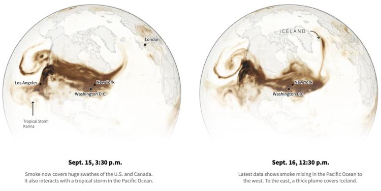
• Membership
  • Newsletter
  • Projects
  • Learning
  • About
  • Member Login
  • Increased case counts not just from increased testing

    July 3, 2020

    Topic

    Statistics  /  coronavirus, ProPublica, testing

    Some attribute increased Covid-19 case counts to increased testing. While that is certainly part of the reason, it doesn’t explain it all when you compare testing rates against the increase in positives.

    Charles Ornstein and Ash Ngu for ProPublica:

    In other states, including Arizona, Texas and Florida, which did not see a wave of early cases and deaths, the increase in positive results has far surpassed testing growth. In Florida, testing has even decreased a bit comparing the seven days through Tuesday to the same period before Memorial Day. (Florida recorded an abnormally high number of new tests on May 20, which may have inflated the rolling average on May 25.)

    But what about decreased virus-related deaths? Death doesn’t come right after a positive test, which means death rate doesn’t increase at the same time that cases increase. There’s a lag. So we’re not in the clear yet.

  • Members Only

    Try New Visual Encodings, Because Something Might Work (The Process 096)

    July 2, 2020

    Topic

    The Process  /  experiment

    Sometimes a chart type seems terrible. But you’ll never know until you try.

  • Data Underload  /  OpenTable, restaurant

    Restaurant Reopenings, a Comparison to Last Year

    Restaurants are reopening for dining across the United States. Some states are doing it faster than others.

    Read More
  • Map shows where to go to get away from fireworks

    July 1, 2020

    Topic

    Maps  /  David Yanofsky, fireworks, Quartz

    Using a voronoi map, David Yanofsky for Quartz mapped the places in the US that are the farthest away from legal fireworks sellers in case you need to get away from the early celebrations. Or, people could just stop setting off fireworks at 1am. That would be okay too.

  • Decade-long time-lapse of the sun

    July 1, 2020

    Topic

    Maps  /  NASA, sun, time-lapse

    NASA’s Solar Dynamics Observatory has been taking a picture of the sun every 0.75 seconds for a decade. Above is a time-lapse of the resulting 20 million gigabytes of data:

    This 10-year time lapse showcases photos taken at a wavelength of 17.1 nanometers, which is an extreme ultraviolet wavelength that shows the Sun’s outermost atmospheric layer — the corona. Compiling one photo every hour, the movie condenses a decade of the Sun into 61 minutes. The video shows the rise and fall in activity that occurs as part of the Sun’s 11-year solar cycle and notable events, like transiting planets and eruptions.

  • When the world shut down, seen through global flights

    June 30, 2020

    Topic

    Maps  /  coronavirus, flights, Washington Post

    Lauren Tierney and William Neff for The Washington Post used a rotating globe to show how connections between countries quickly shut down as the coronavirus spread.

    I’m looking forward to when we get to watch the map in reverse.

  • Cataloging all the house number styles

    June 29, 2020

    Topic

    Data Sharing  /  Dan Kois, house numbers, Slate

    Dan Kois walked all of the blocks in his ZIP Code and collected data on whether houses used serif or sans serif fonts for their house numbers:

    Between March 10 and May 25, I walked every street in Arlington, Virginia’s 22207, a total distance of about 200 miles, according to my Fitbit. The ZIP code covers a lot of territory, 6.37 fairly densely populated square miles, from the Potomac River and the Washington border at the east to East Falls Church and the McLean border at the west. It includes some of Virginia’s richest and whitest neighborhoods, but also a number of apartment buildings and townhouses along Lee Highway and the historically Black middle-class neighborhood of Hall’s Hill.

    Here’s the final result in a Google map. There doesn’t seem to be much of a pattern in Kois’ ZIP code, but it’s a good walking exercise. I wonder what other types of data one might collect while walking a large area.

  • How to Make a Spiral Chart in R

    Using a spiral might not be the best way to encode data. But here’s how to do it anyway. Just in case.

  • Map of Covid-19 surge

    June 26, 2020

    Topic

    Maps  /  Axios, coronavirus, surge

    Axios provides a straightforward state map showing the percentage change in the 7-day average for confirmed Covid-19 cases. Numbers are up in a lot of places.

    Increased testing does not explain away these numbers. Other data points make clear that we’re seeing a worsening outbreak, not simply getting better data.

    So frustrating.

  • LEGO relief map

    June 26, 2020

    Topic

    Maps  /  Cameron Bennett, LEGO

    Cameron Bennett made a relief map of Idaho, completely out of LEGO bricks:

    In March, the COVID-induced quarantine sent me home, but more importantly, to my childhood Legos. What resulted was too much time, money, and effort spent entertaining some combination of my childhood and young adult self. By building a map. Out of Legos.

    What have I even been doing with my time.

  • Members Only

    Visualization Tools, Datasets, and Resources – June 2020 Roundup

    June 25, 2020

    Topic

    The Process  /  roundup

    Here’s the good stuff for June.

  • How the coronavirus won in the United States

    June 25, 2020

    Topic

    Maps  /  coronavirus, New York Times

    Using a wide array of sources, The New York Times shows how the virus spread at a granular level. The foundation is a map with moving dots, and the piece takes you through movements based on cell phone data and air travel in concert with known coronavirus cases.

    Your jaw might drop a few times as you go through it.

    Back in March, NYT published a similar work for how the spread started in China. We were talking about washing hands and restaurants closing. Thinking back to then and seeing where we are now stings.

  • Algorithm leads to arrest of the wrong person

    June 25, 2020

    Topic

    Mistaken Data  /  arrests, bias, facial recognition, police

    Even though there was supposedly a person in the decision-making process and a surveillance photo wasn’t actually Robert Julian-Borchak Williams, he still ended up handcuffed in front of his own home. Kashmir Hill reporting for The New York Times:

    This is what technology providers and law enforcement always emphasize when defending facial recognition: It is only supposed to be a clue in the case, not a smoking gun. Before arresting Mr. Williams, investigators might have sought other evidence that he committed the theft, such as eyewitness testimony, location data from his phone or proof that he owned the clothing that the suspect was wearing.

    In this case, however, according to the Detroit police report, investigators simply included Mr. Williams’s picture in a “6-pack photo lineup” they created and showed to Ms. Johnston, Shinola’s loss-prevention contractor, and she identified him. (Ms. Johnston declined to comment.)

  • Face depixelizer with machine learning, and some assumptions

    June 25, 2020

    Topic

    Mistaken Data  /  bias, face, pixels

    In crime shows, they often have this amazing tool that turns a low-resolution, pixelated image of a person’s face to a high-resolution, highly accurate picture of the perp. Face Depixelizer is a step towards that with machine learning — except it seems to assume that everyone looks the same.

    There might still be some limitations.

  • Bad bar chart

    June 24, 2020

    Topic

    Mistaken Data  /  annotation

    Welcome to whose bar chart is it anyway: where the geometries are made up and the numbers don’t matter. [via @dannypage]

  • Who is responsible for climate change?

    June 24, 2020

    Topic

    Infographics  /  climate change, Kurzgesagt

    Kurzgesagt, in collaboration with Our World in Data, tackle the question of who is responsible for climate change and who should fix it. As you might imagine, the answer is not always straightforward.

  • Statistical Atlas  /  age, generations

    Age Generation Populations

    Based on estimates from the United States Census Bureau released for July 2019, Millennials are the largest living generation in the country now.

    Read More
  • Extract data from a plot in a flat image file

    June 22, 2020

    Topic

    Software  /  datasets, image

    Maybe you’ve seen a chart and wished you could look at the data yourself. Maybe you want to see it from a different angle. But the underlying dataset is nowhere to be found. The WebPlotDigitizer by Ankit Rohatgi lets you load an image and it will attempt to pull out the dataset. Amazing.

    I can’t believe this has been around since 2010, and I’m just now hearing about it. [via @jburnmurdoch]

  • Gaps between black and white America

    June 19, 2020

    Topic

    Statistical Visualization  /  demographics, New York Times, race

    New York Times Opinion compared several demographics, such as unemployment and income, between majority-black and majority-white neighborhoods in the United States.

    They come back to the zipper chart technique where the dots start together and then separate to emphasize the gaps. Horizontally, dots are sorted by smallest to largest difference.

  • “Take On Me” by a-ha recreated in Excel

    June 19, 2020

    Topic

    Software  /  a-ha, Excel, songs

    Dylan Tallchief recreated “Take On Me” by a-ha in Excel.

    It’s not the tools. It’s how you use them. Something something blah blah. It’s in Excel!

  • Page 101 of 391
  • <
  • 1
  • ...
  • 98
  • 99
  • 100
  • 101
  • 102
  • 103
  • ...
  • 391
  • >

Analyze, visualize, and communicate data usefully, beyond the defaults.

Become a member →

Recently for Members

May 8, 2025
When the data is not what it seems

May 1, 2025
Finding the Right Charts

April 24, 2025
Visualization Tools, Datasets, and Resources – April 2025 Roundup

April 17, 2025
Breaking Out of Chart Software Defaults

April 15, 2025
Line Chart with Decorative Neon Accents

Browse by Chart Type See All →

Dot Map Spiral Chart Frequency Trails Baseline Chart Small Multiples Choropleth Map Line Chart Bar Chart Voronoi Diagram

Browse By Topic

  • Visualization

    Seeing data

  • Maps

    Seeing geographic data

  • Infographics

    Explaining data

  • Networks

    Connecting data

  • Statistics

    Analyzing data

  • Software

    Working with data

  • Sources

    Getting data

  • Design

    Making data readable

Get the Book

Visualize This: The FlowingData Guide to Design, Visualization, and Statistics

Available now.

Order: Amazon / Bookshop

Made by FlowingData

  • The Process

  • Data Underload

  • Chart Everything

  • Guides

  • Books

  • Shop

  • About
  • Contact
  • Newsletter
  • LinkedIn
  • Instagram
  • Bluesky
  • RSS
Copyright © 2007-Present FlowingData. All rights reserved.