Bar Chart
The old standby. The classic. The bar height or length represents data. The baseline starts at zero.
Olympic medal tracker variations
As the 2024 Summer Olympics wrap up, medal trackers will fade from homepages…
College Admission Rates for U.S. Schools Compared
See how your college's selectivity ranks against the rest.
Where the Time Goes with Age
We get 24 hours in a day. How do we spend this time? How does our time use change as we get older and priorities shift?

Sleep Hours and Feeling Rested
Two-thirds of adults get at least 7 hours of sleep. I am not in that two-thirds.
Feeling Rested with Age
How much you sleep each night matters, but more importantly, it's about the quality and if you feel rested when you wake up.
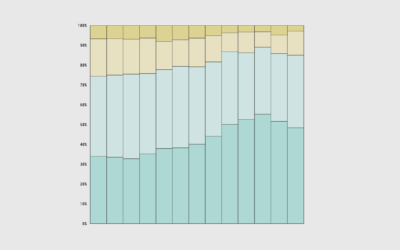
Commonness of Races in Different Occupations
Some occupations are more race-dominant than others. This is the percentage of employed persons 16 years and older who are a given race or ethnicity for each.

Young Money
We often associate high income with older people, but young people can also earn higher incomes. Let's see what those people studied and what they do for a living.
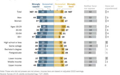
Attitudes towards tipping in the U.S.
Tipping seems to be in a confusing spot right now. On the one…
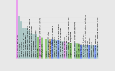
Jobs with Higher Income and Fewer Hours
So people earn a six-figure income without working all the time. What do they do?
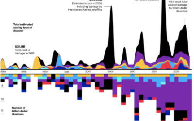
Billion dollar natural disasters
For Bloomberg, Rachael Dottle and Leslie Kaufman go with the combo stacked area…

Oldest and Youngest, by State
States aren't uniformly young and old. Well, other than Maine. This is the breakdown by age group and regions.

Renting vs. Owning a Home, by State
Among households in the United States, 68% are owned and 32% are rented, based on estimates from the American Community Survey in 2021. That breakdown isn't uniform across the country though.


Income Sources
Most people have a job and receive wages in return, but that starts to change when you get into the higher income groups.
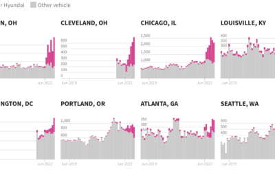
Excess Kia and Hyundai car thefts
In the middle of 2022, a popular video on TikTok, since taken down,…

Why South Koreans grew taller so quickly
As a world population, we’re growing taller, but South Koreans seemed to grow…
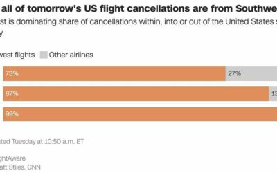
Southwest flight cancellations
There were a lot of flight cancellations this week, but Southwest Airlines is…

One home’s blackouts in Kyiv
Volodymyr Agafonkin and his family live in Kyiv, Ukraine. He visualized when the…