Bar Chart
The old standby. The classic. The bar height or length represents data. The baseline starts at zero.
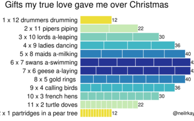
Gifts my true love gave to me over the 12 days of Christmas
From Reddit user neilrkaye. This is very important.…

Where We Find Meaning in the Everyday
Meaningfulness scores from the American Time Use Survey provide a hint of what we value.
When Americans Had Intercourse with Opposite Sex for the First Time
The National Survey of Family Growth, run by the Centers for Disease Control and Prevention, asks participants about their birth and relationship history.

Commonness of Divorce in America
I wondered how common it is for someone to get a divorce. While I’ve touched on the topic before, I’ve never calculated it directly, so I gave it a go.

How Much Time We Spend Alone and With Others
Oftentimes what we're doing isn't so important as who we're spending our time with.
Who We Spend Time with as We Get Older
In high school, we spend most of our days with friends and immediate family. But then we get jobs, start a family, retire, and there's a shift in who we spend our days with.
Social Media Usage by Age
Here's the breakdown by age for American adults in 2021, based on data from the Pew Research Center.

Who Takes Care of the Kids, By Household Income
Higher income usually means more childcare, and lower income usually means less.
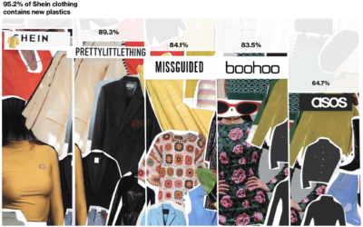
Fashion industry’s environmental impact
For Bloomberg, Rachael Dottle and Jackie Gu look at the current state of…
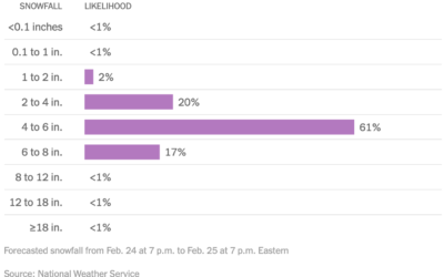
Distribution of snowfall estimates to show uncertainty
For NYT’s The Upshot, Aatish Bhatia, Josh Katz and Margot Sanger-Katz show the…

Settling all the internet debates in one go with a bunch of polling
The internet was once this fun place where people had goofy debates about…

Most Common Daily Routines
We all have our routines, but from person-to-person, the daily schedule changes a lot depending on your responsibilities.
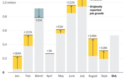
Job growth was underestimated
Andrew Van Dam for The Washington Post used a bar chart with corrections…
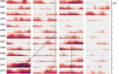
Drought extent by region
For Scientific American, Cédric Scherer and Georgios Karamanis charted drought extent by region…
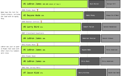
NBA carry jobs
With professional basketball, we often hear about carry jobs. There’s one star player…
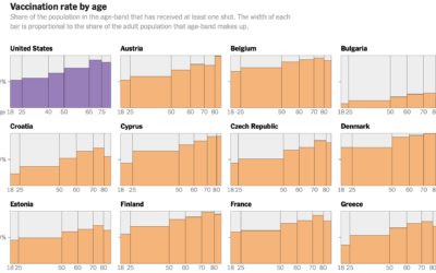
Decline of U.S. vaccination rate compared against Europe’s
Elian Peltier and Josh Holder for The New York Times highlight the vaccination…

Jobs that Marry Together the Most
Find out which jobs most often pair together among married couples.
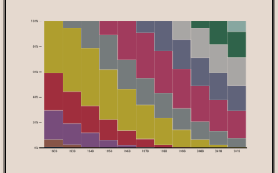
Coming and Going Age Generations
Since no one has figured out how to defeat time, age generations come and go. This chart shows the generational breakdowns since 1920.
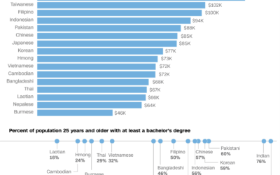
Varying demographics within the Asian American population
We often hear about the Asian American community as one big group of…
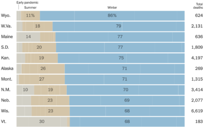
Half of coronavirus deaths were in the winter
You probably knew that coronavirus deaths have been in the several thousands per…