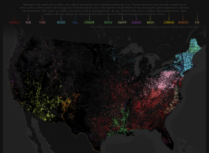
The names of places can say a lot about a geographic area. Derek…
Maps
Intuitive to look at spatial patterns and great for distributing geographic data.
-
Generic terms for streams mapped
-
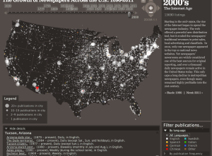
Growth of newspapers across the United States
The Rural West Initiative and the Bill Lane Center for the American West…
-
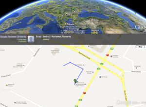
Google Map Maker edits in real-time
Google Map Maker is a simple tool that lets you draw your own…
-
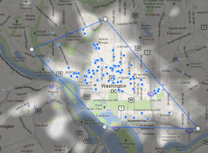
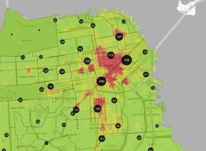
Find popular places to stay with Google Hotel Finder
When you’re picking a hotel to stay at in an area you don’t…
-
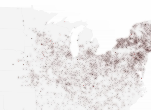
US post offices spreading over time, 1700 to 1900
Using data from the USPS Postmaster Finder and the USGS Geographic Names Information…
-

Fly through a survey of the universe
Paul Bourke, a research professor at the University of Western Australia, provides us…
-
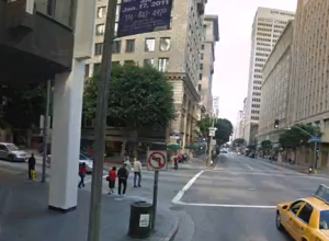
Digital spotlights on landmarks
Think about when you take a picture of something. It’s kind of like…
-
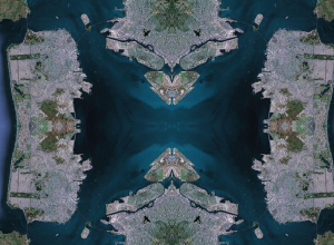
Maps as kaleidoscope in Rorschmap
Maps aren’t just a way to see directions from point A to point…
-
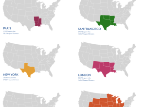
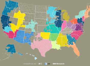
If the world lived in a single city
World population is estimated to be 6.9 billion people, and while that is…
-
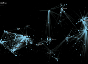
Data reenactment via stolen iPhone
Remember when Joshua Koffman was posting pictures of the guy who had this…
-
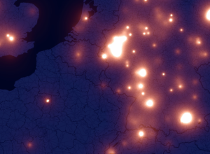
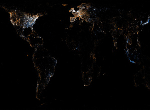
iPhone fireflies across the Europen sky
A few months ago there was a lot of hoopla around the iPhone…
-

Netflix favorites by location
If you have Netflix, you know that there’s a section for local favorites,…
-
Geography of Wikipedia edits
A while back we saw the history of the world according to Wikipedia.…
-
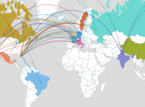
Community connections via SMS and phone call data
We often think of communities in the framework of government-set boundaries, but relationships…
-
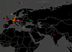
Flickr and Twitter mapped together – See Something or Say Something?
For all the maps by Eric Fischer I’ve posted, it’s amazing how little…
-
Link
The History of Cartography →
Complete Volume 1 from 1987, available for free
-
In pursuit of the American dream (house)
Trulia Insights sure has been having fun lately. In their most recent dig…
-
Trulia Crime Map helps you find safe living places
Real estate site Trulia made a great move when they acquired mapping outfit…
Recently for Members
Second Edition
 Visualize This: The FlowingData Guide to Design, Visualization, and Statistics (2nd Edition)
 Visualize This: The FlowingData Guide to Design, Visualization, and Statistics (2nd Edition)
New tools, refined process.
Browse by Chart Type See All →


