Quantum computing promises a higher level of processing power over current computers, but…
Infographics
Telling stories with data and graphics.
-

Quantum computing visual explainer
-

Non-abstract Curry shot chart
Stephen Curry of the Golden State Warriors scored 50 points in game 7…
-

Switching to electric school buses
For Bloomberg, Zahra Hirji and Denise Lu on the electrification of the national…
-

An illustrated tour of the skies in an elevator
Neal Agarwal is up to his wonderful ridiculousness again. Imagining an elevator that…
-

Scale of flying animals
A straightforward lineup of animals that fly provide a sense of scale, from…
-
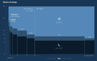
Age and getting enough sleep
Reuters dug in to the science of sleep and how paying attention to…
-

Physics of a bicycle visually explained
Riding a bicycle is a seemingly simple activity that we never forget how…
-

Words used in layoff letters
Tech layoffs continue, and as companies deliver more letters, there are some repeated…
-

Visual explainer on what an AR-15 does to the human body
This is necessarily uncomfortable to go through, but for The Washington Post, N.…
-

Fake sugars in your food
For The Washington Post, Anahad O’Connor, Aaron Steckelberg, and Laura Reiley visually describe…
-
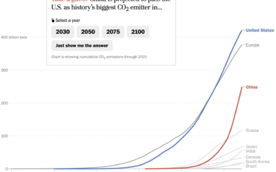
Line chart race to show emissions
For The Washington Post, Harry Stevens used the line chart equivalent of a…
-

Asian representation at the Oscars
Asian characters in American films are historically less integral to the stories and…
-

Why South Koreans grew taller so quickly
As a world population, we’re growing taller, but South Koreans seemed to grow…
-

Shooting down the Chinese balloon
Shooting down a floating balloon out on its lonesome seems like a straightforward…
-

Ski resorts dealing with fewer snow days
For Bloomberg Green, Jin Wu, Laura Millan and Hayley Warren, on the challenges…
-
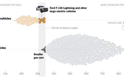
Emissions from big electric trucks vs. gas vehicles
Based on estimates from CarbonCounter by the MIT Trancik Lab, electric vehicles typically…
-

Greatest unexpected NBA performance
This is a fun one from Russell Samora and Reshad Malekzai for The…
-
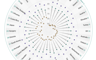
Countries with the longest healthy retirements
Bloomberg compared retirement years in the context of life expectancy and healthy life…
Recently for Members
Second Edition
 Visualize This: The FlowingData Guide to Design, Visualization, and Statistics (2nd Edition)
 Visualize This: The FlowingData Guide to Design, Visualization, and Statistics (2nd Edition)
New tools, refined process.
Browse by Chart Type See All →


