This interactive heatmap by Jonas Schöley shows mortality rates by age. Just use…
Statistical Visualization
Finding patterns, distributions, and anomalies.
-
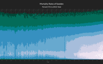
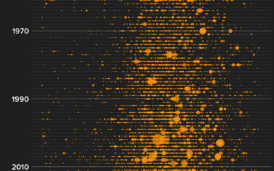
Heatmap shows deaths by age in different countries
-

Teaching kids data visualization
Jonathan Schwabish gave his fourth-grade son’s class a lesson on data visualization. He…
-

A collection of Charles-Joseph Minard’s statistical graphics
Charles-Joseph Minard, best known for a graphic he made (during retirement, one year…
-

Millions of data points with deep scatterplots
Ben Schmidt uses deep scatterplots to visualize millions of data points. It’s a…
-
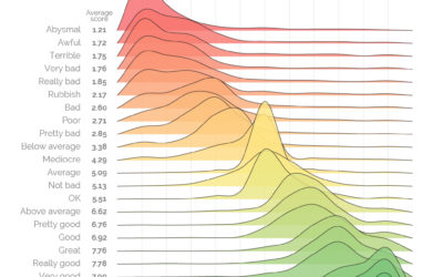
Measuring the varied sentiments of good and bad words
There was a survey a while back that asked people to provide a…
-
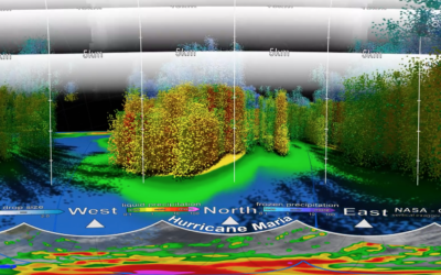
Inside Hurricane Maria, a 3-D perspective
This 3-D view inside Hurricane Maria, from NASA’s Scientific Visualization Studio and NASA’s…
-
Constructing charts and graphs
Jeffrey Heer, a computer science professor at the University of Washington, provides an…
-

Experience a soccer game through crowd noise
Sports visualization and analysis tends to focus on gameplay — where the players…
-
More wildfires than ever
Peter Aldhous for BuzzFeed News delves into the increasing number of wildfires in…
-

Why the city is hotter than the suburb
NPR used video from a thermographic camera to explain why cities tend to…
-
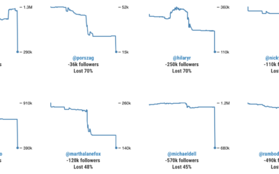
Twitter bot purge
With Twitter cracking down, some users are experiencing bigger dips in follower count…
-
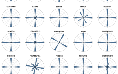
Street network orientation in major cities
Using OpenStreetMap data, Geoff Boeing charted the orientation distributions of major cities:
Each… -
Visual introduction to bias in machine learning
A few years ago, Stephanie Yee and Tony Chu explained the introductory facets…
-
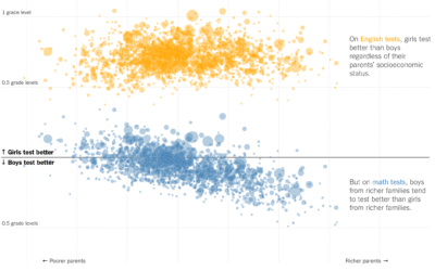
Math gender gap bigger in richer school districts
This is quite the scatterplot from Claire Cain Miller and Kevin Quealy for…
-

A visualization game to understand education and school segregation
Educate Your Child by Gabrielle LaMarr LeMee uses census data and the school…
-
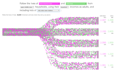
Income mobility for different groups
Building on their previous visualization work on black boys dropping income levels in…
-
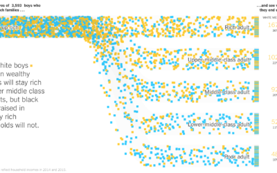
Black boys dropping income levels as adults
Research by Raj Chetty, Nathaniel Hendren, Maggie Jones, and Sonya Porter from the…
-
One-way tickets out for homeless people
Many cities provide free bus tickets for homeless people who want to relocate.…
Recently for Members
Second Edition
 Visualize This: The FlowingData Guide to Design, Visualization, and Statistics (2nd Edition)
 Visualize This: The FlowingData Guide to Design, Visualization, and Statistics (2nd Edition)
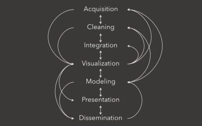
New tools, refined process.
Browse by Chart Type See All →


