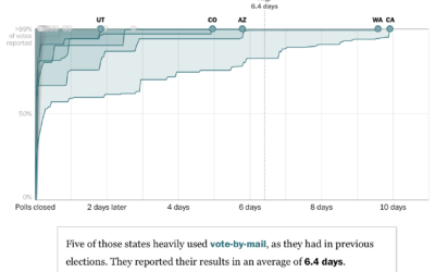
For The Washington Post, Ashlyn Still and Kevin Schaul charted how long it…
Statistical Visualization
Finding patterns, distributions, and anomalies.
-
Election night might take weeks
-
Tracking the mail
With mail-in ballots looking to be more common than ever this year, NYT’s…
-
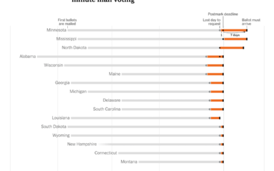
Time for last-minute mail voting
The New York Times provides a state-by-state chart timeline for voting by mail:…
-
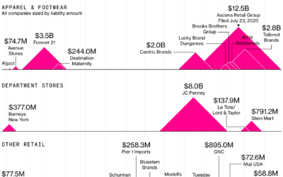
Dying mid-range mall
Bloomberg looks at how retail struggles might kill the middle-of-the-road malls before this…
-
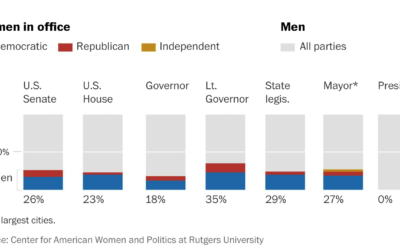
How long before there is gender equality in the U.S. House and Senate
For The Washington Post, Sergio Peçanha asks, “What will it take to achieve…
-
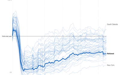
Visits to businesses compared year-over-year in each state
Businesses are still seeing visits mostly down compared to last year, which shouldn’t…
-
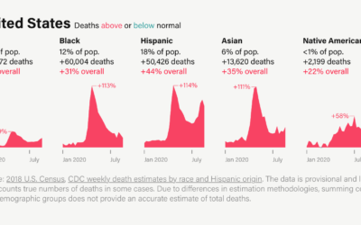
Excess deaths, by race
It’s clear that Covid-19 has affected groups differently across the United States. By…
-
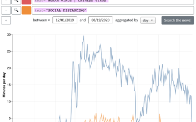
Analyzing the topics of cable TV news
From the Computer Graphics Lab at Stanford University, the results from an analysis…
-
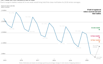
Vote-by-mail volume compared against years past
The volume of mail-in ballots will likely be higher than usual this year,…
-
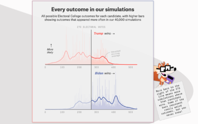
FiveThirtyEight launches 2020 election forecast
The election is coming. FiveThirtyEight just launched their forecast with a look at…
-
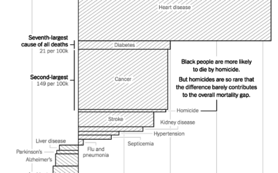
Gaps between mortality rates for black and white Americans
For NYT Opinion, Gus Wezerek charted the gaps between white and black mortality…
-
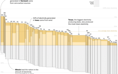
Electricity sources by state
With Joe Biden calling for 100% clean electricity, John Muyskens and Juliet Eilperin…
-
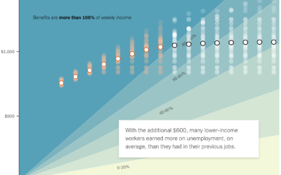
If the unemployed lose $600 per week
A $600 per week benefit expires for the unemployed at the end of…
-
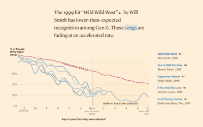
Defining ’90s music, based on song recognition
In search of songs that define music in the 1990s, Matt Daniels and…
-
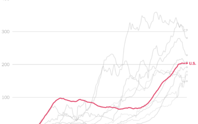
Comparing U.S. coronavirus case rates to other hot spots
The numbers are high here in the United States, and at this point,…
-
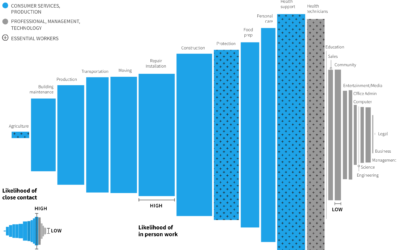
Remote work and industry
Some industries are more compatible with remote work than others. Jonathan I. Dingel…
-
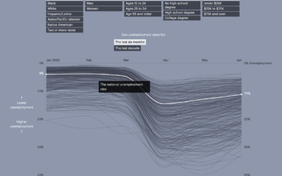
Unemployment for different groups
Unemployment has hit the United States hard over the past several months, for…
-
Bitcoin scam, Twitter hacked
Twitter was hacked yesterday. Over a few hours, prominent accounts were tweeting that…


 Visualize This: The FlowingData Guide to Design, Visualization, and Statistics (2nd Edition)


