Using data from NOAA, Krishna Karra and Tim Wallace for The New York…
Maps
Intuitive to look at spatial patterns and great for distributing geographic data.
-
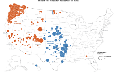
All-time temperature records broken in 2021
-
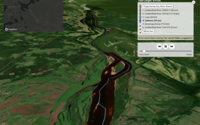
Drop rain anywhere in the world and see where it ends up
One of my favorites of the year, Sam Learner’s River Runner shows you…
-
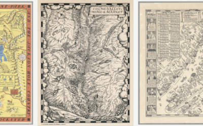
David Rumsey Map Center, cataloging historical works
The David Rumsey Map Center at Stanford houses hundreds of thousands of maps…
-
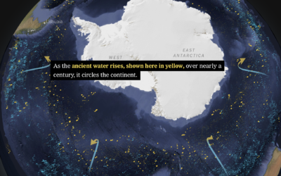
Shifting currents and melting ice in the Antarctic
Based on data from autonomous sensors floating in the oceans, researchers are able…
-
Mapping the weather disasters of 2021
Zach Levitt and Bonnie Berkowitz for The Washington Post mapped and animated the…
-
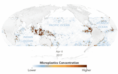
Animated map of microplastics in the ocean
Using estimates based on satellite data, Joshua Stevens for NASA Earth Observatory mapped…
-
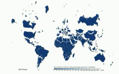
Shrinking the Mercator projection to equal area
It’s been a while since we got our regular reminder that the Mercator…
-
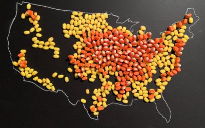
Map made of candy corn to show corn production
With candy corn as her medium, Jill Hubley mapped corn production in the…
-
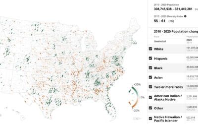
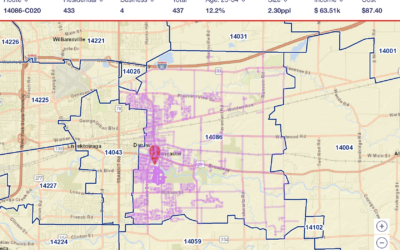
Census Mapper, a tool to visualize population and racial shifts
Pitch Interactive and the Census 2020 Data Co-op, supported by the Google News…
-
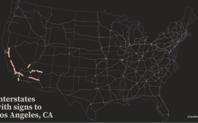
Map of highway signs
This is a fun map by Matt Dzugan. Search for a city, and…
-
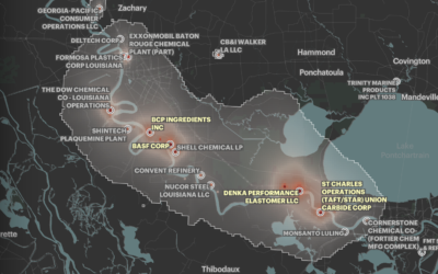
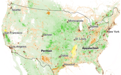
Where cancer risk is greater due to air pollution
Based on five years of data from EPA models, ProPublica mapped areas in…
-
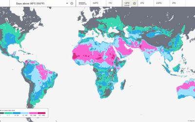
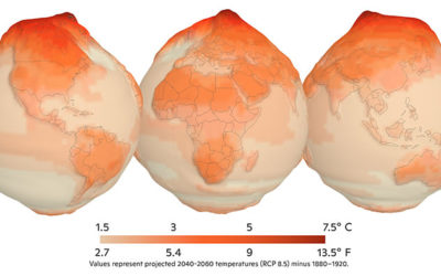
Mapping the probable heat around the world
Earth is getting warmer, and the previously abstract concept seems to grow more…
-
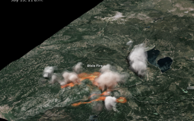
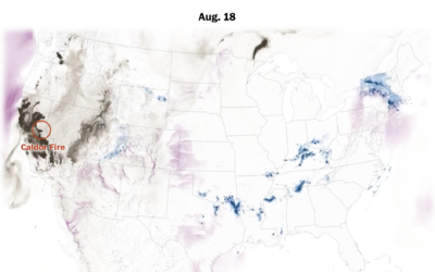
3-D rendering of Dixie fire smoke clouds
The New York Times used radar data to create a 3-D model of…
-
Search every USPS mail route
I’m not sure how long this has been around, but the USPS has…
-
Reducing methane to slow climate change
We often hear about increased CO2 in the context of global warming. Hayley…
-
Mapping climate change in the Arctic
UnstableGround is a project from the Woodwell Climate Research Center that focuses on…
-
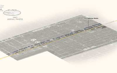
Black neighborhoods split by highways
Rachael Dottle, Laura Bliss and Pablo Robles for Bloomberg on how urban highways…
-
Atlas of the Invisible
James Cheshire and Oliver Uberti teamed up for another book of maps, Atlas…
Recently for Members
Second Edition
 Visualize This: The FlowingData Guide to Design, Visualization, and Statistics (2nd Edition)
 Visualize This: The FlowingData Guide to Design, Visualization, and Statistics (2nd Edition)
New tools, refined process.
Browse by Chart Type See All →


