Sergio Peçanha and Yan Wu for The Washington Post made a calculator that…
Infographics
Telling stories with data and graphics.
-

Commuting calculator
-

A view from the Moon’s south pole
NASA Goddard visualized the point of view from the south pole of the…
-

How the 3-point line changed basketball
Vox shows how the 3-point line is “breaking” the game.
The basic math… -
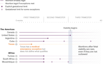
Comparing abortion limits in the U.S. against other countries
The Washington Post, in an effort that I’m sure took more energy and…
-

Visual guide for protecting your home from wildfire
Aaron Steckelberg and Tik Root for The Washington Post provide a visual guide…
-

This is a good Venn diagram.
[via]…
-

Sand mining viewed from above
Poyang Lake is China’s largest freshwater lake, but sand mining has changed its…
-
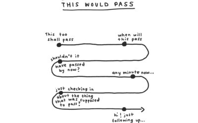
Humorous charts to organize thoughts
When I’m feeling confused about what’s going on around me, I gravitate towards…
-
Beautiful News, a book charting the good things in the world
From David McCandless and team, who you might know from such books as…
-

Black mortality gap
Anna Flagg, for NYT’s The Upshot, used dots arranged as a stacked area…
-
Bitcoin power usage
You might have heard that Bitcoin uses a lot of electricity. More than…
-

How vaccines can make a difference with the Delta variant
We see percentages for the vaccinated and unvaccinated, and people can easily misinterpret…
-
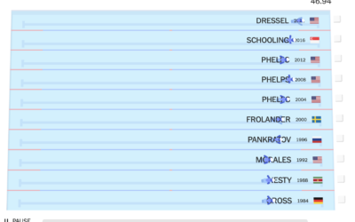
Olympic champions versus past Olympians
With the 2020 Olympics wrapped up, The New York Times raced this year’s…
-
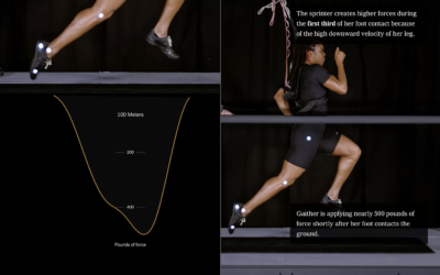
Science behind running fast vs. running far
From The New York Times, the combination of video, motion graphics, and charts,…
-
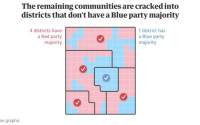
Visual guide to redistricting
Gerrymandering continues to be an important thread that I think many people still…
-

New Olympic sports explained
The 2020 Summer Olympics are here, so ’tis the season for experimental visual…
-

Olympic event visual explainers
With the Olympics starting on Friday, The New York Times started their coverage…
-
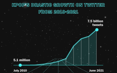
Rise of K-pop
K-pop seems to be inescapable these days, which really confuses me. Marian Liu,…
Recently for Members
Second Edition
 Visualize This: The FlowingData Guide to Design, Visualization, and Statistics (2nd Edition)
 Visualize This: The FlowingData Guide to Design, Visualization, and Statistics (2nd Edition)
New tools, refined process.
Browse by Chart Type See All →


