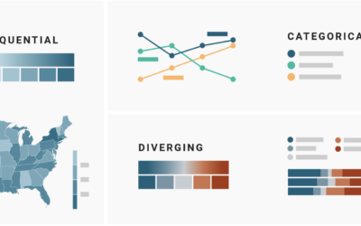
On a superficial level, color scale selection seems like a straightforward task. Pick…
Nathan Yau
-
Which color scale to use for your charts
-
Teaching statistical models with wine tasting
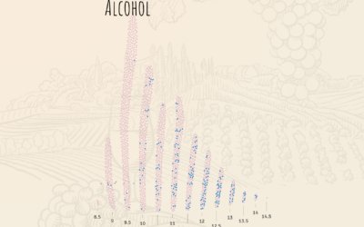
For The Pudding, Lars Verspohl provides an introduction to statistical models disguised as…
-
Statistical limits
Reviewing Deborah Stone’s Counting and Tim Harford’s The Data Detective, Hannah Fry discusses…
-
Inadequate hate crime statistics
For ProPublica, Ken Schwencke reports on a poor data system that relies on…
-
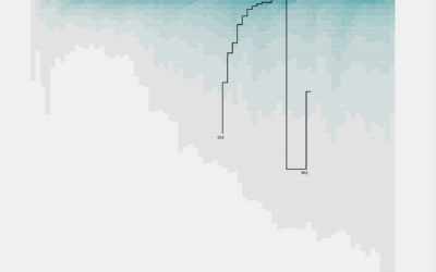
Career Timelines for Every Basketball Player Who Has Played an NBA Game
I was curious who played for a single team over their entire career, who skipped around, and how the patterns changed over the decades.
-
Members Only
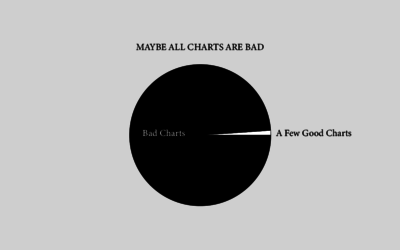
Maybe All Charts are Bad – The Process 131
But probably not.
-
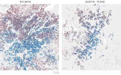
Mapping all of the voters
In what seems to have become a trend of making more and more…
-
Rising number of anti-Asian attacks
Russell Jeung, chair of the Asian American Studies Department at San Francisco State…
-
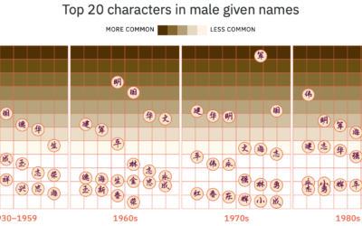
Evolution of Chinese names
For Kontinentalist, Isabella Chua took a dive into the evolution of Chinese names:…
-
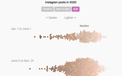
Analysis of skin tones in beauty ads on Instagram
For Quartz, Amanda Shendruk and Marc Bain analyzed skin tones that appeared in…
-
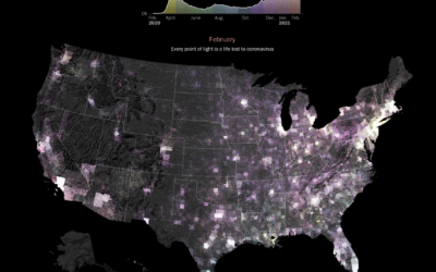
Pandemic timeline as animated dot density map
As a lead-in and backdrop to a timeline of the past year by…
-
Facebook feed comparison between groups
As part of their Citizen Browser project to inspect Facebook, The Markup shows…
-
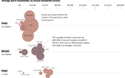
Average stimulus aid, by household size and income
Alicia Parlapiano and Josh Katz, reporting for NYT’s The Upshot, plotted the average…
-
Seeing CO2 is a playable data visualization
Seeing CO2, by design studio Extraordinary Facility, is a playable data visualization that…
-
Members Only
Imagining the Path to a Bad Chart – The Process 130
Bad charts get made. It’s inevitable. Sometimes I wonder how it happens though.
-
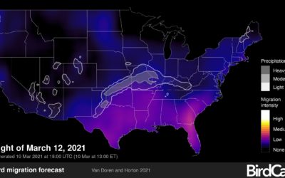
Bird migration forecast maps
BirdCast, from Colorado State University and the Cornell Lab of Ornithology, shows current…
-
DeepTomCruise breakdown
Chris Ume, with the help of Tom Cruise impersonator Miles Fisher, created highly…
-
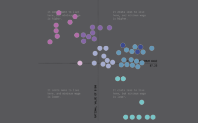
Minimum Wage and Cost of Living
We already looked at minimum wage over time, but when it comes to geography and income, you also have to consider the cost of living for a fair comparison.
-
Machine learning to find movie ideas
Speaking of A.I. and fiction, Adam Epstein for Quartz reported on how Wattpad,…
-
A.I. love story
Pamela Miskhin, in collaboration with The Pudding, wrote a love story. It’s not…





 Visualize This: The FlowingData Guide to Design, Visualization, and Statistics (2nd Edition)


