As we know by now, conservatives in the U.S. are more commonly against…
Nathan Yau
-

Stat-driven view on how American conservatives shifted against vaccine
-
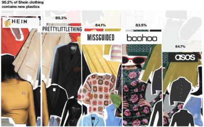
Fashion industry’s environmental impact
For Bloomberg, Rachael Dottle and Jackie Gu look at the current state of…
-
Members Only
Visualization Tools and Learning Resources, February 2022 Roundup
Here’s the good stuff for February.
-
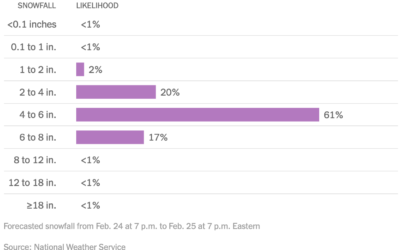
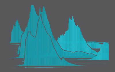
Distribution of snowfall estimates to show uncertainty
For NYT’s The Upshot, Aatish Bhatia, Josh Katz and Margot Sanger-Katz show the…
-

Many Ukraine maps
There are many maps trying to show what is happening in Ukraine right…
-
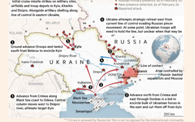
Map of invasion in Ukraine
This map by Henry Foy and Steven Bernard for Financial Times shows a…
-

Statistician answers stat questions
For Wired, stat professor Jeffrey Rosenthal answered statistics questions from Twitter, such as…
-

More readable writing illustrated with more readable writing
For The Pudding, Rebecca Monteleone and Jamie Brew (with design and code by…
-
Trendiest Baby Name Every Year Since 1930, in the U.S.
Baby names gain sudden popularity for various reasons. See how it’s changed over the years.
-
Members Only
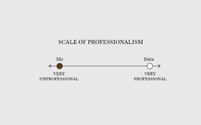
Very Unprofessional – The Process 177
Sometimes being unprofessional works to your advantage when communicating data.
-
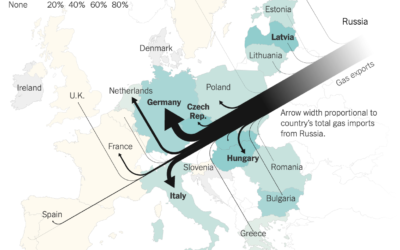
Map of Russian gas exports
Speaking of Russian gas, Josh Holder, Karl Russell and Stanley Reed for The…
-

Russian gas supplies in Europe
For Reuters, Prasanta Kumar Dutta, Samuel Granados and Michael Ovaska detail Europe’s dependence…
-

Interactive traffic simulator
Traffic always seems so sensitive to the smallest disruptions. Someone pulls over to…
-
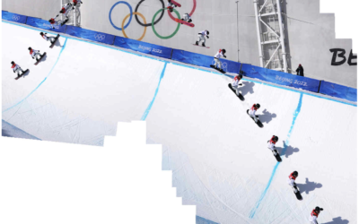
Snowboarding composite photos
If you watched the men’s halfpipe in the Olympics, you were probably impressed…
-
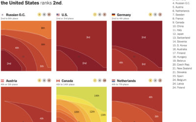
Weighted Olympic medal counts
To decide who’s doing best at the Olympics you have to define what…
-
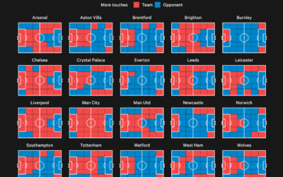
Premier League territory control
The Athletic charted territories on the field to show whether the team of…
-
Age of Moms When Kids are Born
It’s a wide range, based on data from the National Center for Health Statistics.
-
Members Only
Good Redundant
Think of the redundancies as reinforcement for a clearer signal.
-

Modernized version of a mid-19th century encylopedia
Between 1849 and 1851, J.G. Heck published a 10-part encyclopedia called Iconographic Encyclopædia…
-
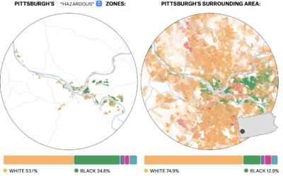
Past redlining still seen in the present
In the 1930s, a group called the Home Owners’ Loan Corporation went to…
Recently for Members
Second Edition
 Visualize This: The FlowingData Guide to Design, Visualization, and Statistics (2nd Edition)
 Visualize This: The FlowingData Guide to Design, Visualization, and Statistics (2nd Edition)
New tools, refined process.
Browse by Chart Type See All →


