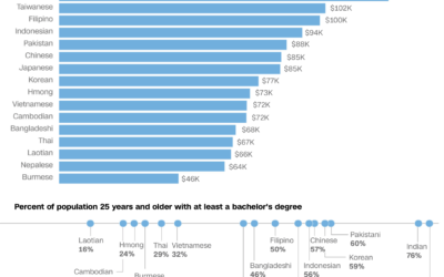
We often hear about the Asian American community as one big group of…
Nathan Yau
-
Varying demographics within the Asian American population
-
All the art in the Oval Office
The President of the United States chooses the art for the Oval Office,…
-
Members Only
Visualization, Manually – The Process 138
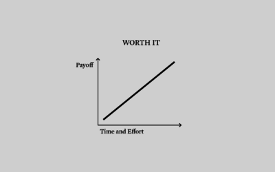
Put in the time to get to know your data and design around that for best results. Usually this part of the process isn’t automated.
-
Bird song sonographs show distinct drawing patterns
These sonographs of bird song, in contrast to the sounds from traditional instruments,…
-
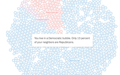
See if you live in a political bubble
Gus Wezerek, Ryan D. Enos, and Jacob Brown for NYT Opinion use neighborhood-level…
-
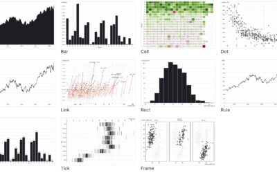
Observable Plot, a JavaScript library for more straightforward visualization of tabular data
If you’re into the notebook workflow, Observable Plot is a JavaScript library built…
-
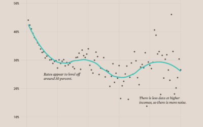
Divorce Rates and Income
Divorce rates are tied to job security, age, and occupation, so it should make sense that we see a pattern when we plot divorce rates against income.
-
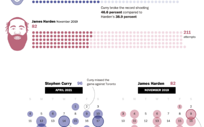
Stephen Curry’s record-setting month for shooting threes
Steph Curry has been on a tear as of late. In April he…
-
Climate change and uncertainty
In his new data-driven documentary, Neil Halloran digs into the uncertainty attached to…
-
Members Only
Visualization Tools and Learning Resources, April 2021 Roundup
Here’s the good stuff for April 2021.
-
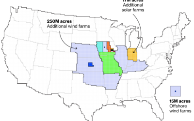
Maps of land required to get to net-zero emissions
Princeton University’s Net-Zero America project analyzes and models the infrastructure required to get…
-
Melting glaciers
Niko Kommenda for The Guardian used small multiples to show 90 of the…
-
Population Growth and Seats Gained
The Census Bureau released state population counts for 2020. Here’s how each state gained and lost population and seats.
-
Surprise, Less Happiness During Pandemic
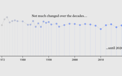
Since 1972, the General Social Survey has asked people about their happiness. It never changed much — until 2020 happened.
-
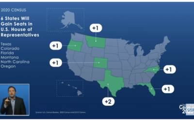
States that gained and lost seats with 2020 count
The Census Bureau announced their state population totals, so we can see who…
-
Seat apportionment over time
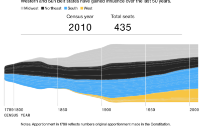
The 2020 Census count at the state level is set for release this…
-
Where people moved during the pandemic
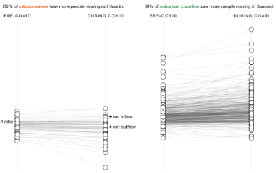
In another look at migration through the lens of USPS change of address…
-
Using noise in creative coding
Oftentimes visuals generated through code can seem cold and mechanical when you’re after…
-
Compare the scale of any area in the world
Riffing on the Ever Given Ever Ywhere, which lets you place the Ever…
-
Members Only
Relative Comparison – The Process 136
In analysis and visualization, you’re often tasked with the “compared to what” question. Your approach will change the perspective.








 Visualize This: The FlowingData Guide to Design, Visualization, and Statistics (2nd Edition)


