I post this graphic by Muller on the Coen brothers filmography mostly because,…
Nathan Yau
-

A history of Coen brothers filmography
-
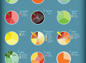
Charted guide to fancy drinks
I’m partial to all things food and drink related, so naturally my eyes…
-

Adults with college degrees, over time
The Chronicle of Higher Education lets you explore the percentage of adults with…
-

Find more of the data you need with DataMarket
Add another online destination to find the data that you need. DataMarket launched…
-
FlowingData is brought to you by…
My many thanks to the FlowingData sponsors. They help me keep the servers…
-
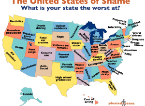
What your state is the worst at – United States of shame
In a survey of rankings from a variety of sources, Pleated Jeans maps…
-
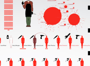
Dexter’s victims through season five
DeviantArt user dehahs, who seems to enjoy making graphics based on fiction (see…
-
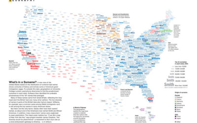
Map: United States of surnames
Mina Liu and Oliver Uberti for National Geographic examine the most common surnames…
-

Comment to win free registration for Strata data conference – winner announced
Okay, I sort of dropped the ball on this one. I have a…
-

Map of scientific collaboration between researchers
In the spirit of the well-circulated Facebook friendship map by Paul Butler, research…
-

Open thread: Charts during the State of the Union address
President Barack Obama delivered his State of the Union address yesterday, and this…
-
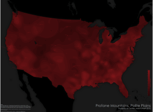
Where people swear in the United States
Cartographer Daniel Huffman has a look at swearing in the United States, according…
-
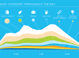
Growth and usage of foursquare in 2010
Foursquare has a look at their usage in 2010. I bet you were…
-

Explore your LinkedIn network visually with InMaps
LinkedIn has been having some fun with their data lately. They opened up…
-

Visual analysis of ‘I Have a Dream’ speech
Nancy Duarte of Duarte Design has a look at Martin Luther King, Jr.’s…
-
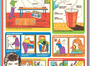
Flight safety-esque beer pong guide
It’s Friday. You might need this vintage-looking guide on how to play beer…
-
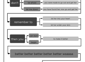
Hey Jude flowchart
What day is it? Flowchart Friday of course. Old but new to me.…
-

Tracking space garbage with Space Fence
Lockheed Martin’s Space Fence, expected to be in initial operation in 2015, will…
-
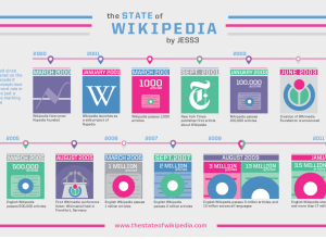
State of Wikipedia, 10 years later
In their most recent video (below) to their “State of…” series, JESS3 takes…
-

States with the most and fewest firearms murders
According to 2009 numbers reported by the Federal Bureau of Investigation, DC, Louisiana,…
Recently for Members
Second Edition
 Visualize This: The FlowingData Guide to Design, Visualization, and Statistics (2nd Edition)
 Visualize This: The FlowingData Guide to Design, Visualization, and Statistics (2nd Edition)
New tools, refined process.
Browse by Chart Type See All →


