Earlier this week we saw two versions of mobile patent lawsuits. The original…
Nathan Yau
-
Open thread: Is it OK to confuse if that’s the message?
-
Generic terms for streams mapped
The names of places can say a lot about a geographic area. Derek…
-
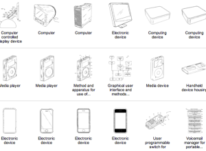
Steve Jobs patents
Steve Jobs stepped down as CEO of Apple yesterday, and one of the…
-

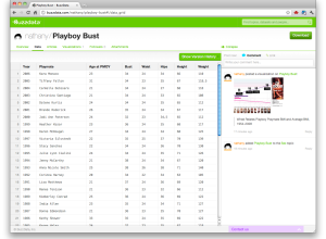
Who owns the beer
When you walk the beer aisle at the grocery store, there are lots…
-
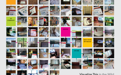
Visualize This: Spotted in the wild
It’s been about a month since Visualize This came out, but it took…
-
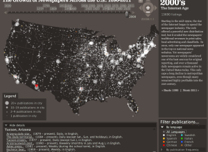
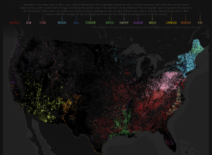
Growth of newspapers across the United States
The Rural West Initiative and the Bill Lane Center for the American West…
-
Link
On the role of bacon in visualization →
“Bacon is a legitimate ingredient to many dishes, and can be quite tasty, when used right. But if your cooking style is to start with cooking something bland, and then add bacon to make it less bland, then, trust me, you are not a great cook.”
-
BuzzData aims to make data more social
In many ways, data wants to be social. It wants to get out…
-

Statisticians as a tribe
Peter Curran for BBC Radio 4 puts the tribe of statisticians under the…
-
Strata data conference: Last day for early bird registration + 20% off
Following the success of the Strata conference earlier this year here on the…
-
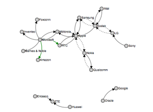
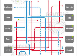
Mobile patent lawsuits
Mike Bostock visualizes mobile patent lawsuits, improving on a graphic from Thomson Reuters…
-
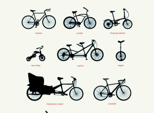
Bikes of San Francisco
Tor classifies areas in San Francisco by bicycle. I’d say that’s about right.…
-
Statistics for gambling
Statistics isn’t just for finding out how our world works and how companies…
-
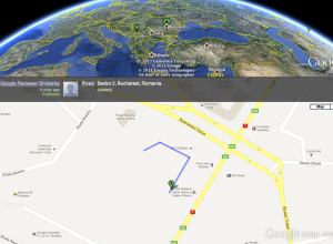
Google Map Maker edits in real-time
Google Map Maker is a simple tool that lets you draw your own…
-
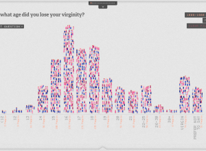
The Sexperience 1000 shows a (statistical) view of what goes on in the bedroom
The bedroom is a private place, and what goes on in the bedroom…
-
Statistical Graphics and Information Visualization
The two differ in who uses them, how they are used, and who…
-
Visiting Census
I’m visiting the US Census Bureau this week, so there’s a good chance…
-
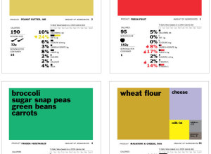
Rethinking the food nutrition label
The food nutrition label is on almost every food item, but it can…
-

Data visualization freelancing
In an interview with Enrico Bertini, Moritz Stefaner, whose work you’ll probably recognize,…
-

Data Scientist: The hottest job you haven’t heard of
Maryalene LaPonsie describes some novel job called Data Scientist (although we’ve known about…
Recently for Members
Second Edition
 Visualize This: The FlowingData Guide to Design, Visualization, and Statistics (2nd Edition)
 Visualize This: The FlowingData Guide to Design, Visualization, and Statistics (2nd Edition)
New tools, refined process.
Browse by Chart Type See All →


