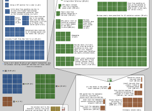
Randall Munroe of xkcd, with the help of a friend who is senior…
Nathan Yau
-
Radiation doses and safety in perspective
-
Japan satellite photos show before and after
The New York Times has a set of sobering satellite photos of Japan.…
-
Straight lines are surprisingly hard to draw with a mouse
Remember when you played Telephone as a kid? No matter how simple the…
-
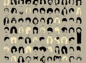
Visual history of hot haircuts in popular music
A Visual Compendium of Notable Haircuts in Popular Music from Pop Chart Lab…
-
Open thread: What data do you want to see visualized?
There is so much data available and new data released every day, but…
-
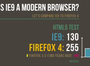
Firefox vs. IE: Is IE9 a modern browser?
Mozilla tech evangelist Paul Rouget has a go at Internet Explorer 9 in…
-
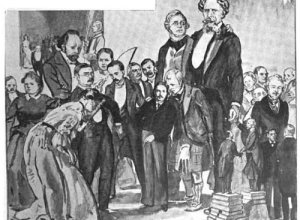
Vintage literary stature graphic from 1906
Greg Ross highlights an old school graphic from The Strand Magazine, published in…
-
Code to make your own movie barcodes available
You know those compressed movie barcodes that we saw last week? Here’s a…
-
The Like Log Study: Buzzwords and engagement
The Web is a game of pageviews, and outlets such as Twitter and…
-
Best of digital news design winners announced
The Society for News Design announced the winners of their annual digital competition.…
-
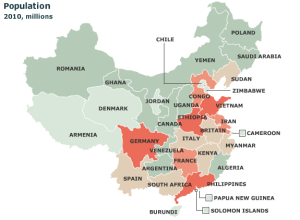
Chinese provinces compared to countries
It’s easy to forget just how big some countries are. For example, China:…
-
Typographic world map and water colors
Typographic maps are all the rage these days. Instead of drawing well-defined boundary…
-
Why sports statisticians should be more involved in games
Hot off the MIT Sloan Sports Analytics Conference, Sean Gregory argues for more…
-
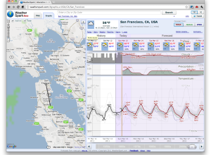
WeatherSpark for more graphs about the weather than you will ever need
You know Matthew Ericson’s simple weather mashup? It shows only what you need…
-
Billionaires, apples, and other things
The World’s Billionaires — Forbes publishes their annual list of the world’s richest…
-
Japanese quake and predicted tsunami wave heights
The New York Times maps the reach of the 8.9-magnitude earthquake in Japan.…
-
Animation: North and South Poles melting away
Adrian Meyer and Karl Rege of Zurich University of Applied Sciences visualize the…
-
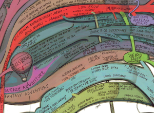
History and origins of science fiction
Artist Ward Shelley maps the history of science fiction in painstaking detail. See…
-
Data-Driven Documents for visualization in the browser
As we know, browsers keep getting better, and it grows easier every day…
-
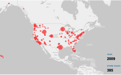
Watching the growth of Costco warehouses
Costco is one of the best stores ever. It’s got everything you need…









 Visualize This: The FlowingData Guide to Design, Visualization, and Statistics (2nd Edition)


